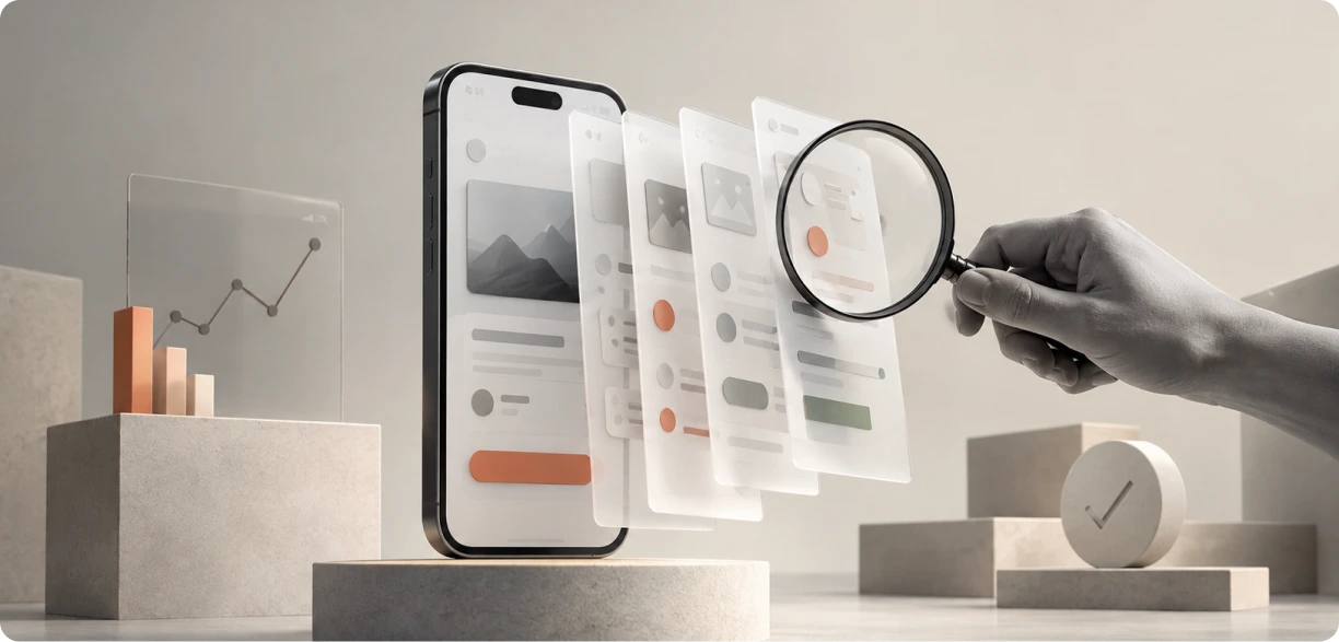
A wireframe is a rough layout that shows where things sit on a screen. A prototype is an interactive version that people can click through and actually use. Put simply, wireframes UX design sorts out the structure, while digital prototyping shows how the thing behaves. You wireframe early to plan, and you prototype later to see how real users respond.
Introduction
Sit through enough product kickoff meetings, and you’ll notice a familiar pattern. The conversation quickly shifts to button colors, typography, and visual details, while a more important question often goes unasked: Does the product actually make sense to use? Focusing on aesthetics before usability is like choosing paint colors before the house has been built. A great user experience starts with solving the right problems, not polishing the interface.
Wireframes and prototypes fix that, but they are not the same thing, and they do not do the same job. A wireframe helps you think through the structure. A prototype tells you whether that structure actually holds up when a real person tries to use it. Treating them as the same can cost you time and money later.
Therefore, YUJ Designs helps businesses across industries get the foundation right before development begins. Our wireframing and user testing process uncovers usability issues early, validates design decisions with real users, and reduces the need for expensive changes after launch.
This guide explains the same approach we use with our clients. It covers the roles of wireframes, prototypes, and usability testing, when to use each, and how they work together to create products that are intuitive, effective, and ready for real users.
Understanding Wireframes and Prototypes
The two are often confused, so it’s important to understand the difference first.
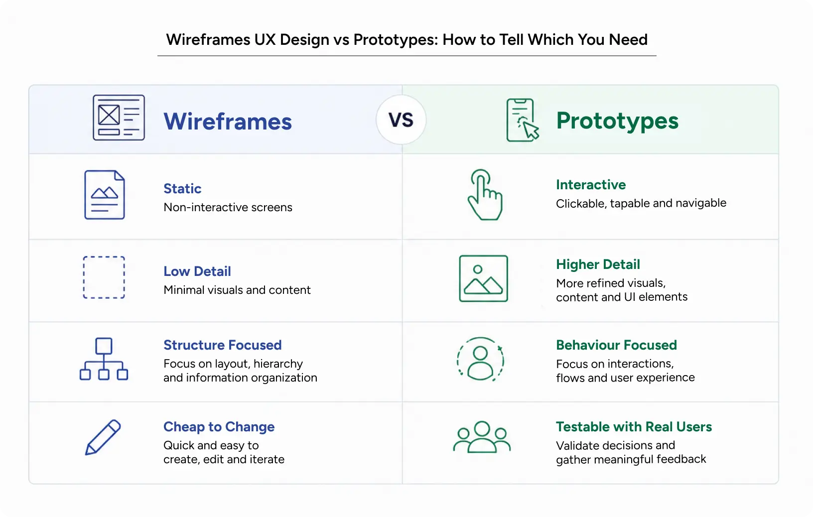
A wireframe is a stripped-back map of a screen. It shows layout, content blocks, and what sits above what. No color, no polish. Good wireframing is really answering one blunt question: Does this structure make sense to a human?
A prototype goes further. It looks and behaves much closer to the finished product, so you can tap something and watch it react. That is the point of prototyping. Static ideas start moving, and you can quickly see if they work.
A wireframe is the floor plan. A prototype is the show home you walk through before you sign anything.
Types and Variations
Wireframes come in two rough grades. Low fidelity ones are quick sketches, often literally pen on paper. High fidelity ones add spacing, real labels, and a closer sense of the layout. Strong wireframes UX design usually start scrappy and sharpen as you learn more.
Prototypes vary, too. A simple interaction prototype covers a single flow, say signing up. A richer one stitches many screens into one continuous journey.
This is where interaction design prototyping really earns its keep. If done well, it captures the small stuff, like the way a menu slides open or how an error message shows up. Small details matter, and users notice them all.
Core Principles
- Match the tool to the question you have: If you are working out the structure, that is, wireframing. If you are testing behavior, that is prototyping.
- Do not polish too early: Show someone a pretty screen, and they will comment on the color, not on whether the flow actually works.
- Test what you build: A prototype that never meets a real user is just a nicer-looking guess.
Also Read: Design Ops Explained: How to Scale UX Across a Growing Organization
Why It Matters in UX Design
This is not about looking slick in a review. It is about protecting the product and the money behind it.
Impact on User Experience
Wireframes take pressure off users early. When the structure is clear, people find what they need without stopping to puzzle out where to click.
Prototypes push it further. With prototype usability testing, you get to watch real people either sail through or get stuck, all before a developer writes a line of code. That is the feedback worth having. User testing often reveals problems that design reviews miss. A button that seems obvious to the design team can go unnoticed by several users because they don’t have the same familiarity with the interface.
Thoughtful prototyping helps accessibility, too. You can check tap sizes, contrast, and how the flow feels with a range of users, and the awkward bits show up while they are still cheap to fix.
Impact on Business Metrics
What matters most to leadership is cost and efficiency. Fixing a usability issue during the wireframing stage is simple and affordable. Finding the same issue after launch can lead to costly redesigns, delays, and additional development work.
Good digital prototyping tends to lift conversion, because you strip out friction before anything ships. It helps retention, too, since the product feels right the first time someone opens it. And it earns trust, which is what brings people back.
There’s another benefit too. Testing prototypes early gives developers a clearer direction, helping them build faster and avoid expensive changes later. The impact can be significant. When YUJ Designs tested and improved StubHub’s seat selection flow with real users, conversions increased by 4.4%, and sales grew by 10.6%.
Common Mistakes to Avoid
1. Adding Visual Detail Too Early
A common mistake is adding color and visual detail to wireframes too soon. This shifts everyone’s attention away from the structure, navigation, and user flow that still need refinement.
2. Skipping Usability Testing
Another common mistake is skipping usability testing to save a few days. It rarely pays off. The test you skip today often returns as a support ticket or usability issue after launch.
3. Treating User Testing Prototypes as a Checkbox
The sneakiest mistake is treating user testing prototypes as a box to tick. Effective testing means observing users, listening to their feedback, and improving the design based on real insights, not simply validating what has already been created.
How to Apply It: A Practical Workflow
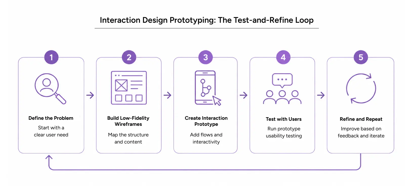
Here is a flow that holds up, from first idea to a product you have actually tested.
Step-by-Step Workflow
1. Start With the Problem
Define the user’s goal before opening Figma. Once you understand what they’re trying to achieve, then start sketching.
2. Build Low-Fidelity Wireframes
Build low-fidelity wireframes next. Keep them rough and focus on layout and flow. Wireframing at this stage is quick to make and inexpensive to change, which is exactly the point.
3. Move Into Digital Prototyping
When the structure feels right, move into digital prototyping. Turn those static screens into a clickable interaction prototype and connect the key steps so users can complete real tasks instead of imagining the experience.
4. Conduct Prototype Usability Testing
This is where prototype usability testing becomes essential. Give five to eight people a task, observe how they interact with the prototype, and note every point where they hesitate or take a wrong turn.
5. Refine Through Interaction Design Prototyping
Interaction design prototyping is an iterative process, not a one-time activity. Test, learn, improve, and test again until the experience becomes intuitive and easy to use.
6. Bring It Together With a Design Sprint
Some teams compress this entire process into a design sprint. It is a focused week to sketch, prototype, and test one big idea. Popularized by Google, a design sprint helps teams make faster, more informed decisions when the cost of getting them wrong is high.
Pro Tips from Business Team
- Test with fewer people than instinct suggests: Five users can uncover most major usability issues. After that, you’ll likely start seeing the same problems repeated.
- Keep your prototype simple: One well-designed user flow is better than ten incomplete ones.
- Avoid stepping in during user testing: The moment you catch yourself explaining how something works, you have found a design problem.
- Use a Design Sprint to Break Deadlocks: When a team is stuck arguing, run a design sprint. Building and testing a prototype settles a debate faster than any meeting ever has.
Tools and Resources
1. Figma
The default for most teams now is handling both wireframes and digital prototyping in one place. It is quick, easy to share, and most people can find their way around it in an afternoon.
2. Adobe XD and Sketch
Though the crowd has drifted toward Figma in the last few years. And for quick wireframes and UX design, honestly? A pen and a sheet of paper are hard to beat. No tool loads faster than a napkin.
When it comes to usability testing, tools like Maze and Lookback let you run remote sessions and collect feedback from far more people than you could ever fit in a room.
Also Read: UX Consulting vs Embedded Design Teams: Which Model Wins in 2026?
Real World Example: StubHub
StubHub is the largest online secondary ticket marketplace in the United States, owned by eBay. Their ticket-buying flow had plenty of features, yet conversion had stalled. Buyers found the search confusing and the seat selection clumsy.
Rather than guess at fixes, YUJ Designs treated this as a prototype-and-test problem. We started with user research, mapped the structure, and then moved into hands-on interaction design prototyping. The centerpiece was a dynamic seat map that let buyers feel the view from a seat before booking.
We did not ship that idea on faith. Through repeated prototype usability testing with real buyers, we cut clutter, reduced steps, and refined the flow until it worked. Every change was earned in testing, not decided in a meeting.
The result was strong. Conversion rose by 4.4%, overall sales climbed 10.6%, and the redesigned seat selection flow delivered a reported ROI of USD $117M.
Conclusion
Wireframes and prototypes are not competing for the same job. They work in sequence. One helps you plan a clear structure, and the other helps you check real behavior before you commit to building it.
So get it right with wireframing, then move into digital prototyping to see how people actually handle it. Rely on real user testing to guide your decisions. User behavior provides clearer insights than assumptions or opinions.
The process is simple. Test your ideas early, learn from user feedback, and improve the design based on what you discover.
At YUJ Designs, this is how we help products across the United States and India go from confusing to clear. If yours feels harder to use than it should, the fix usually starts with a better sketch and a smarter test.

FAQs