
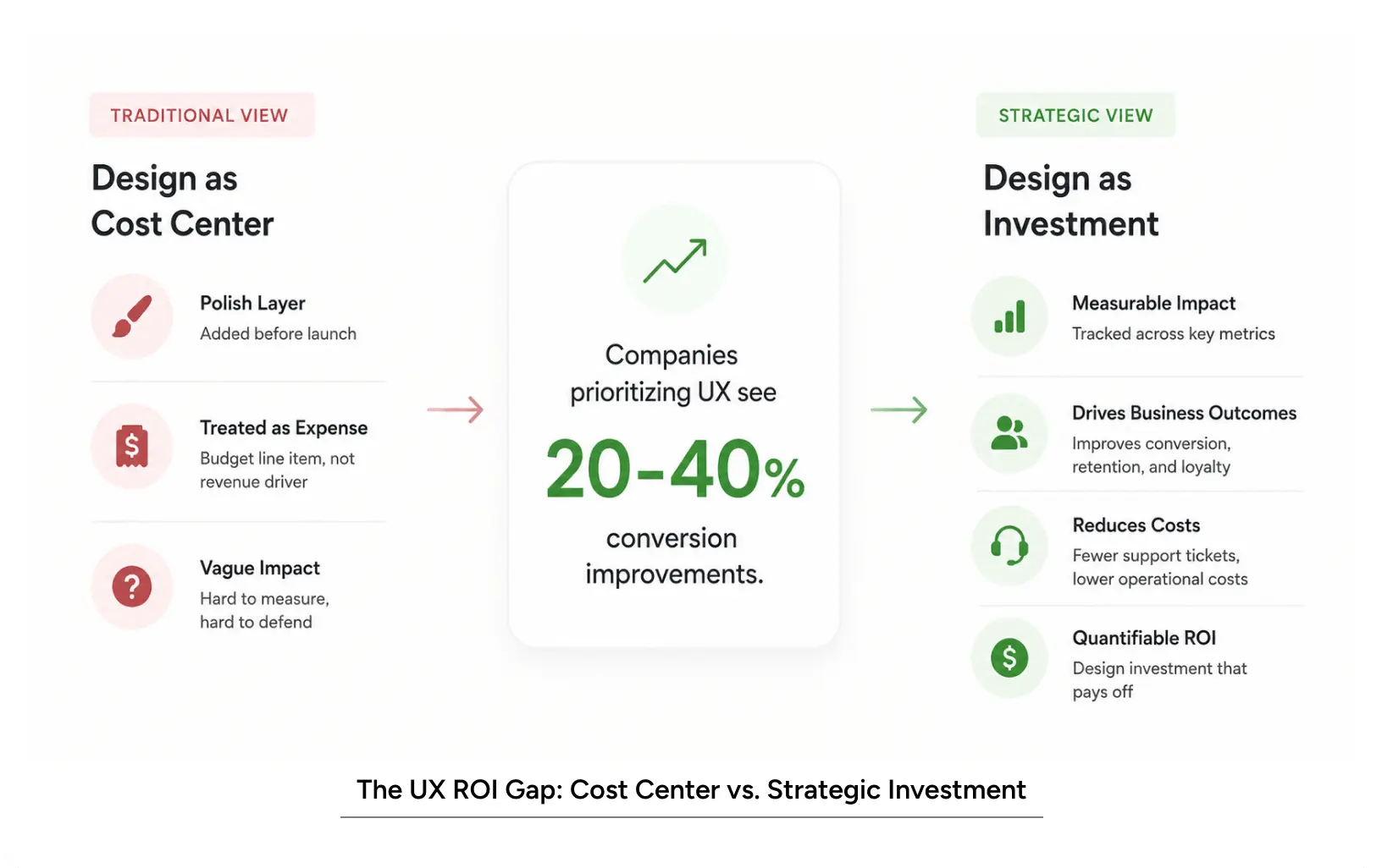
Good design isn’t decoration. It’s revenue. UX work shows up on the P&L in three obvious places: conversion, support costs, and retention. Companies that take it seriously usually see conversion gains somewhere in the 20-40% range, faster shipping, and lower churn. But you only get those numbers if you bother to measure them, which most teams don’t.
Why UX Design is Your Biggest Untapped Revenue Lever?
Same story every time. A product launches. The engineering is solid. The interface looks fine. Users don’t adopt it. Support tickets pile up. Conversion sits flat. And then everyone in the room blames the product, the market, the launch timing. Almost nobody points to the user experience design.
I’ve been doing enterprise work for over twenty-five years, and I’ll just say it plainly: the product is rarely the problem. The way people interact with the product is the problem.
Most companies still treat design like a coat of paint you apply right before launch. That’s a choice, and it’s a bad one. The companies that treat UX as a real investment get real returns. Not vibes. Actual conversion lifts, actual support cost drops, actual retention.
Convincing people that good design matters isn’t hard. Convincing your CFO how much it matters, in numbers she trusts, is where most designers lose the argument. This blog is about how to win it.
What ROI of UX Design Actually Means
The honest definition
UX ROI is the money your design work makes you or saves you. That’s it. It’s not what the screens look like. It’s what the screens do.
In practice, it shows up as:
- More people finishing what they started (signing up, paying, subscribing)
- Fewer confused users emailing your support team
- People are sticking around longer and using the thing more
- Less rework because you figured out what to build before you built it
- Shorter cycles, because a validated design beats guessing
The reason this framing matters is that it’s a language your finance team
already speaks. Your CFO doesn’t care about the button color. She cares whether the button gets clicked, the card gets charged, and the customer comes back.
UX vs. UI (quick aside, because people keep mixing them up)
UI is the surface. Buttons, layouts, colors. UX is what the surface makes someone do and feel. You can have a gorgeous UI and a miserable UX. You can’t really have good UI with a bad UX.
For the business case, UX is where the money is. One onboarding redesign can take a 2% conversion rate to 5%. That’s not a color change. That’s somebody figuring out where users get stuck and clearing the path.
Key User Experience Metrics to Track
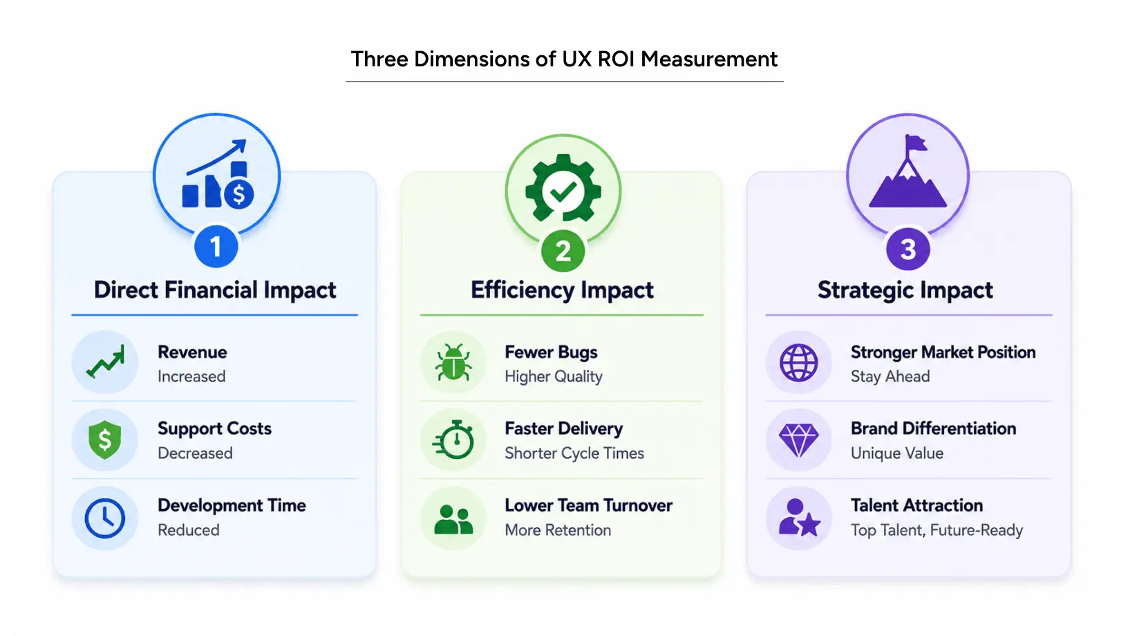
Three lenses, in rough order of how often people use them:
- The money: revenue up, support costs down, development time down.
- The operations: fewer bugs in production, faster shipping, and less team churn out.
- The strategy: market position, brand image, and recruiting.
Most teams stop at #1. The best teams track all three.
Also Read: Navigating the Agentic Era: Redefining UX for Real-World Impact
The Business Case for UX ROI
Usability is the floor, not the ceiling
When people talk about UX, they usually mean usability. Can people find what they need? Is the screen easy to understand? Of course, that matters. But that’s just the basic expectation.
The stuff that actually improves ROI is further up the stack:
- Cognitive load – How hard is it to think while using your product? More effort, more drop-off.
- Trust – How fast does a new user decide you’re legit? You usually have seconds.
- Emotional response – Does using the thing feel light, or does it feel like work?
I’ll give you a concrete one. We audited a fintech app last year. Onboarding worked. Every input validated. Every step submitted. And yet completion was 38%. Why? The app asked for seven personal details before showing anyone why it needed them. People felt interrogated. So they bailed.
We didn’t change the data we collected. We simply explained why each field mattered, validated inputs in real time, and added a progress bar to give users a sense of security throughout the process. Six weeks later, completion rates hit 67%. Same app. Just a more trustworthy experience.
How UX Design Impacts ROI
Okay, the part everyone wants.
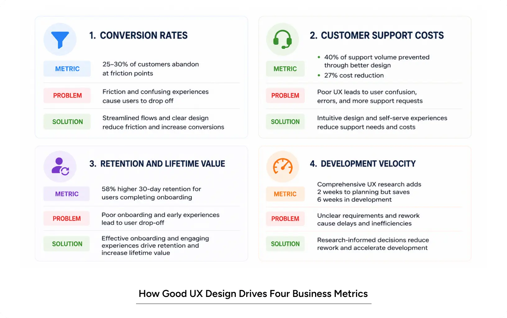
Conversion. A typical e-commerce site loses around a quarter of potential buyers at checkout because the form is too long or too confusing. SaaS products lose roughly a third of their trial signups during onboarding because the value isn’t obvious quickly enough. These aren’t small numbers. If you’re doing $5M a year at a 3% conversion rate and you push that to 4%, you don’t just get 33% more revenue, you get more than that, because the same traffic converts better and the people who convert tend to be worth more over time.
Support. A confusing product writes its own support tickets. We worked with an AI writing tool where 40% of inbound support was answering questions the UI should’ve answered. The info was in the product. People just couldn’t find it. We added contextual help, fixed some labels, and smoothed the first-run flow. Ticket volume dropped by 27%. With each ticket costing around $150 to resolve, the costs add up quickly.
Retention. Confused people leave. Confident people stay. We measured this with a healthcare platform: users who actually finished the guided onboarding had 58% better 30-day retention than those who skipped it. That gap compounds for a year. By the time you look at lifetime value, there’s a significant difference.
Dev velocity. When research happens before code, dev time shrinks. Sounds obvious. We’ve watched projects where two extra weeks of upfront research cut six weeks off the build. Net four weeks ahead, and a product that didn’t surprise anyone at QA.
Common Mistakes When Measuring UX Success
Measuring effort instead of impact. “We redesigned the dashboard” isn’t a metric. “We made insights accessible in just one step.” A lot of teams celebrate the activity and ignore the outcome.
Bad attribution. You ship a checkout redesign, and conversion jumps 12%. Great. But you also ran an ad campaign that week, and it was payday Friday. Was it the design? You don’t actually know unless you run a control. So run one. Keep 10% of users on the old version. Compare. That’s the only number worth trusting.
Calling it too early or too late. Conversion changes can show up in a week. Retention changes might need 60 days to clarify. Running a two-day test and declaring victory is a great way to burn money on a “win” that isn’t real.
Ignoring the qualitative side. A 2% lift sounds boring. But if that 2% came from finally fixing the experience for, say, mobile users in India on 2G who were silently giving up, that’s not a 2% lift. That’s a new market segment. Numbers without context will make you do dumb things.
Also Read: UI design vs UX design: The Difference That Actually Matters for Your Product
5-Step Framework to Apply ROI of UX
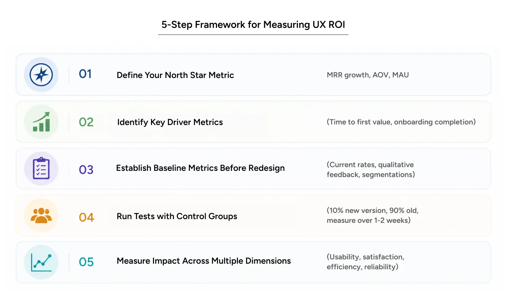
Step 1: Pick one north star
What’s the single number that means you’re winning? For SaaS, it’s usually MRR growth. For e-commerce, AOV and repeat purchase rate. For a creator platform, MAU.
Pick one. Everything ladders up to it.
If your goal is to increase trial-to-paid conversions from 12% to 16%, then every redesign gets graded against that. Did it help? By how much? What did it cost? That’s your ROI calculation, and it’s not complicated.
Step 2: Figure out the drivers
You can’t move the North Star directly. You move the things that move it.
For trial-to-paid, the drivers are usually some mix of:
- Time to first value (how fast someone gets the “oh, I see why this is useful” moment)
- Onboarding completion
- Feature activation
- Time to users’ first action
Improve the key factors, and the main metric improves too.
Step 3: Get your baseline, no shortcuts
You cannot measure improvement against nothing. Before you change anything:
- Write down the current numbers
- Talk to users who failed and find out why
- Slice the data by segment so you know who’s behaving how
This is the step everyone wants to skip. It’s also the reason most “the redesign worked!” stories don’t actually hold up.
Step 4: Run real tests with controls
Never roll a redesign to 100% on day one. Put it in front of 10% of users, leave the other 90% on the old version, and watch for a week or two, depending on your traffic.
If the new one wins, ramp it up. If it doesn’t, you just dodged a bullet.
Step 5: Measure UX Metrics Beyond Conversion
Conversion isn’t the whole story. Also look at:
- Can people finish the task at all?
- Did they feel good about it?
- Did it take less time or fewer clicks?
- Did anything break or feel rough?
Pair the numbers with actual conversations. Surveys, research sessions, and support transcripts. If the data says it’s better and the qualitative says it isn’t, trust the people.
Users don’t want to “use your product.” They want to get something done. If your research is about “how do people use the dashboard,” you’re already off. The question is “what business question are they trying to answer when they open it,” and “did the dashboard help them answer it.”
Aggregate metrics lie. A redesign can lift desktop conversion and quietly tank mobile, and the overall number can still look fine. Always slice by segment. Always.
Count the operational wins too. A clearer error message can stop a bug from happening, which saves your support team hours a week. Nobody puts that on a slide, but they should.
UX ROI Case Study: The StubHub Redesign
The biggest secondary ticketing marketplace in the US had a real problem. Plenty of inventory, plenty of content, but conversion was weak. Discovery was confusing, picking a seat was harder than it needed to be, and the purchase flow had too many steps.
YUJ Designs rebuilt the booking experience. Cleaner task flow, a real seat-map visualization (with the row, the view from the seat, and the price point all visible at once), and an information architecture that didn’t make you work for it.
The numbers came back fast, and they were not subtle. Revenue was up by 4.4%, while overall sales increased by 10.6%. Generated an extra $117M in revenue.
One redesign. Nine figures. When somebody asks me whether UX matters, that’s usually the case study I reach for.
Read the full case study: StubHub – Enhanced Ticket Buying Experience
Conclusion
The right question was never “Does UX matter?” Of course it does. The right question is whether your company has the discipline to measure it, the outlook to prioritize it, and the patience to iterate when the first version doesn’t land.
There’s nothing magical about UX ROI. It’s just careful problem-solving aimed at the place where humans meet your product. Measure it properly, and the business case stops being something you have to defend in every meeting.
The companies pulling ahead right now aren’t the ones with the prettiest screens. They’re the ones who can tell you exactly which design decision moved which number and by how much.
So next time you’re in a product review, and someone says “the redesign looks great,” that’s your cue. Ask: Did it lift conversion? Did it cut support volume? Did people adopt it faster?
Those are the questions that turn design from an expense into an investment.
FAQs