
Heuristic evaluation is a structured UX audit method where expert reviewers assess a digital product against a set of established usability principles. Typically based on Jakob Nielsen’s 10 heuristics, it identifies usability issues quickly without needing live user testing. Product teams use it to catch critical UX problems early and cut costly fixes later.
The UX Problem That Ships With Every Product
Picture this. Your app ships. Engagement is low. Users drop off in the first session. Support tickets pile up. You run user tests, and the problems are always there. They just never got caught.
This happens more than it should. Product teams invest months in development and days in testing. But the gap between “it works” and “users can actually use it” remains wide. That gap is where heuristic evaluation lives.
Heuristic evaluation in UX is one of the fastest, most cost-effective ways to find usability problems before users do. It doesn’t replace user research. It accelerates it. And when done right, it changes how product teams think about quality.
In this guide, you’ll learn what heuristic evaluation UX design looks like in practice: the method, the steps, the mistakes, and the results. Real examples included.
What Is Heuristic Evaluation?
Defining the Method
To define heuristic evaluation: it’s an inspection technique where UX experts evaluate a product’s interface against a set of usability principles (heuristics). No users are involved directly. Instead, trained evaluators simulate the user’s perspective and flag issues.
Jakob Nielsen and Rolf Molich introduced the method in 1990. Their 10 heuristics became the industry standard. They’re still the most widely used framework today.
The method sits under a broader category called heuristic analysis, which includes other inspection methods like cognitive walkthroughs and expert reviews. Heuristic analysis specifically focuses on matching observed interface behaviour against known usability rules.
Heuristic usability audits are especially valuable when:
- You don’t have time for full user testing
- You need to identify issues quickly before a product launch
- You want to prioritise fixes based on severity
- You’re evaluating a competitor’s product
What Heuristic Evaluation Is Not
It isn’t user testing. It doesn’t capture real user behaviour. It doesn’t replace qualitative research. And in practice, it’s rarely enough on its own.
Evaluating a product only against Nielsen’s 10 heuristics gives you a solid foundation but it leaves out business goals, strategic intent, content quality, navigation architecture, and the growing complexity of AI-driven interactions.
That’s why leading UX teams treat heuristic evaluation as the starting point of a broader review, not the whole picture.
Also Read: 2026: Agentic AI Moves from Experimentation to Enterprise
Beyond Heuristics: The Expert Review Approach
At YUJ Designs, heuristic evaluation is one lens within a more comprehensive practice called an Expert Review (ER). An Expert Review goes beyond checking a product against usability heuristics. It evaluates design from four perspectives simultaneously: human factors, user experience standards, user goals, and business goals. This distinction matters: a product can pass every Nielsen heuristic and still fail to serve the people using it or the business that built it.
The ER process begins before any screen is reviewed. The first step is a structured stakeholder conversation to elicit business goals (what the product needs to achieve commercially) and user goals (what the people using it are actually trying to do).
This goal-elicitation phase is what separates a genuine Expert Review from a checklist audit. It means every issue found during the review is assessed not just against usability principles, but against whether it blocks a real user from completing a real task or prevents the business from achieving a measurable outcome.
YUJ’s NPCIS Framework
YUJ Designs reviews products against its own proprietary framework NPCIS which covers five dimensions of experience quality. Each dimension surfaces a different category of design problem.
1. Navigation
examines how users move through the product. Are pathways logical? Can users find what they need without retracing steps? Navigation failures aren’t always obvious in a heuristic check; they show up in task completion rates and support tickets.
2. Presentation
covers how information is displayed. Visual hierarchy, layout density, typography, and colour all affect whether users can process what they’re looking at or give up trying.
3. Content
evaluates the quality, clarity, and relevance of the language in the interface. Labels, error messages, microcopy, and empty states are all content decisions. Poor content often causes more confusion than poor layout.
4. Interaction
assesses how the product responds to user actions. Input controls, feedback, loading states, transitions, and error handling all fall here. This is the dimension where most heuristic usability violations cluster.
5. Strategy
is the dimension that sets an Expert Review apart from a heuristic analysis. It asks whether the product’s design is aligned with business and user goals identified in the stakeholder elicitation phase. A beautifully usable product that doesn’t drive the behaviour the business needs is still a design failure.
Types of Heuristic Evaluation
Not every heuristic evaluation ux project looks the same. Here are the three most common forms:
Standard Heuristic Evaluation: Three to five evaluators independently review the product. They flag issues, rate severity, and compile findings. Reports are then compared. This is the most rigorous format.
Solo Expert Review: One senior UX practitioner reviews the product. Faster, less thorough. Works well for rapid audits before a sprint. Less comprehensive than multi-evaluator reviews.
Comparative Heuristic Analysis: Two products are reviewed side by side using the same heuristics. Useful for competitive analysis or A/B design decisions. Heuristic analysis in this form reveals not just what’s broken but what your competitors are doing that users prefer.
Heuristic Evaluation Frameworks: Nielsen, Shneiderman and AI
Nielsen’s 10 heuristics are the most widely cited, but they’re not the only framework a rigorous heuristic evaluation ux design should draw from. In an Expert Review, evaluators work across multiple heuristic sets because different frameworks surface different categories of problems.
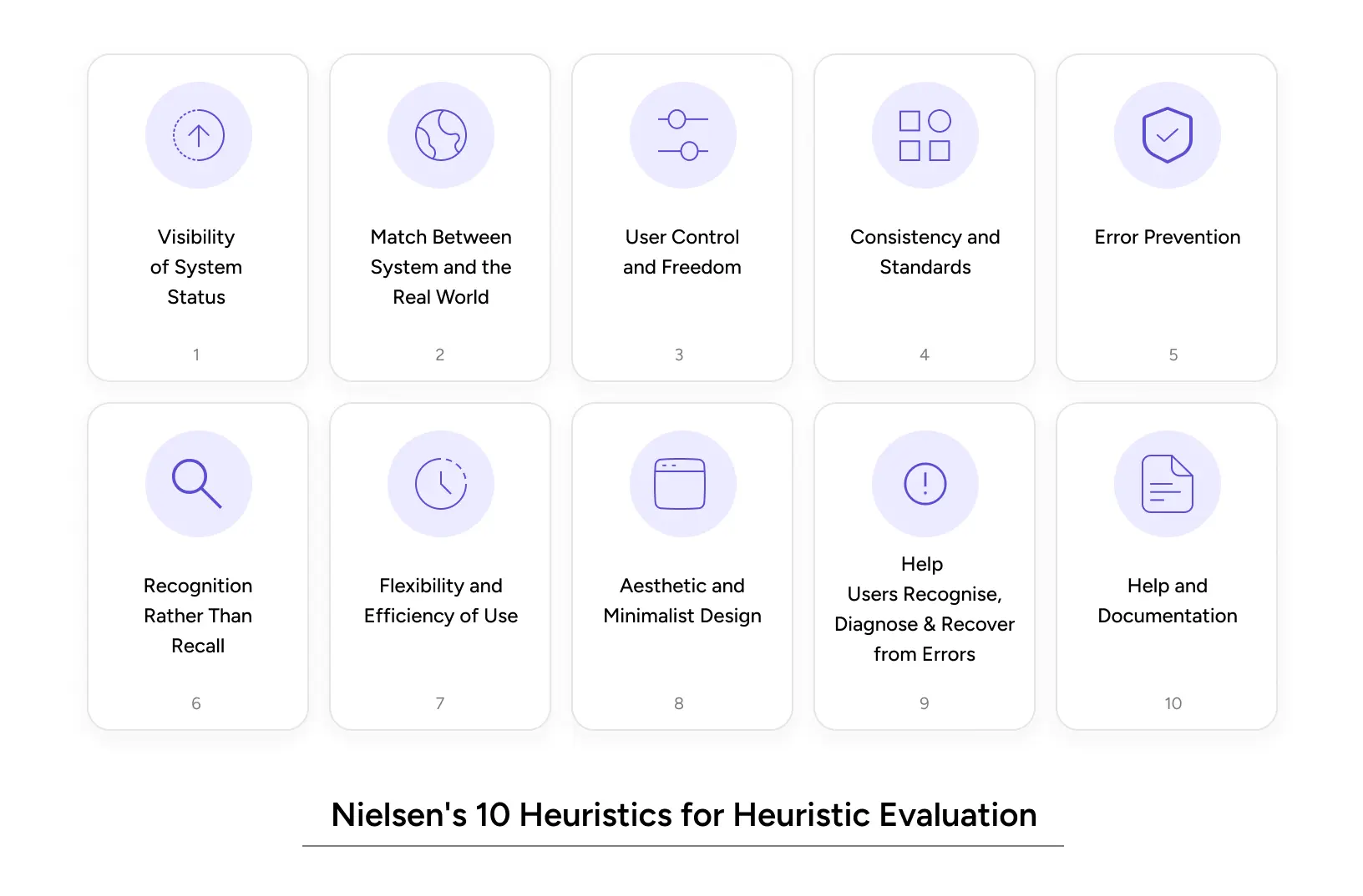
Nielsen’s 10 Usability Heuristics
These remain the foundation of any heuristic evaluation and are the baseline for every Expert Review at YUJ Designs. Each one maps to a known pattern of failure.
1. Visibility of System Status: Users should always know what’s happening. Loading indicators, progress bars, and confirmation messages matter.
2. Match Between System and the Real World: Use language users understand. Avoid internal jargon. Think “Your order is on the way” vs. “Order status: DISPATCHED_IN_TRANSIT.”
3. User Control and Freedom: Users make mistakes. Give them an easy undo. Clear exit paths reduce anxiety.
4. Consistency and Standards: Don’t reinvent the wheel. Follow platform conventions. Users build mental models from other apps.
5. Error Prevention: Better than good error messages: stop the error from happening. Confirmation dialogs for destructive actions are a basic example.
6. Recognition Rather Than Recall: Make options visible. Don’t ask users to remember what they saw on the last screen.
7. Flexibility and Efficiency of Use: Power users need shortcuts. New users need guidance. Great products serve both.
8. Aesthetic and Minimalist Design: Every unnecessary element competes for attention. If it doesn’t serve the user, remove it.
9. Help Users Recognise, Diagnose, and Recover from Errors: Error messages should be specific. “Something went wrong” is not a message, it’s a failure.
10. Help and Documentation: Sometimes users need help. When they do, make it findable and useful.
Shneiderman’s 8 Golden Rules
Ben Shneiderman’s framework adds precision to areas where Nielsen’s heuristics stay broad. It’s particularly useful for heuristic analysis of data-dense, task-heavy, or enterprise applications.
1. Strive for Consistency
Interfaces should maintain consistency in design patterns, terminology, layouts, and actions to help users interact with confidence and predictability.
2. Enable Frequent Users to Use Shortcuts
Experienced users should be able to complete tasks faster through shortcuts, accelerators, and streamlined workflows that improve efficiency.
3. Offer Informative Feedback
Every user action should generate clear and timely feedback so users always understand what the system is doing.
4. Design Dialogs to Yield Closure
Tasks and interactions should have a clear beginning, middle, and end, giving users a sense of completion after finishing an action.
5. Prevent and Handle Errors
Good interfaces should proactively reduce the chance of mistakes while also helping users recover smoothly when errors occur.
6. Permit Easy Reversal of Actions
Users should be able to undo or reverse actions easily, reducing anxiety and encouraging exploration.
7. Support Internal Locus of Control
Interfaces should make users feel in control of the system rather than feeling controlled by it.
8. Reduce Short-Term Memory Load
Designs should minimize the amount of information users must remember at once by keeping important details visible and accessible.
AI Design Heuristics
Traditional heuristics were designed for predictable interfaces, but AI products behave differently. They generate unexpected outputs, fail in less explainable ways, and introduce new trust challenges that standard frameworks were not built to address.
Frameworks like Google’s People + AI Research (PAIR) guidelines and Amershi et al. (2019) Guidelines for Human-AI Interaction help evaluate AI-specific UX issues. Key principles include clearly communicating what the AI can and cannot do, explaining decisions, supporting corrections, setting accurate expectations, and maintaining user control throughout the experience.
A product that fails in these areas often loses users not because the AI is inaccurate, but because its behaviour feels unclear and unpredictable.
Why Heuristic Usability Audits Impact UX and Revenue
Impact on User Experience
Heuristic usability audits directly address the three biggest experience killers:
Cognitive load: Too many choices, unclear labels, and inconsistent patterns all tax the user’s brain. Heuristic evaluation catches these before they drain users’ patience.
Error recovery: Research from Nielsen Norman Group shows that users abandon tasks 40% of the time after hitting a confusing error. A proper heuristic evaluation flags poor error handling before users see it.
Trust signals: Visual inconsistencies and broken conventions erode confidence especially in fintech and healthcare products. Heuristic analysis includes design consistency checks that surface these trust risks.
Impact on Business Metrics
The ROI case for heuristic evaluation in UX is straightforward.
A study by Forrester Research found that improving UX can cut development costs by 50% and increase conversion rates by up to 200%. Finding problems during an audit costs a fraction of what post-launch fixes cost.
For SaaS companies: a 10% improvement in trial-to-paid conversion often comes from fixing the onboarding flow. Heuristic evaluation ux design catches the onboarding violations that user tests might miss entirely because users often give up without saying why.
For e-commerce, the Baymard Institute reports that 70.19% of shopping carts are abandoned. Many of those abandonments trace directly to heuristic violations, unclear progress indicators, poor error messages, and too many steps.
Also Read: Gamifying AI with Octalysis: Designing Motivation in Intelligent Systems
Common Heuristic Evaluation Mistakes to Avoid
Even experienced teams make these errors when running a heuristic analysis.
Using only one evaluator, a single reviewer catches roughly 35% of usability issues. Three to five evaluators catch 75%+. Don’t shortchange the process.
Conflating heuristics with personal preferences. A violation has to map to a specific heuristic. “I don’t like this colour” is not a heuristic evaluation finding. “This CTA button fails the contrast ratio required by heuristic #8 (Aesthetic and Minimalist Design)” is.
Skipping severity ratings. Every issue found needs a severity score (typically 0–4). Without this, development teams can’t prioritise. Everything feels equally urgent, which means nothing gets fixed first.
Reviewing only the happy path, most evaluators test the main flow. But error states, empty states, and edge cases are where heuristic usability problems hide. Evaluate the unhappy paths, too.
Treating the audit as a one-time event, a heuristic evaluation done once provides a snapshot. Products change. Run audits at each major release cycle to catch regressions.
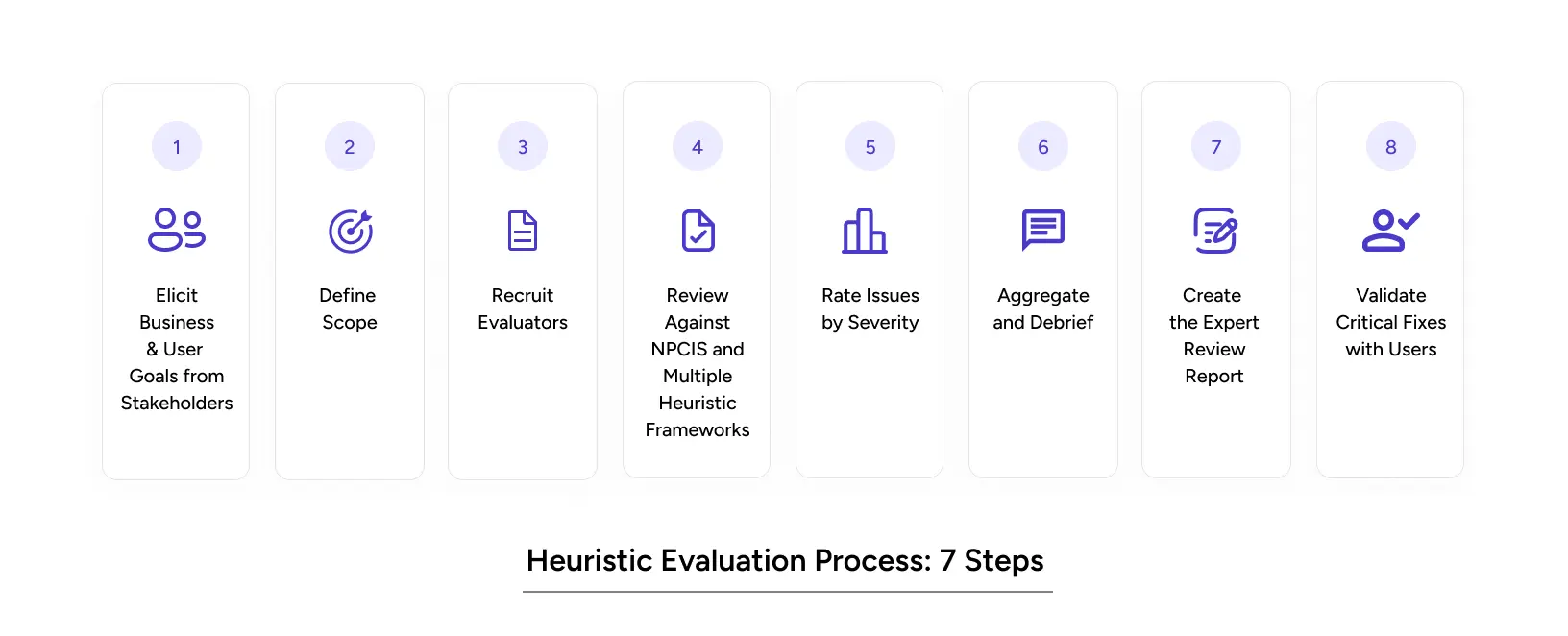
How YUJ Runs a Heuristic Evaluation: Step by Step
A standard heuristic evaluation starts at the screen. YUJ’s Expert Review starts earlier with the people who built the product and the goals it was built to serve.
Step 1: Elicit Business and User Goals from Stakeholders.
Before any screen is opened, YUJ conducts structured conversations with product owners and stakeholders to establish two things: what the business needs the product to achieve, and what users are actually trying to do.
This doesn’t involve research with users, it’s an internal goal-alignment session. Without it, every issue found in the review is an isolated observation. With it, every issue is weighted against a real goal.
Step 2: Define Scope.
Which flows are being reviewed: a single critical path or the full product? A clear scope keeps the review deep where it matters instead of shallow everywhere.
Step 3: Recruit Evaluators.
Three to five UX practitioners with relevant domain knowledge review the product. A B2B compliance tool needs evaluators who understand how investigators think, not just how interfaces work.
Step 4: Review Against NPCIS and Multiple Heuristic Frameworks.
Each evaluator independently reviews the product across YUJ’s five NPCIS dimensions: Navigation, Presentation, Content, Interaction, and Strategy, drawing from Nielsen’s 10 heuristics, Shneiderman’s 8 Golden Rules and (for AI products) the Amershi et al.
AI interaction guidelines. Independence is critical. Shared discussion before individual reviews biases findings.
Step 5: Rate Issues by Severity.
Every issue is scored 0 to 4. Without the goal context from Step 1, severity ratings are guesses. With it, they’re prioritizing decisions.
Step 6: Aggregate and Debrief.
Evaluators compare findings. Issues flagged by multiple reviewers are elevated immediately. The output is a ranked list of problems that trained practitioners agree are real.
Step 7: Create the Expert Review Report.
The deliverable is a severity-rated issue list with annotated screenshots, the heuristic or NPCIS dimension each issue maps to, and a recommended fix. Strategy-dimension findings connect design decisions back to the goals established in Step 1.
Step 8: Validate Critical Fixes with Users.
Run a focused usability test on severity-4 issues post-fix. Confirm each fix works for a real user before closing it out.
Real-World Heuristic Evaluation Examples
B2B Fintech Anti-Money Laundering Application
Heuristic analysis applies equally to complex B2B tools, and the stakes are often higher. YUJ Designs worked with a financial services client to design a machine-learning-assisted anti-money laundering platform.
Analysts were processing thousands of alerts daily. The existing interface buried the signal in noise, made comparing current and previous data difficult, and gave investigators no clear path from alert to resolution. These are textbook violations of heuristic #8 (Aesthetic and Minimalist Design), heuristic #6 (Recognition Rather Than Recall), and heuristic #7 (Flexibility and Efficiency of Use).
YUJ redesigned the platform to isolate relevant signals from data, enable quick filtering and comparison, and give investigators a library of past case conclusions to reference, cutting the resolution cycle at each stage.
The application now provides a single window for complex investigative workflows, is customisable across different banks and regional regulatory environments, and helps financial institutions build credibility with end customers by acting on suspicious activity quickly and accurately.
Read More: AML Case Study
Conclusion
Heuristic evaluation is not a luxury. It’s a quality gate.
Here’s what matters most:
- Heuristic evaluation finds up to 75% of usability problems when done with three to five evaluators at a fraction of the user testing cost.
- Define heuristic evaluation correctly: it’s an expert inspection against Nielsen’s 10 heuristics, not a preference exercise.
- Heuristic analysis is best run before major releases, after competitive redesigns, and when onboarding or conversion data looks wrong.
- Heuristic evaluation examples consistently show that the biggest wins come from fixing error states, onboarding flows, and information hierarchy, not surface-level aesthetics.
- Heuristic usability audits are fast (3–5 days for a focused flow), actionable, and directly tied to measurable business outcomes.
The products that earn user trust aren’t necessarily the most complex. They’re the most considered. Every heuristic violation is a moment where a user was confused, frustrated, or lost. Your product can’t afford many of those.
If your product has a UX problem you can feel but can’t locate, heuristic evaluation ux design will find it.
FAQs