
Fintech UX design is the practice of creating intuitive, secure, and trustworthy digital experiences for financial products. It combines user research, security design, and behavioral psychology to reduce friction in money management. Trust is the currency of fintech. When users can’t predict what will happen next or worry their money isn’t safe, they leave. Good fintech UX design bridges this gap.
Introduction
Here’s what happens in most fintech apps: A user opens the screen. They see numbers. They hesitate.
Not because they don’t understand math. Because they don’t understand what the app is about to do with their money.
This is the core problem that fintech UX design solves. And it’s not a cosmetic problem. It’s a revenue problem.
A fintech company that optimizes for speed but ignores clarity will watch 40-60% of users abandon during onboarding. A banking app UX that buries critical information under layers of navigation will see declining engagement. A UX design financial services platform that fails to make security visible will lose users to competitors who do.
Trust isn’t built with fancy animations or premium typography. Trust is built with:
- Clarity about what happens next
- Visibility of security measures
- Predictable behavior
- Honest, human language
- Design that respects the user’s anxiety
This blog explores exactly how fintech UI UX design accomplishes this. We’ll look at the principles, the practical steps, and the real outcomes. By the end, you’ll understand why a fintech UX agency focused on trust design isn’t a luxury. It’s the difference between a product users love and one they abandon.
What Is Fintech UX Design and Why Is It Different
Fintech UX design is the practice of designing digital experiences for financial products. It combines user research, interaction design, and behavioral psychology to create products people trust with their money.
Here’s what makes it different from other UX disciplines:
Speed vs. Clarity Trade-Off: In most apps, speed is king. Fintech reverses this. A user will tolerate a slower experience if it feels safer. A fast experience that leaves them uncertain will be abandoned immediately.
Risk Perception: Every interaction in a financial product carries perceived risk. Moving money, changing settings, and linking accounts each trigger anxiety. Good banking UX design acknowledges this anxiety and reduces it through design, not by ignoring it.
Regulation and Compliance: Unlike most software, fintech operates in regulatory sandboxes. Security disclosures, data handling, and transaction rules aren’t optional. A fintech UX agency must design compliant experiences that don’t feel like compliance.
Cognitive Load in High-Stakes Moments. A user checking their email can skim. A user transferring ?50,000 cannot. They need to read every word. UX design for financial services must account for this. Clarity isn’t nice-to-have. It’s essential.
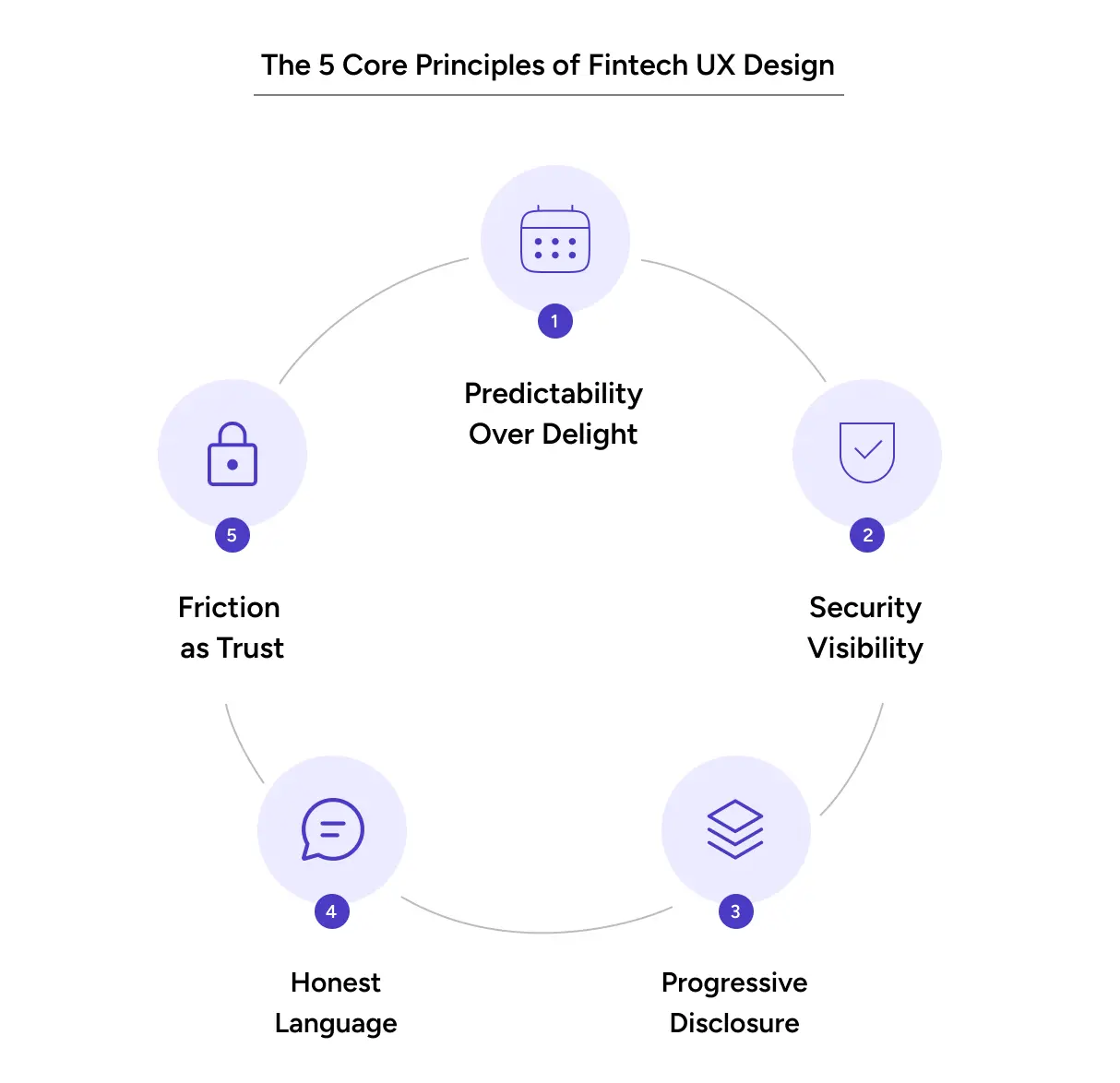
Core Principles of Fintech UX Design
Principle 1: Predictability Over Delight
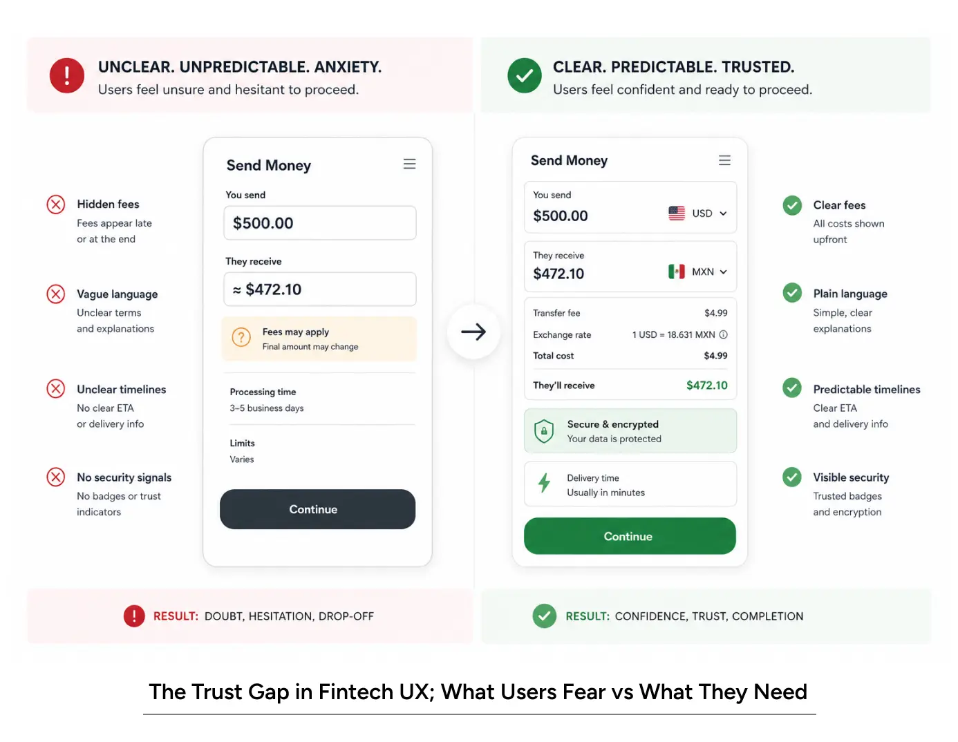
A user’s first instinct when using a financial product is not “Wow, I hope this surprises me.” It’s “I hope nothing goes wrong.” Design for predictability. Every action should lead where the user expects.
Principle 2: Security Visibility
Users need to see that their money is protected. This doesn’t mean cluttering screens with security jargon. It means designing safety into every interaction: confirmation screens, encryption indicators, transaction verification steps. A banking app UX that makes security invisible has failed half its job.
Principle 3: Progressive Disclosure
New users don’t need to see every feature. They need to accomplish one task. Advanced features, detailed settings, and secondary options come later. A B2B UX design approach works here: show the essential path first.
Principle 4: Honest Language
“Synergizing your payment gateway” is corporate nonsense. So is “leveraging blockchain technology for transaction optimization.” Users are managing money. They need human language. “Your money is moving to this account, and it will arrive in 2-3 hours.”
Principle 5: Friction Is Not Your Enemy
Most UX designers optimize for frictionless experiences. In fintech, some friction is trust. A confirmation screen isn’t bad UX. It’s good UX. It says, “This matters, so let’s double-check.”
Also Read: Navigating the Agentic Era: Redefining UX for Real-World Impact
How Fintech UX Design Impacts Users and Revenue
Impact on User Experience
Reduced Anxiety
A person moving money online is anxious. This is normal. A well-designed fintech UX design acknowledges this. Confirmation screens, progress indicators, and clear next steps turn anxiety into confidence.
Improved Clarity
Financial products are complex. Interest rates, fees, transaction types, and regulatory requirements are all inherently complicated. Good fintech UI UX design simplifies without lying. It shows complexity where it matters and hides it where it doesn’t.
Faster Onboarding
A user shouldn’t need a tutorial to open a savings account. They should be able to do it in 3-4 steps. Banking UX design that requires deep product knowledge before the first transaction has failed its first test.
Better Decision-Making
When users understand what will happen, they make better decisions. They see the fee before they pay it. They understand the terms before they agree. They see the impact before they commit. This is UX design for financial services at its core.
Impact on Business Metrics
Conversion and Activation
The difference between a well-designed onboarding flow and a poorly designed one is 20-35% in activation rates. When a banking app ux reduces friction from 7 steps to 4, conversion often doubles.
Retention and Engagement
Users stay with products that make them feel in control. A fintech UX agency that builds transparency into every interaction creates habit-forming products. Users return not because the app is flashy, but because it makes them feel competent.
Reduced Support Costs.
A clear design reduces confusion. Fewer confused users means fewer support tickets. A financial services company we worked with saw a 34% drop in support inquiries after a fintech ux design overhaul focused on clarity.
Brand Trust In fintech, brand trust is everything. A person chooses Bank A over Bank B because they trust Bank A more. Design that prioritizes transparency and predictability builds that trust faster than any marketing campaign.
Common Fintech UX Design Mistakes to Avoid
Mistake 1: Overloading the First Screen. New users see seventeen options. They panic and leave. A banking ux design should show one clear path forward.
Mistake 2: Hiding critical information behind interaction fees, terms, or security details shouldn’t require clicking through layers. Make them visible. A fintech UX design that obscures cost is a fintech ux design that loses users.
Mistake 3: Assuming users understand financial jargon. Not everyone knows what “APR” or “transaction settlement” means. A B2B UX design approach is relevant here: explain terms when they first appear.
Mistake 4: Neglecting Mobile Experience 80% of fintech usage happens on mobile. A banking app ux that works on desktop but falls apart on phones will hemorrhage users.
Mistake 5: Sacrificing Security Design for Speed “Let’s remove the confirmation step to make transfers faster.” This is how fintech companies lose user trust. A fintech UI UX design should make security feel fast, not slow.
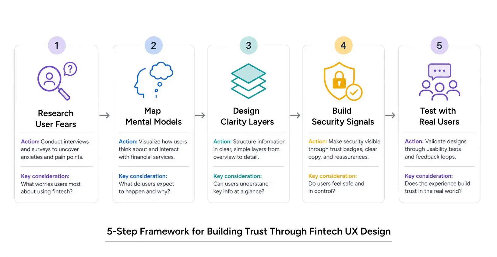
How to Build Trust Through UX
Step 1: Research What Actually Scares Users
Before designing a single screen, talk to users. Ask them:
- What makes them hesitant to use financial apps?
- What do they worry about?
- What reassures them?
A fintech UX agency that skips this step is designing blind. One fintech company we worked with assumed users were afraid of making mistakes. Research showed they were actually afraid their money would disappear into a digital void. The design needed to focus on visibility and tracking, not error prevention.
Step 2: Map the User’s Mental Model
A user’s mental model of how money moves is not always accurate. They might think their transfer is instant when it takes two days. They might assume all fees are transparent when some are hidden.
A fintech UX design should align with their mental model – or gently correct it with clear information. A banking ux design flow should show:
- What happens right now
- What happens next
- When the process completes
- Where their money is at each stage
Step 3: Design the Clarity Layers
Layer 1: Information Architecture. Organize features by user intent, not by backend systems. A user doesn’t think in terms of “Payment Systems” and “Account Management.” They think in terms of “Send Money,” “Check Balance,” and “View History.”
Layer 2: Interaction Design. Every interaction should confirm action and outcome. “You’re sending ?10,000 to Aisha” is clear. “Processing transaction” is vague. A fintech UI UX design removes ambiguity at every step.
Layer 3: Microcopy Fintech copy is where UX design for financial services either builds or breaks trust. “We’ll verify your identity” is reassuring. “Initiating authentication protocol” is threatening. The difference is just tone- but the outcome is different.
Step 4: Build in Security Signals
Security shouldn’t be hidden. It should be visible:
- Show when encryption is active (padlock icons where appropriate)
- Display verification steps prominently
- Explain what you’re doing with user data
- Make consent explicit and easy to understand
Banking apps shouldn’t hide their security. Users need to see proof that their money is safe.
Step 5: Test with Real Users Under Real Conditions
A designer reviewing fintech ux design on a desktop screen in a quiet office isn’t representative. Test with users on mobile. Test them during commutes, distractions, and time pressure. Test them when they’re transferring real money, not fake test amounts.
A fintech UX agency should conduct:
- Usability testing (can users complete core tasks?)
- Security perception testing (do users feel safe?)
- Stress testing (does the design hold up under pressure?)
Pro Tips from Fintech UX Designers
Tip 1: Use Defaults Wisely A default that’s safe and reversible builds trust. A default that’s unsafe or irreversible erodes it. A banking app UX should default toward caution.
Tip 2: Show Progress. Users want to know where they are in a process. A progress bar on account opening. A step indicator during fund transfers. A timeline showing when money will arrive. Fintech UI UX design is about reducing uncertainty in real-time.
Tip 3: Make Undo Possible. If a user can undo an action for 60 seconds, they feel more in control. This reduces anxiety and increases willingness to explore. A fintech UX design that allows reversals (or delayed execution) builds trust.
Tip 4: Reduce Cognitive Load in Moments of Risk. When a user is about to move money, don’t ask them to remember login credentials or security questions. They’re already anxious. Make authentication seamless. Make confirmation simple. A B2B UX design principle applies: context matters, and the context here is high-stakes.
Real-World Application: Case Study
Powering the Future of Instant Lending
Lentra is an AI-first, cloud-based SaaS platform designed to transform the digital lending ecosystem for banks and Non-Banking Financial Companies (NBFCs).
It partnered with a leading private bank to build a zero-risk digital lending ecosystem that accelerated the launch of new personal loan categories while ensuring reliability, scalability, and compliance. The challenge was to create a unified platform that seamlessly connected customers, agents, and backend teams while reducing turnaround time and operational friction.
Through extensive user research, Lentra identified key gaps around trust, transparency, eligibility awareness, and loan flexibility. To address these challenges, the team designed a self-serve onboarding journey across web and mobile, introduced “Coiny,” a virtual assistant simplifying complex lending steps, and enabled instant status visibility for agents and customers. Features like Video KYC, co-applicant enablement, and simplified five-step applications improved both speed and confidence throughout the lending journey.
The transformation delivered measurable business impact, including a 30–40% reduction in onboarding time, a 20–25% increase in application completion rates, and a 15–20% improvement in approval rates, helping banks scale modern lending experiences with greater efficiency and trust.
Read More: Lentra Case study
Conclusion
Here’s what most fintech companies miss: The person using a financial app is not optimizing for delight. They’re optimizing for safety and control.
A fintech ux design that succeeds understands this. It prioritizes clarity over cleverness. It makes security visible. It reduces cognitive load in moments of risk. It uses language that humans actually speak. It respects the user’s anxiety instead of ignoring it.
This is not soft design thinking. It’s hard-headed business sense. A fintech UX agency that applies these principles will see:
- Higher activation rates
- Better retention
- Lower support costs
- Stronger brand trust
If you’re building a financial product, don’t treat UX design for financial services as an afterthought. Don’t outsource it to someone who’s never designed for fintech. A banking ux design that builds trust is what separates products users love from products they merely tolerate.
FAQs