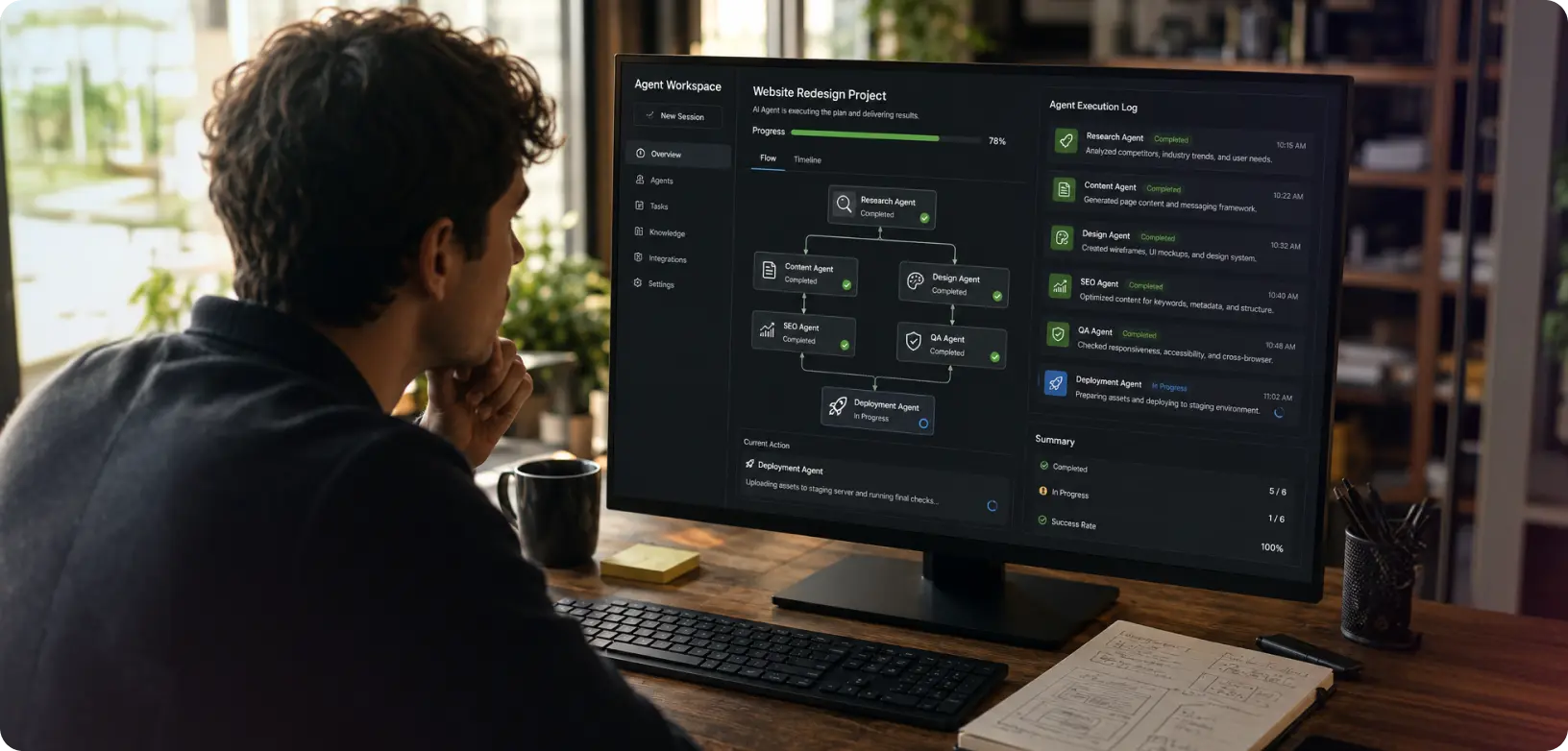
A data dashboard is an information management tool. Navigating through a dashboard to find the right information is like, navigating through a busy airport to look for your airline’s kiosk. However well-planned the airport is, the experience for the user is always going to be critical. User needs a dashboard that visually groups the information and efficiently leads the user through the maze to the desired point. The dashboards track, analyze and display key metrics.
The term dashboard being used in computer applications, is in fact inspired by the dashboards we see in vehicles, in a cockpit. In enterprise businesses, the dashboards represent all the important information on one screen. This is data represented visually.
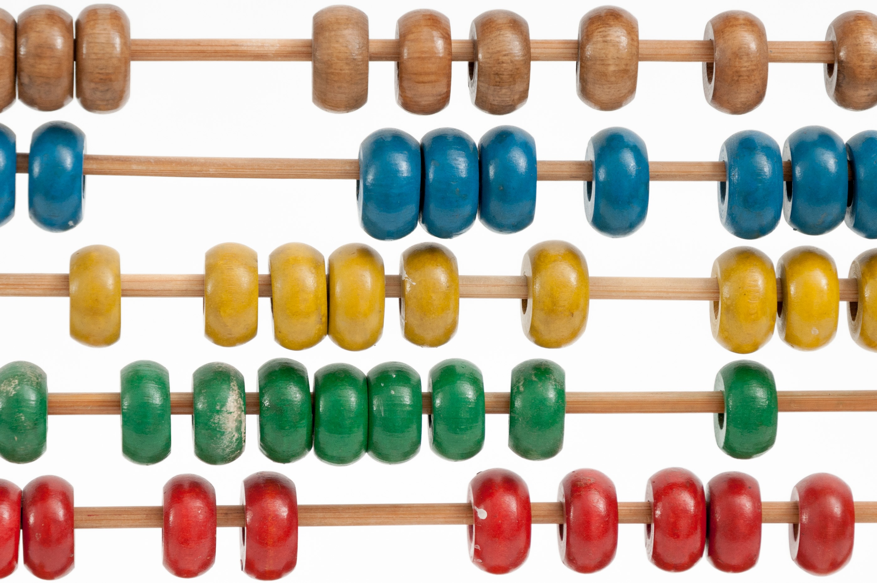
These are the times of big data. It is after all the currency. Companies go all out to gather and manage more data. In order to manage the data efficiently, it needs to be interpreted visually, so as to reduce the cognitive load of the people managing it. Dashboards seamlessly harbour all the information useful for the user to be viewed in one go. Bigger data induces fear and strain on the people managing it. Although, it is a UX designer’s skill not to overwhelm the user with the interface to help achieve completion of the desired task. No matter how great the data may be, if it can’t be understood, interacted with and most importantly acted upon, the purpose of the dashboard has not been achieved.
Efficiently designed dashboard
Let’s explore some of these characteristics of an efficiently designed dashboard –
1. Control
Data when presented well, should lend user the complete control of the dashboard. It should not overwhelm the user with a load of information with no hierarchy and sense of purpose. The dashboard should command attention. Dashboards are the entry points to all the actions user needs to take in the interface just like in a Hub and Spoke model.
2. Structure and Clarity
Dashboards are expected to be designed in a way that, they offer clarity on the preferences and the hierarchy of data presented. They should offer a structure to the overall confusing, haphazard data collections. These make the user’s work easier by helping prioritize actions in order to manage time. Information collected from time to time gets reflected in a visual and understandable way for the users.
3. Simplicity
When it comes to larger and more complex data, studies have shown that majority people find it difficult to handle the tasks. They struggle with the complexity of the data. This hampers their efficiency, time and quality of work. A good dashboard design cuts through all the complexity and allows the user to make timely, efficient decisions based on the valuable data.
Going forward, here are some of the guides to achieve efficiently designed dashboards:
1. Purpose
We can improve that which can be measured. A well-designed dashboard brings about the importance of a shared understanding of the business data. To start off, you need to know the purpose of the dashboard, and most importantly the audience. Users who will be using the dashboards. With the purpose in mind, you will have to dig deep to understand the users.
Once you start from here, always remember find the core, ask better questions and interpret the insights to inform the design. Choose the right parts of these ingredients.
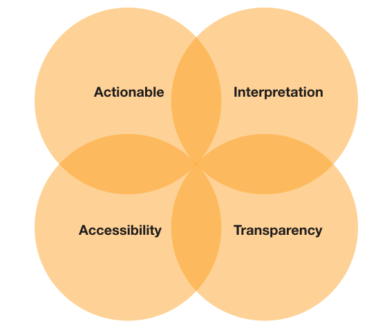
2. Apply the Design Principles
As you move closer to putting the pieces together, there are some thumb rules you should know. The fundamental objectives that will guide your design decisions –
- Compact Data to enhance productivity.
- Gradual Reveal as per the user’s interest.
- Guide Attention to the most critical matter.
- Customization to become relevant to different users.
- Explanation before Information to understand new and unfamiliar events.
- Lead to Action to complete the tasks.
3. Frame the Experience
Conceal the information and controls that are unnecessary in the moment and raise the alert only when needed. Anticipate when users need to see the next steps and operate the same way. Personalize the dashboard UI.
Amplify your brand presence with the best UX design studio that truly aligns your needs with those of your consumers! Get in touch with us at YUJ Designs, today!