Travel app design succeeds when it simplifies choices that travelers shouldn’t have to think about. Strong travel UX design shortens the distance between a search and a confirmed booking, using clear hierarchy, honest pricing, and contextual defaults, turning window-shoppers into paying guests.
Introduction
A traveler opens a flight app at 11 pm on a slow hotel Wi-Fi connection, three tabs deep into comparing fares, and abandons the booking before entering a single card digit. This happens on nearly every travel platform, every single day. The gap between “I want to go somewhere” and “I’ve booked it” is where most travel companies lose their most motivated users, not because the destination wasn’t right, but because the product got in the way.
Good travel app design isn’t about adding more filters or flashier destination photography. It’s about removing the friction that sits between intent and action. This is where mobile app UX design earns its keep: every screen either moves a traveler closer to booking or gives them a reason to close the tab. Get this wrong and even a competitively priced fare loses to a competitor with a calmer, clearer flow. Strong travel UX design is what separates the products travelers return to from the ones they abandon mid-search. At Yuj Designs, this is the exact problem we help travel and enterprise clients solve. This guide breaks down what actually reduces friction in the search-to-booking journey, why it matters for both the traveler and the business, and how to apply it, with a real example from a US airline project.
Understanding Travel App UX
A traveler opens a flight app at 11 pm on a slow hotel Wi-Fi connection, three tabs deep into comparing fares, and abandons the booking before entering a single card digit. This happens on nearly every travel platform, every single day, and it happens especially often in the US, where a traveler booking a domestic flight will typically check the airline’s own app alongside two or three OTAs before committing. The gap between “I want to go somewhere” and “I’ve booked it” is where most travel companies lose their most motivated users, not because the destination wasn’t right, but because the product got in the way.
Good travel app design isn’t about adding more filters or flashier destination photography. It’s about removing the friction that sits between intent and action. This is where mobile app UX design earns its keep: every screen either moves a traveler closer to booking or gives them a reason to close the tab. Get this wrong and even a competitively priced fare loses to a competitor with a calmer, clearer flow. Strong travel UX design is what separates the products travelers return to from the ones they abandon mid-search. In the US market specifically, where switching cost between booking apps is close to zero, and comparison shopping is the norm, this margin matters more than almost anywhere else.
At Yuj Designs, this is the exact problem we help travel and enterprise clients solve, and it’s a growing part of our work as we expand our practice with US travel and hospitality brands. This guide breaks down what actually reduces friction in the search-to-booking journey, why it matters for both the traveler and the business, and how to apply it, with a real example from a US airline project.
Types of Friction in Travel Products
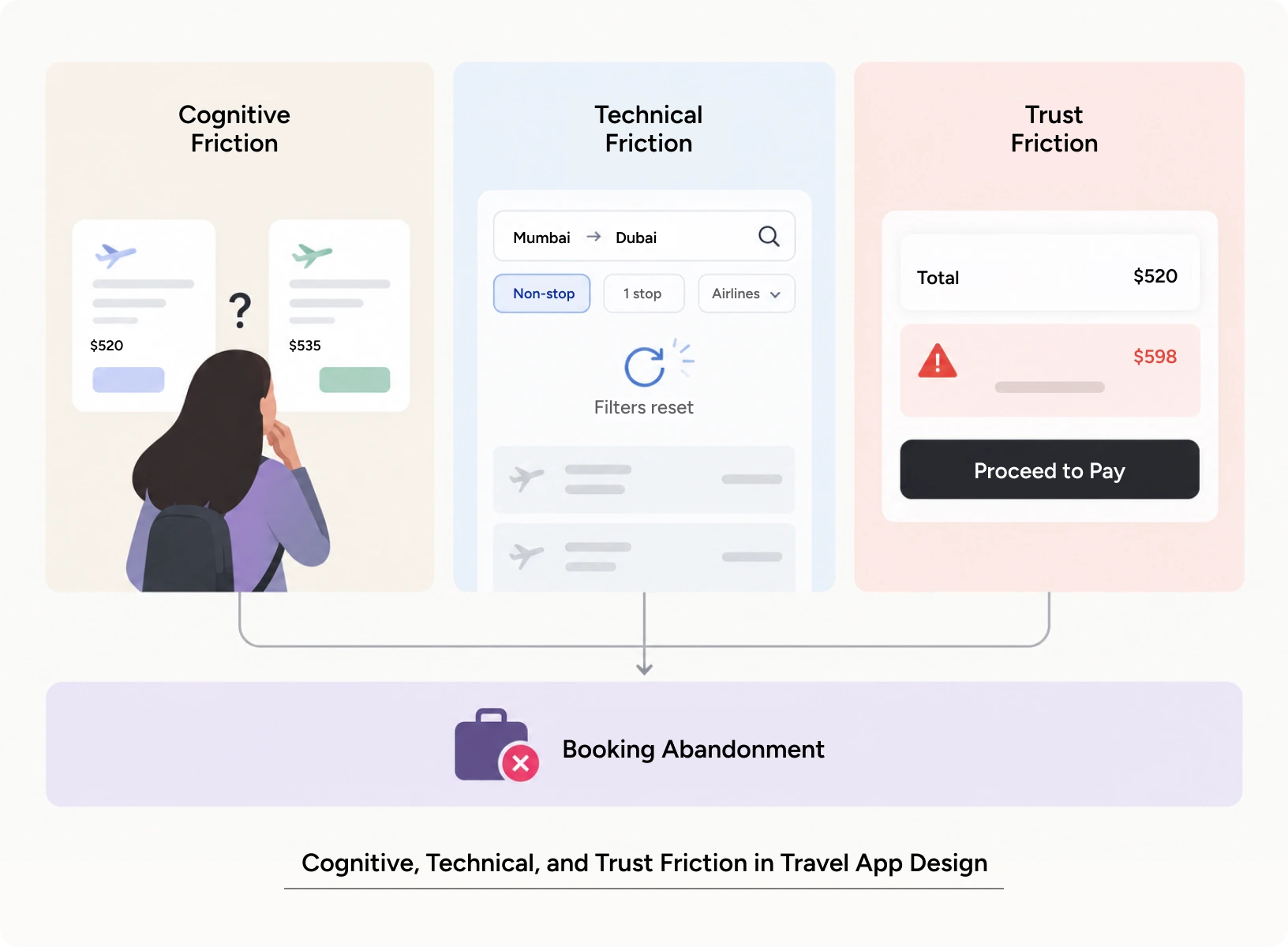
Friction in travel app design tends to show up in three recognisable forms. Cognitive friction happens when a traveler has to think too hard to compare two similar-looking fares or rooms. Technical friction happens when a form resets, a filter doesn’t persist, or a page reloads mid-search. Trust friction happens when pricing changes unexpectedly at checkout, or when a traveler can’t tell what’s included in a quoted rate. Every one of these is solvable through mobile app UI UX decisions made early in the design process, not patched in after launch. Recognising which type of friction is at play is the first job of good travel UX design.
Core Principles of Reducing Friction
Three principles hold up across most travel products we’ve worked on. First, defaults should reflect the most common traveler, not the edge case. Pre-filling dates, nearby airports, or likely traveler counts saves real time. Second, information should appear exactly when it’s needed, not all at once; a strong mobile user interface design reveals detail progressively rather than front-loading every option. Third, price transparency has to hold from the first search result to the final confirmation screen. Any gap between quoted and charged price is where trust, and bookings collapse.
A fourth principle, easy to overlook, is consistency of pattern across the entire product. If filters behave one way on the search screen and a different way on the results screen, travelers relearn the interface mid-task, which quietly adds to drop-off even when each screen looks fine in isolation. Sound mobile app ui UX treats the whole funnel as one continuous conversation, not a series of disconnected screens. Consistency like this is what separates disciplined travel UX design from a set of screens designed in isolation.
Why Travel UX Design Matters
Friction is never just a design detail. It shows up in how travelers feel, how often they return, and how much a travel business spends fixing problems that better travel app design would have prevented.
Impact on User Experience
A traveler booking a flight or hotel is usually managing more than the transaction itself: work deadlines, family logistics, budget limits. Mobile app UX design that respects this context, through fewer required fields and clearer error recovery, reduces the cognitive load a stressed traveler is already carrying. Accessibility matters here too: a booking flow that only works with perfect eyesight, a fast connection, and a large screen quietly excludes a meaningful share of travelers. Thoughtful travel UX design accounts for all of this before a single screen gets built.
Impact on Business Metrics
Friction has a price tag. Every extra screen, every ambiguous label, and every slow load between search and checkout measurably lowers conversion. Well-executed travel app design shows up directly in the numbers that matter to a travel business: search-to-booking conversion rate, cart abandonment, and repeat booking rate. A traveler who completes a booking without confusion is also far more likely to return for the next trip, which makes retention a downstream effect of good dashboard UX and checkout design, not a separate initiative.
Customer support cost is another metric worth watching. A confusing checkout doesn’t just lose the sale in the moment. It generates calls and chat tickets from travelers trying to figure out what they were actually charged, or whether their booking went through. Reducing friction upstream, at the design level, tends to reduce support volume downstream, which is a cost saving that rarely gets attributed back to the product team even though it belongs there.
Common Mistakes to Avoid
The most common mistake is treating the booking flow as a form to be filled rather than a decision to be supported, stacking every filter and field on one screen instead of sequencing them. A second mistake is inconsistent mobile app UI UX across the funnel, where the search experience feels modern but the payment screen feels like it was built five years earlier. A third is skipping real user journey mapping before redesigning anything, which leads teams to fix screens that were never the actual problem. All three mistakes come from treating travel app design as a series of screens rather than one continuous decision.
User Journey Mapping: A Practical Guide
Reducing friction is a process, not a single redesign sprint. It starts with understanding where travelers currently drop off, and ends with a tested, measurable improvement. Applying good travel UX design means treating each stage below as connected, not as separate tasks to check off.
Step-by-Step Workflow
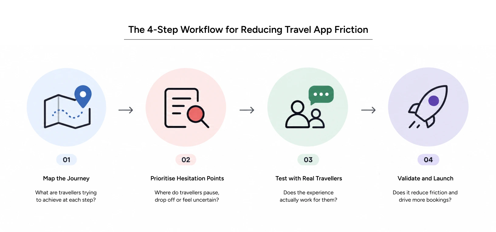
The first step is always user journey mapping: walking the entire path a traveler takes, from the first search to the confirmation email, and marking every point of hesitation, backtracking, or drop-off. From there, the team prioritises the two or three moments causing the most damage, rather than trying to fix everything at once. Wireframes are tested with real travelers, not just internal stakeholders, before any visual design begins. Only once the flow is validated does the team move into full mobile user interface design, followed by usability testing on the built product before launch. This sequence is the backbone of practical travel UX design work, not a one-time exercise.
Pro Tips Yuj Designs
Experienced teams treat the search results page as the most important screen in the product, not the homepage. It’s where comparison happens and where most abandonment starts. They also test booking flows on real, slow connections, not just office Wi-Fi, because that’s closer to how most travelers actually experience the product. And they build a single, consistent dashboard UX for managing bookings after checkout, since post-booking confusion (change fees, cancellation terms, itinerary changes) drives as much support cost as pre-booking friction. Small habits like these are what separate strong travel app design teams from ones that only look polished on the surface.
Tools & Resources
Most travel UX teams rely on a mix of tools throughout the process: Figma for design and prototyping, Maze or UserTesting for remote usability sessions, and analytics platforms like Google Analytics or Amplitude to track where mobile app UX design decisions actually move conversion. None of these tools replace user journey mapping done with real travelers. They support it. Prototyping tools are also where early mobile app ui UX decisions get pressure-tested, before a single line of production code is written.
Real-World Application
Yuj Designs worked with Alaska Airlines, a major US carrier, on a project that speaks directly to this kind of friction reduction, even though the users weren’t travelers booking flights, but airline staff resolving issues on the ground. The principles of good travel UX design apply just as much to internal operational tools as they do to a consumer booking flow. The airline needed a faster way for pilots, flight attendants, and customer service agents to get technical support during their shifts, without formal training or a long onboarding process.
Yuj Designs approached it the same way it approaches any travel app design problem: map the real journey first, then simplify. The result was SpotOn, a combined physical hub and companion app that let ground and flight crew find help quickly, book support appointments, and track requests without friction. The project spanned branding, mobile app ui UX, and signage design, and Alaska Airlines’ Employee Experience Manager described the Yuj team as fast-paced, organized, and invested in outcomes rather than just deliverables. It’s a clear example of what disciplined mobile user interface design looks like when applied to a real operational bottleneck.
Read More: Alaska Airlines Case Study
Conclusion
Every extra tap, every unclear price, and every screen that makes a traveler think twice is a small tax on your booking rate. Good travel app design isn’t a visual layer added at the end. It’s the discipline of removing everything that stands between a traveler’s intent and their confirmation screen. Strong travel UX design treats user journey mapping, honest pricing, and thoughtful dashboard UX as one connected system, not separate checkboxes.
Yuj Designs has spent 25+ years doing exactly this kind of work for enterprise and travel-adjacent clients in the USA & in India: mapping real journeys, finding the actual point of friction, and designing the fix. Whether the project calls for a full rebuild or a focused pass on mobile user interface design, the process starts the same way: understand the traveler, then simplify. Every engagement, regardless of scope, is built on the same discipline of travel app design described throughout this guide. If your booking flow is losing travelers somewhere between search and confirmation, that gap is fixable.

FAQs