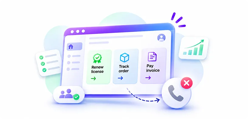
Good customer portal design starts with the tasks people log in to finish, not the features a vendor wants to show. When a B2B portal makes those tasks quick to find and easy to complete, customers stop calling support, adoption climbs, and the portal becomes a reason accounts renew.
Introduction
Most enterprises have a customer portal. Far fewer have one their customers actually like using.
You can usually spot the difference in the support queue. A distributor logs in to download an invoice. They can’t find it under three similar menus, so they email their account manager instead. An IT admin tries to renew a license and hits a page asking for a contract number they’ve never seen. They open a ticket.
The portal technically works. People just don’t trust it to get them to the finish line.
Gartner’s research shows how common this is. In a survey of 5,728 customers, only 14% of service issues were fully resolved through self-service. Even for issues customers called “very simple,” the figure was just 36%.
This guide looks at why that gap exists and how to close it. It draws on what YUJ Designs has learned over 17 years while working on more than 3,000 projects, including large-scale enterprise platforms with complex user needs. We’ll cover the principles behind effective enterprise portal design, the mistakes that keep adoption low, and what to look for in a design partner.
What Is an Enterprise Self-Service Portal?
An enterprise self-service portal is a secure, logged-in space where customers, partners, or employees handle tasks on their own. Typical jobs include placing and tracking orders, paying invoices, managing licenses, raising support tickets, and pulling reports.
B2B portals differ from consumer apps in a few important ways. One account may hold dozens of users with different permissions. Pricing is often negotiated per customer. A single purchase might need two approvals before it goes through. And the people logging in are usually doing their job, not browsing for fun.
That is why B2B UX needs its own playbook. Consumer patterns help, but they rarely account for roles, approval chains, and account hierarchies. Self service portal design works when it reflects how a customer’s organization actually operates, not how a single shopper behaves.
Why So Many B2B Portals and Customer Self Service Portals Go Unused
People want to use self-service. Gartner’s 2025 survey of 646 B2B buyers found that 67% prefer to buy without talking to a sales rep. The problem is that many portals make it hard for customers to get things done on their own.
When we review portals, we keep seeing the same three issues.
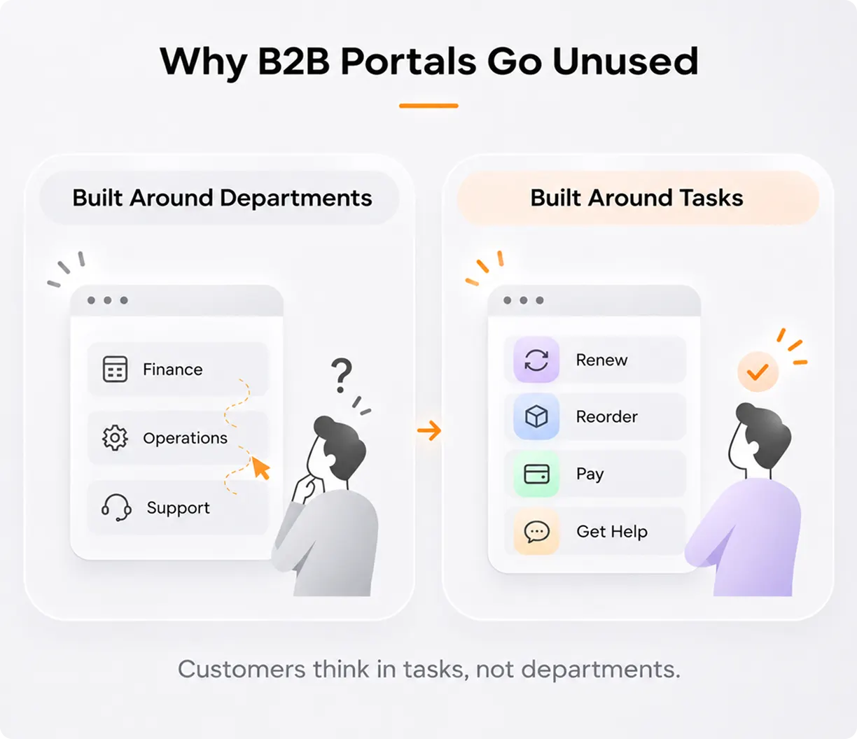
The menus follow the company’s departments. Billing sits under Finance, licenses under Operations, and tickets under Support. But customers don’t think in departments. They think about what they need to get done, like “renew this,” “fix that,” or “show me what I owe.”
Each part runs on a different system. Billing might come from one tool, support tickets from another, and orders from a third. Each tool uses its own words and steps, so users have to work out how they connect.
Answers are hard to find. Customers search for help but get results that don’t match their problem. Gartner found this happens in 43% of self-service cases. It gets even worse when search only works with exact product codes.
Good UX for enterprise applications starts by listing the tasks customers actually need to do. Then it builds one simple path for each of them.
How B2B Portal UX and Customer Portal Design Drive Results
We find it more useful to see a portal as a service channel with its own success rate than as a website with a login. When the experience is clear, that success rate climbs. The effect then shows up well beyond the UX team.
Impact on User Experience
The first change is orientation. A dashboard built around each role’s top tasks tells people where to start within seconds. An admin sees renewals due. A buyer sees open orders. A finance lead sees outstanding invoices.
Confidence follows. When status is visible at every step, people stop guessing. They can see that an order shipped, a ticket is with an engineer, or a license expires in 30 days.
Effort drops too. Saved preferences, bulk actions, and reorder-from-history options remove the repetitive work that makes B2B users dread logging in. Thoughtful portal UX design treats every extra click as a small cost the customer pays.
Impact on Business Metrics
These improvements show up in numbers leadership already tracks.
Support costs fall first. Every task completed in the portal is a call or email your team doesn’t handle. Moving even a handful of common requests, like invoice copies or order status, into self-service frees agents for complex issues.
Onboarding gets cheaper. When screens guide people through a task, new users need less training. That matters as customer accounts continue adding users year after year.
Renewals and expansion get easier. A portal that makes renewing a license or adding seats painless removes friction from revenue you’ve already earned. In B2B UX, the post-sale experience often shapes retention as much as the product itself.
Data quality improves as well. Customers who update their own contacts, addresses, and preferences keep records cleaner than any manual process.
Done well, customer portal design turns a cost center into a retention tool.
Core Principles of Customer Portal Design
These are the principles we come back to on almost every portal engagement.
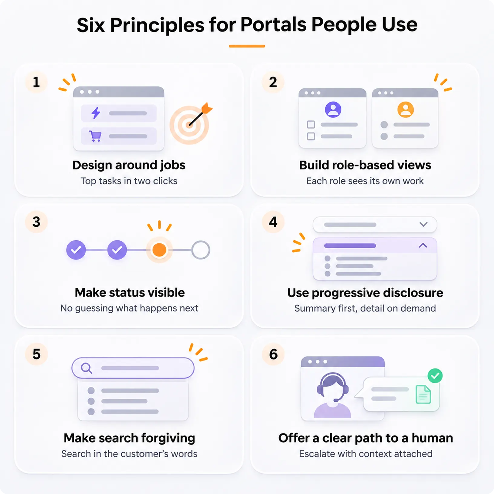
Design Around Jobs, Not Departments
Start with research. Interview customers across roles and list the ten tasks they log in to complete. Those tasks should shape your navigation, homepage, and search. Strong customer portal design makes the most common jobs reachable in one or two clicks.
Build Role-Based Views
A procurement manager and a field technician from the same account need different things. Role-based dashboards and permissions keep each person’s screen focused. This is one area where UX for enterprise applications differs sharply from consumer design.
Make Status Visible Everywhere
Uncertainty drives support calls. Show order, ticket, and approval status in plain language, with dates. If something is stuck, say why and what happens next. In B2B UX, visible status is often the single biggest driver of trust.
Use Progressive Disclosure
Enterprise data is dense. Show the summary first and let people expand into detail when they need it. It keeps screens readable without hiding anything, which makes it one of the most reliable tools in portal UX design.
Make Search Forgiving
People search using their own words, not your SKU format. Search should handle partial part numbers, common synonyms, and typos. Good self-service portal design treats search as a primary navigation tool, not an afterthought.
Offer a Clear Path to a Human
Self-service should never feel like a locked door. When users get stuck, give them a visible way to reach support, with their context already attached. Thoughtful customer portal design makes escalation feel like part of the service, not a failure.
Also Read – Enterprise AI Adoption: UX Patterns That Work
Must-Have Features for B2B Self-Service
Features alone won’t make a portal useful, but missing ones will make it useless. These are the capabilities most B2B customers now expect from modern customer portal design.
Account and user management lets admins add colleagues, assign roles, and remove access without calling you.
Order and quote management covers placing, tracking, and reordering, with negotiated pricing shown correctly for each account.
Invoices and payments give finance teams statements, downloadable invoices, and online payment in one place.
License and subscription management shows what each account owns, what’s expiring, and how to renew or upgrade.
A knowledge base linked to ticketing lets users solve problems or escalate without starting over.
Reports and exports let customers pull usage and spend data into their own tools.
The order in which you build these matters. Start with the tasks that generate the most support volume today. That’s where enterprise portal design can make the biggest difference from the outset.
Common B2B Portal and Customer Portal Design Mistakes to Avoid
Even well-funded portal projects fall into the same traps.
Copying Consumer Patterns Without Adapting Them
A slick consumer checkout assumes one buyer, one card, and an instant purchase. B2B buying often involves purchase orders, approvals, and credit terms. Good B2B UX keeps things simple without overlooking how businesses actually buy.
Launching Everything at Once
Moving every service online at once can delay the launch and affect the overall quality. A phased self-service portal design approach lets you start with the most-used tasks, learn from real user behaviour, and expand over time.
Letting Internal Language Leak Into the Interface
Labels like “Entitlements” or “SO Status” make sense to your team, not your customers. Test labels with users before you lock the navigation. Clear wording is a quiet but powerful part of portal UX design.
Ignoring Admins and Power Users
Every account has someone who manages users, approvals, and billing. If their tools are clumsy, the whole account suffers. UX for enterprise applications has to serve the person running the account, not just the occasional visitor.
Treating Launch as the Finish Line
Portals drift. New features get bolted on, and navigation grows crowded. Ongoing portal UX design work keeps it in check. Review search logs, ticket themes, and drop-off points each quarter, then fix what customers are telling you.
Forgetting Mobile and Accessibility
Field teams check order status on their phones. Some users rely on screen readers or keyboard navigation. Designing for these conditions from day one costs far less than retrofitting later. Accessible, responsive enterprise portal design widens who can actually get their work done.
Real-World Applications: How Yuj Simplified a Multi-Tenant Security Portal
A network security company serving US and global enterprises needed one place for customers to register security appliances and manage services, as its registration, licensing, and renewal processes were inconsistent across products.
Yuj Designs co-created the solution with the client’s teams and worked closely with users. We unified the security offerings into one integrated, single-pane-of-glass platform. Goal-driven screens guided users through each task, with visual cues for critical information. A customizable workspace let users choose what they see. We also simplified filtering, made software trials more contextual, and streamlined product lifecycle and customer creation workflows.
The redesign increased product efficacy by 60%.
How to Choose the Right Portal Design Partner
Websites and portals are different problems, and not every agency handles enterprise portal design well. A few checks help you tell them apart.
Ask How They Discover Problems
A strong partner will want access to support tickets, analytics, and real users before proposing screens. If the first deliverable is a moodboard, be cautious.
Look for Experience With Complex Systems
Portal UX design for enterprises means working with role hierarchies, legacy data, and integrations. Ask to see work on platforms that serve several user types at once.
Check How They Hand Off to Engineering
A design system and detailed specs help developers build what was designed, not an approximation of it. Ask what a typical handoff package includes.
Ask for Measurable Outcomes
Case studies should show what changed, such as task completion, support volume, or efficacy, and how it was measured.
Ask About Their User Testing Process
Expert opinion is useful, but it doesn’t replace watching your customers try to renew a license or find an invoice. Partners who take customer portal design seriously build usability testing into the plan.
How Yuj Designs Approaches Portal Projects
Yuj Designs is a global UX research and design company with studios in Pune and Sunnyvale. Over 17 years, the team has delivered 3,000+ projects and built 200+ enterprise partnerships. Portal work usually begins with a UX audit and task research. From there, we shape UX for enterprise applications around the jobs each role needs to finish. Then we design, test, and refine until the portal earns daily use.
Conclusion
A B2B portal should do more than give customers another way to access services. It should make finding answers, completing tasks, and managing accounts easier than contacting support. If customers still need to pick up the phone for routine tasks, the portal isn’t doing its job.
Effective customer portal design starts with understanding what customers need to do, not how many features a portal can offer. Build around real workflows, make important actions easy to find, and keep improving based on how people use the platform. That’s what turns a portal from another digital touchpoint into a tool customers genuinely rely on.

FAQs