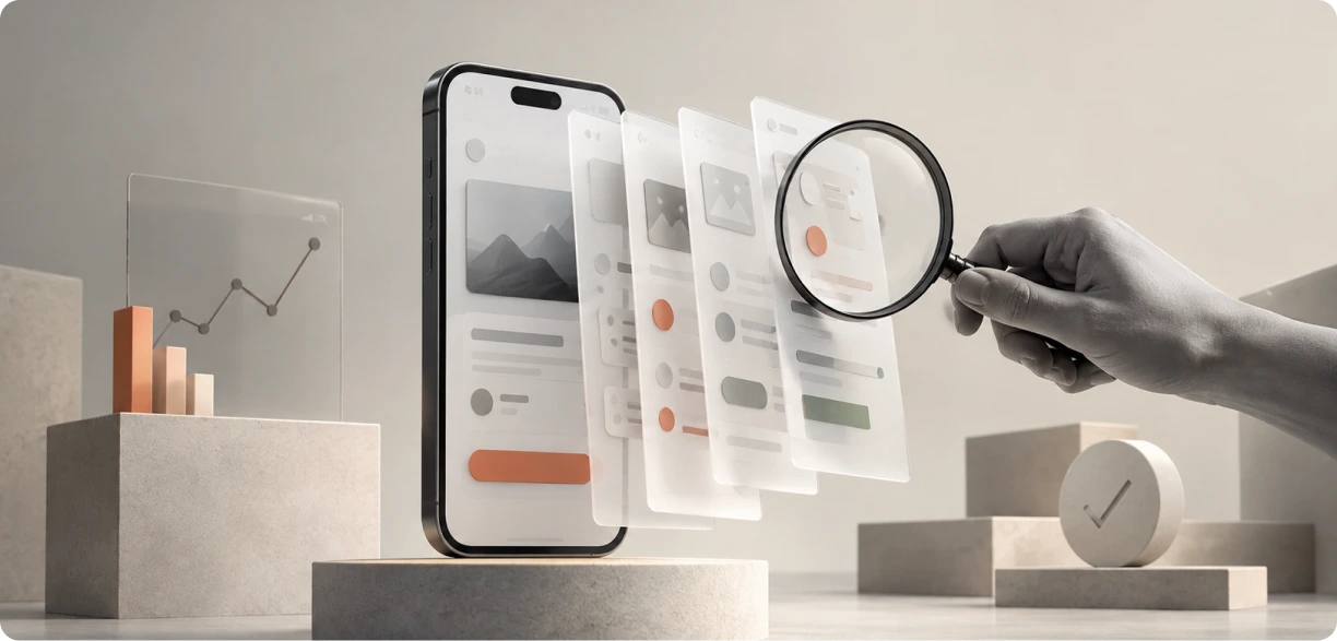
A mobile app UX audit is a structured review that finds where users get stuck, confused, or frustrated inside your app. It combines expert evaluation, usability testing on mobile, and real behavioural data to flag friction and rank fixes by impact. For any team serious about mobile app UI UX, an audit is the fastest way to find what is actually costing your users.
Introduction
Most people decide whether to keep or delete an app within the first few sessions. They rarely complain when something confuses them. They just leave, and they rarely come back.
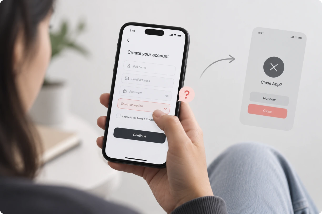
This is where a mobile app UI UX audit earns its place. It is a practitioner-led process that pinpoints exactly where users struggle, why they struggle, and what to fix first, instead of relying on guesswork or personal taste.
In this guide, we will cover what a mobile app UX audit actually involves, why it matters for retention and revenue, how to run one step by step, and a real YUJ Designs client story where an audit-led redesign changed the outcome for a US supply chain risk company.
If your app has stalling downloads, rising uninstalls, or a support inbox full of the same three complaints, this one is for you.
Understanding a Mobile App UX Audit
What Is a Mobile App UX Audit?
A mobile app UX audit is a systematic review of your app’s interface, flows, and interactions, built to uncover exactly where users hit friction. Unlike a general design critique, it blends heuristic evaluation, real user testing, and behavioural data to produce a fix list ranked by impact, not opinion.
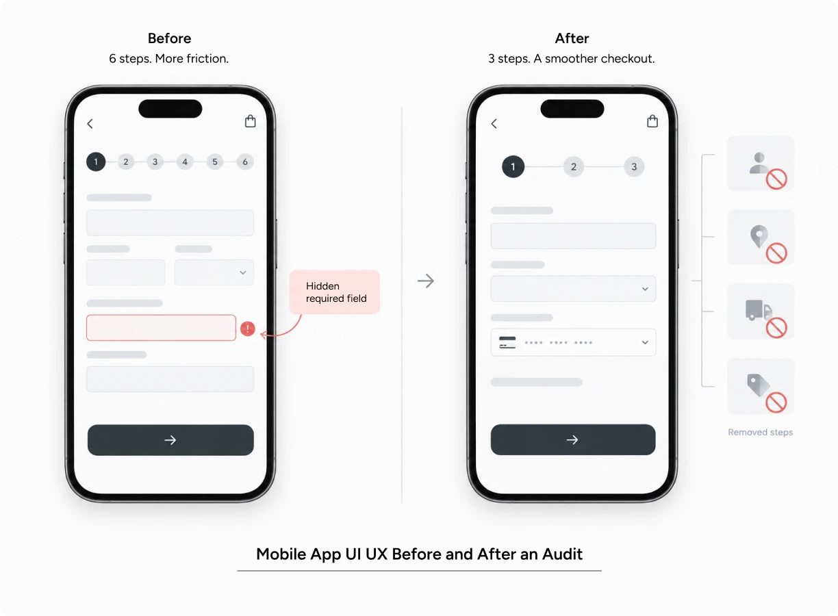
A simple example: an e-commerce app is losing 4 in 10 users at checkout. An audit does not guess why. It watches real users attempt checkout, checks the analytics for the exact drop-off screen, and finds that one hidden required field is the cause. This is the core value of usability testing for mobile applications: it replaces guesswork with what people actually do.
Types of Mobile App UX Audits
There are three common approaches, and most serious UX audit services combine at least two of them:
- Heuristic or expert review: a trained evaluator checks the app against established usability principles.
- Usability testing for mobile applications: real users complete real tasks while a researcher observes and records.
- Analytics-led audit: drop-off funnels, crash reports, and session data reveal where behaviour breaks down at scale.
Use a heuristic review for a quick first pass. Use mobile app usability testing when you need to see friction firsthand. Use an analytics-led audit when you are trying to explain a drop in a specific funnel.
Core Principles
Good mobile app UX design rests on a handful of principles: clarity, consistency, feedback, forgiveness, and performance. Screens should say what they mean. Similar actions should look and behave the same way everywhere in the app. Every tap should get a visible response. Mistakes should be easy to undo. And the app should feel fast, because speed itself is part of the experience.
Skip any one of these, and it usually shows up later as a support ticket or a quiet uninstall.
Why Ux Audit Matters in Mobile App
Impact on User Experience
A mobile app UI UX audit directly affects how usable, accessible, and comfortable an app feels. Usability improves when flows have fewer unnecessary steps. Accessibility improves when audits catch small tap targets, low-contrast text, and missing screen-reader labels. Cognitive load drops when each screen asks for one decision at a time instead of five. Emotionally, users feel in control of the app rather than fighting it.
Impact on Business Metrics
None of this stays confined to design. A mobile app UI UX fix rarely stops at the screen it touches; it ripples into how the business performs. Engagement rises when friction is removed, because people open an app more often when it does not frustrate them. Conversion improves once usability testing on mobile surfaces the exact screen where signups or purchases stall.
Retention climbs when onboarding friction is fixed early, since day-30 retention is often decided in the first session. And brand trust builds quietly, because an app that behaves predictably earns repeat use.
The scale of this shows up clearly in industry data. Nearly half of all installed apps are uninstalled within 30 days, and most of that drop-off happens on day one, according to AppsFlyer’s app uninstall benchmarks. Separate research from Localytics and Appcues found that close to 1 in 4 users abandon an app after a single use, usually because onboarding felt confusing or slow.
This is exactly why the outcome from YUJ Designs’ work with Resilinc’s EventWatch app, covered later in this guide, matters: the redesign led directly to higher user adoption, stronger perceived value among existing users, and lower support costs- the same three outcomes a friction-heavy app tends to lose.
Common Mistakes to Avoid
Three mistakes show up again and again. Teams audit only the “happy path” and skip edge cases like slow networks or interrupted sessions. Teams treat one round of usability testing for mobile applications as final, instead of an ongoing habit tied to every release. And teams fix symptoms, like a confusing button label, instead of root causes, like a flow that simply has too many steps. A rushed mobile app UI UX review tends to repeat all three.
How to Run a Mobile App UX Audit
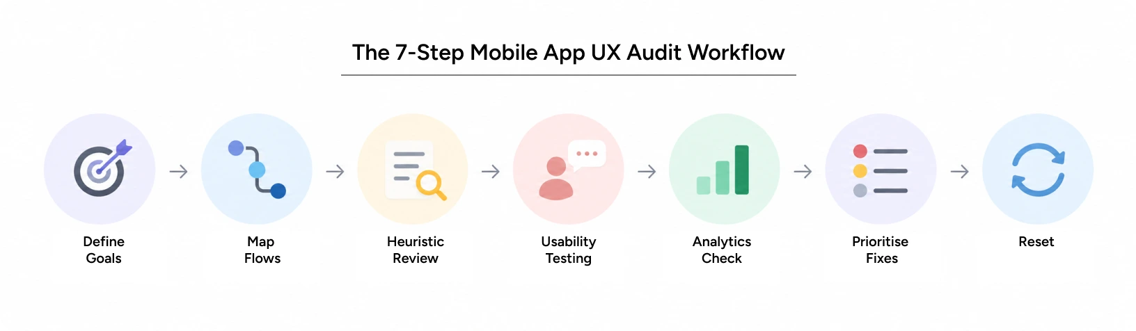
Running an audit does not need to be complicated. Most of the value comes from combining a structured review with real mobile app usability testing, then acting on what you find. Here is the workflow that keeps it useful and repeatable.
Step-by-Step Workflow
- Define goals and success metrics before touching a single screen: know what “better” means for this app.
- Map the core user flows: onboarding, search, checkout, account, and support.
- Run a heuristic review against established usability principles.
- Conduct mobile app usability testing with 5 to 8 real users per flow.
- Cross-check findings against analytics: drop-off points, rage taps, and crash logs.
- Prioritise fixes by effort and impact, not by who argues loudest in the review meeting.
- Retest after changing ship, since a mobile app UX design fix rarely works exactly as planned the first time.
Pro Tips from YUJ Designs
Record every usability testing on a mobile session. Patterns emerge across several users, not from a single strong opinion. Test on real devices, not only simulators, because network speed and touch precision genuinely change behaviour. Watch for hesitation, not just outright failure. A 4-second pause before someone taps a button is data too. And separate what people say from what they actually do. Users are generous in interviews and honest in their behaviour.
Tools & Resources
Figma and Maze work well for prototyping and remote usability testing for mobile applications. Hotjar or FullStory help with session recordings and detecting rage taps. Firebase or Google Analytics supply funnel and drop-off data. And a structured audit checklist, the kind most UX audit services provide as a starting deliverable, keeps a mobile app UI UX review consistent from one release to the next.
Real-World Applications
Frameworks only go so far. Here is how a mobile app UI UX audit plays out with an actual client.
Case Study: Resilinc’s EventWatch App
Resilinc, a US-based supply chain risk management company, came to YUJ Designs with EventWatch, a mobile app built to give event professionals visibility into multi-tier supply chain risk. The app worked, but usage was thin. Important event locations were missing, key information stayed buried behind multiple taps, and users needed up to 6 clicks just to see which partners were affected by a disruption.
YUJ Designs audited the existing app, mapped how people actually needed to act during a live event, and rebuilt it as a news-centric experience organised around urgency: War Room for events already disrupting a user’s supply chain, Relevant for forecasted risks, and News for general industry updates. The redesign increased user adoption, deepened engagement, and cut support costs, turning a B2B tool into one built to expand toward B2C use as well.
Read More: EventWatch case study
Conclusion
A mobile app UX audit is not a one-time checkbox. It is how a team keeps checking whether its product actually works for the people using it, rather than assuming it does. The fixes are rarely dramatic: a shorter form, a clearer label, one fewer screen. But they add up to real gains in engagement, conversion, and retention.
The teams that get the most out of this treat it as a habit. They build mobile app usability testing into every release, not just the ones with a launch deadline attached. They pair mobile app UX design decisions with real evidence instead of internal debate. And they revisit their UX audit services partner regularly, because user behaviour shifts as the app, the market, and the devices people carry all keep changing.
At YUJ Designs, every mobile app UI UX audit is run the way a practitioner would run it, grounded in real user behaviour, backed by 25-plus years of enterprise UX practice across India and the US, and focused on fixes that actually move the numbers.

FAQs