
Conversational UI design is about building software that people can talk to the way they’d talk to a person. Instead of forms and dropdowns, you get chat, voice and AI-driven exchanges. When it’s done right, products feel quicker to use and a lot less annoying to figure out.
What Is Conversational UI Design?
Nobody wants to fill out a seven-field form. They want to talk.
Picture it from the user’s side. They’ve just landed on your product. They’re already trying to keep up with terms they’ve never heard, half-remembering things they were supposed to bring, second-guessing whether they picked the right plan, and then a form appears. Of course, they bounce.
That’s the gap conversational UI design is trying to close.
Over the past 18 months, we’ve looked at a lot of AI product interfaces. Fintech, healthcare, SaaS. The pattern keeps showing up. Form-based flows lose 40 to 60% of users before they finish. Rebuild the same thing as a conversation and the drop-off lands somewhere between 15 and 22%.
That’s not a paint job. That’s the structure changing underneath.
Conversational UI examples are everywhere now. Your banking app asks one question at a time instead of throwing a wall of fields at you. SaaS onboarding feels more like someone walking you through setup. Support chatbots have gotten less FAQ-ish, more actually-helpful.
Most of them are still bad, though. Clunky. Tone-deaf. They try so hard to sound human, they swing all the way back around to sounding like a robot doing an impression of a human. The ones that work share something in common: somebody thought hard about the chatbot UX from the start instead of bolting it on later.
This guide is the version of that thinking I wish more teams started with.
Why Conversational UX Matters for Modern Products
Definition of conversational UI design?
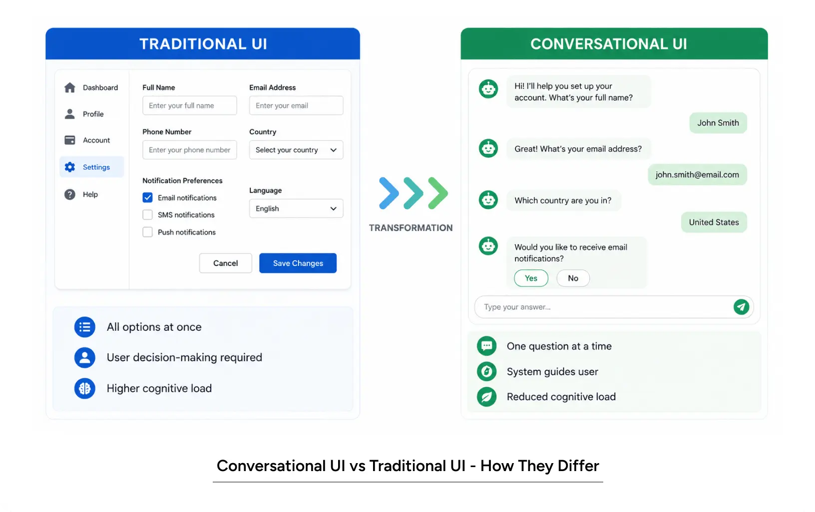
It’s an interaction model where users talk to software in natural language. The interface asks a question, listens to the answer and adapts. No forms, no menus, no submit button at the bottom of a wall of fields.
Here’s the contrast.
Old way: here’s a form. Fill in every field. Click submit.
New way: what are you trying to do? (User answers.) When do you need this by? (User answers.) Okay, here’s what I’d recommend.
The thing that makes this work is progressive disclosure. You’re not piling everything on the user at once. You’re letting the conversation unfold the way a real one would. One question, one bit of context, one step at a time.
Types of conversational interfaces
Rule-based chatbots. These follow a script. If the user says X, reply with Y. Predictable, easy to control, fine for things like password resets or simple FAQs. They fall apart the second someone says something the script didn’t plan for.
AI-powered conversational interfaces. These use language models to figure out what the user actually means. Flexible, good with weird phrasing, get better over time. They’re also harder to predict, so you have to think carefully about guardrails or they’ll wander off.
Hybrid conversational flows. Usually, the right answer for production. Let AI handle the messy job of understanding intent. Use predefined paths to keep the conversation moving toward a real outcome. You get the flexibility without the chaos.
Core principles of conversational UI design
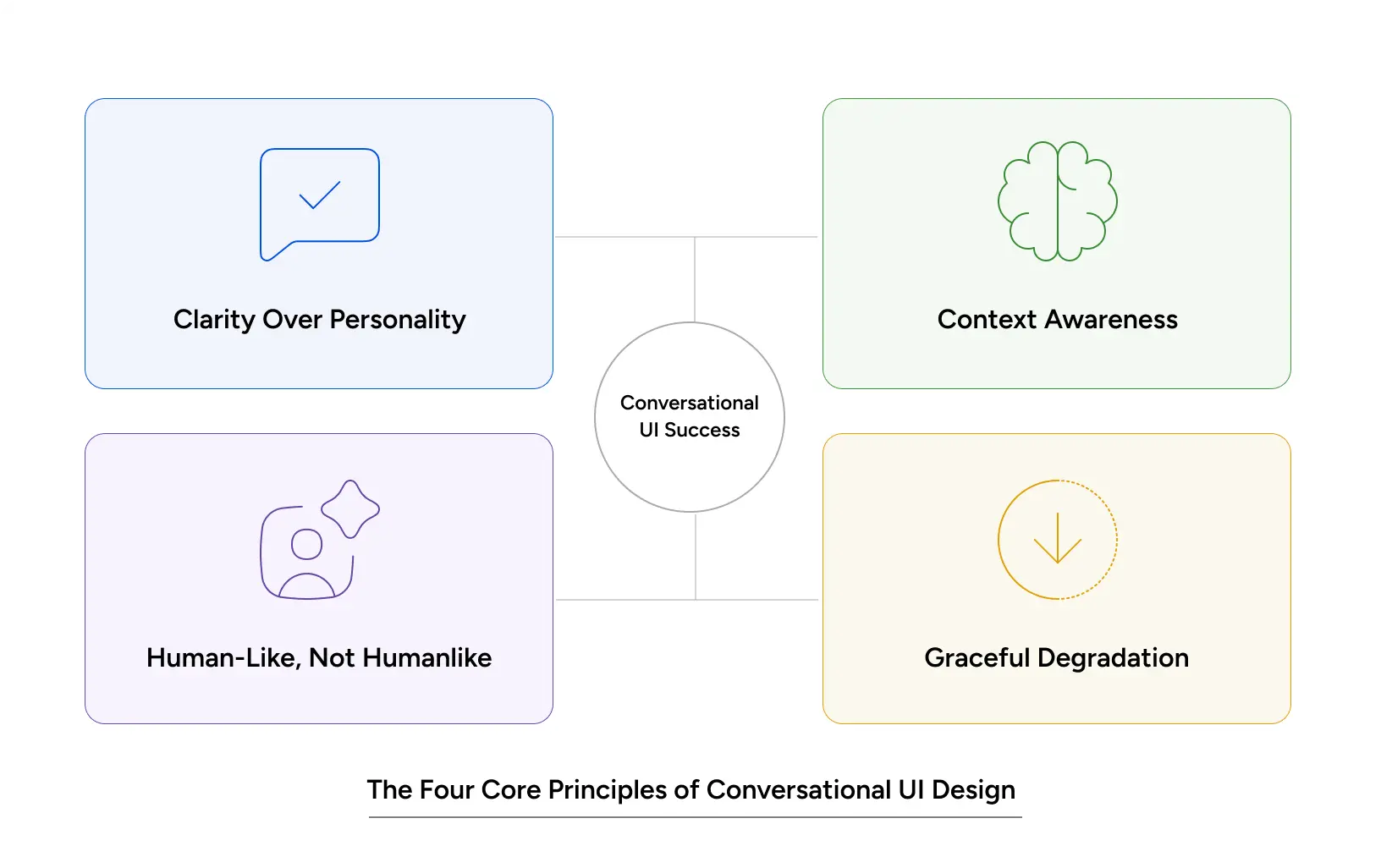
1. Clarity beats personality. Your bot doesn’t need a name. It doesn’t need a backstory. It definitely doesn’t need jokes. It needs to be understood. The best conversational UI examples I’ve seen are the ones that drop the act and just say what they mean. Any personality should come from being actually helpful.
2. Remember what the user said. A bot that asks the same thing twice is maddening. Reference what they already told you. Show that you were listening.
3. Be honest about being a bot. Don’t pretend to be a person. Users figure it out, and the second they do, the trust is gone. “I’m an AI assistant, here’s what I can help with” lands way better than “Hi! I’m Jenny from support!” because the second one feels like a lie waiting to be caught.
4. Fail gracefully. The conversation will break at some point. Plan for it. “Sorry, I didn’t catch that. Want to try rephrasing?” or “Let me hand this to a human.” Dead ends are the worst thing you can do to a user mid-conversation.
Also read: 2026: Agentic AI Moves from Experimentation to Enterprise
Why conversational UI design matters
What it does for users
Lower mental load. Forms are mentally expensive. You’re scanning the layout, reading labels, second-guessing the date format and wondering if your password has enough symbols. A conversation is closer to how your brain actually works. Answer. Next question. Answer. Done.
More accessible by default. If you’ve got dyslexia or a visual processing thing, a dense form is rough. The same flow as a conversation, especially one a screen reader can handle, is way easier to get through. Conversational UI tends to be more accessible almost by accident, because it cuts the visual noise.
Faster. When we tested chatbot UX against a form-based version of the same onboarding, the conversation cut completion time by 30 to 45%. No layout decoding. No scrolling. No validation errors are making people want to throw their laptops.
What it does for the business
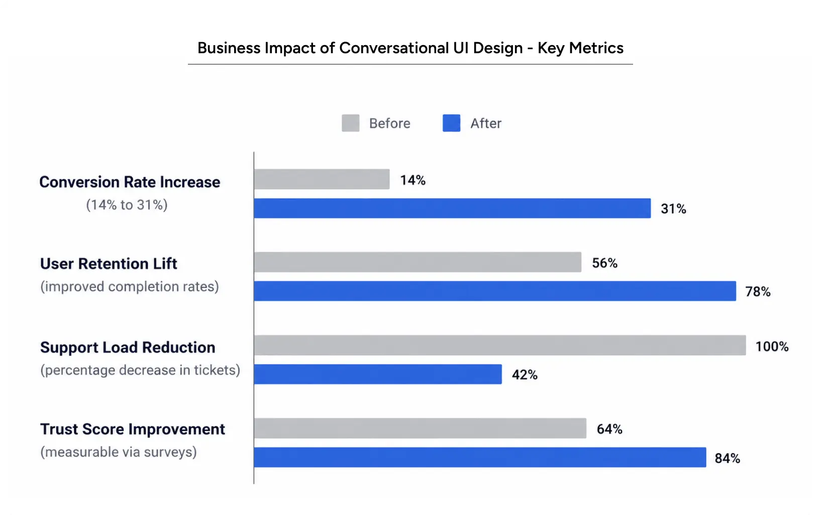
More conversions. A fintech we worked with rebuilt their AI transparency layer from a form into a conversation. Trial-to-paid went from 14% to 31% in 90 days. The product itself didn’t change. The interface did.
Better retention. People who finish onboarding through a conversation come back more often. They weren’t already exhausted by setup.
Less support load. When the AI UI UX is done well, fewer people need help. They actually understood what the product does because the conversation showed them. “How do I…” tickets drop a lot.
More trust and that one’s quieter, but it matters. When someone has a back-and-forth with a product, they feel like the product met them where they were. That feeling compounds. Trust, more than almost anything else, is what makes users stick around.
How to apply conversational UI design
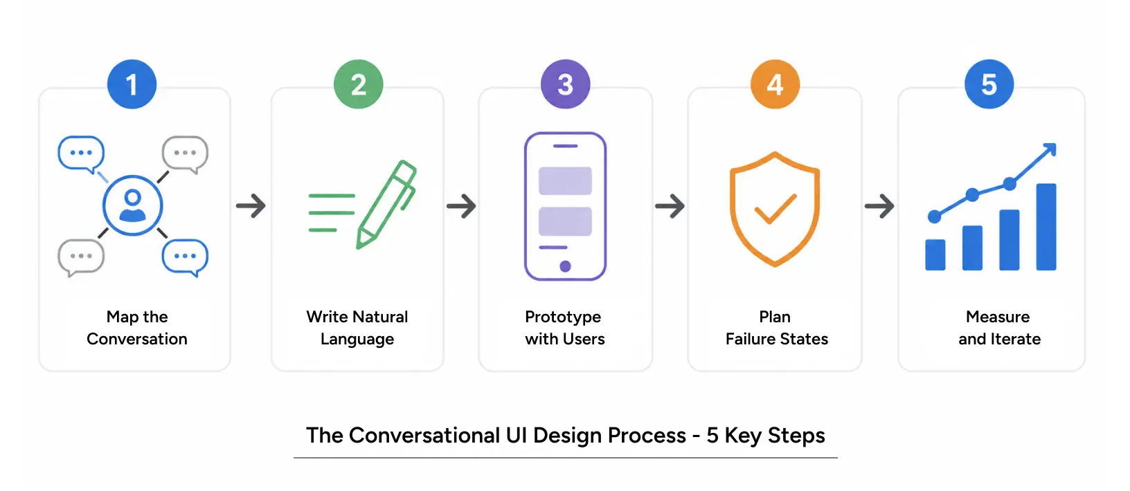
Step 1: Map the conversation, not the form
Stop asking “what information do we need?” Start asking “what would this sound like if two people were actually having this conversation?”
Selling insurance? It probably goes something like this.
“What are you looking to insure?” “Got it. How long do you need coverage?” “What’s your budget look like?” “Okay, here are three options that fit.”
Notice what didn’t happen. Nobody dumped a checklist on the user. The context built up as they went.
Use whatever flow tool you like for this. Figma, Miro, Lucidchart, whatever. But don’t draw the standard branching logic diagram. Draw it from the user’s side. What do they hear, think and type at each step?
Step 2: Write the way people actually talk
This is where most chatbot UX falls apart. Teams write copy like they’re labelling a form.
A real person says:
Short sentences. Contractions. Skip the jargon.
Easy test: read every line out loud. If you’d never say it to a friend, don’t put it in your interface.
Step 3: Prototype with real users
Build a fake version of the conversation. You don’t need the real product. Figma or Framer is enough to simulate it.
Then get five users in front of it and watch them. Where do they stall? Do they misread the question? Do they type things that the bot has no clue what to do with?
This is the step everyone wants to skip. Don’t. Chatbot UI UX always surprises you in testing. Real users word things you would never think of. They jump ahead. They ask clarifying questions you didn’t plan for.
Step 4: Plan for things to break
Either the conversation fails gracefully, or it fails embarrassingly. Pick one before it happens to you.
Think about what the bot does when:
- The input doesn’t match any expected pattern
- The AI genuinely can’t tell what they meant
- The conversation needs to get to a human
- An edge case shows up that nobody mapped
Every one of these needs a real next step. Not “Sorry, I didn’t get that. Try again.” Try something like “I didn’t catch that. Were you asking about pricing or features?”
Step 5: Measure, then iterate
Track these:
- Completion rate. What share of users actually finish?
- Misunderstanding rate. How often does the bot misread the user?
- Time to complete. Is the conversation faster than the form was?
- Escalation rate. How many users give up and contact support anyway?
Then read the transcripts. Real conversations with real users will tell you exactly where things break. Nothing else gives you that.
Also Read: Navigating the Agentic Era: Redefining UX for Real-World Impact
Conversational UI Example: KonaAI Case Study
A US-based fintech deployed KonaAI, an AI compliance platform and ran straight into a trust problem. The AI was flagging thousands of transactions a day. Users couldn’t tell why a given alert mattered, how risky it actually was, or what they were supposed to do about it.
Yuj rebuilt the experience around adaptive workflows that walk users through the risk story conversationally. Instead of raw alerts dropping into a dashboard, users now see structured investigations that explain the AI’s reasoning. Why did this trigger? How does it tie to previous activity? What’s the recommended next step?
The numbers: 30% faster investigations. 20% lift in trust in AI recommendations. 50% less developer time spent propping the tool up.
The AI engine itself didn’t change at all. The conversational layer turned a black box into something people were willing to follow.
Read More: Kona AI case study
Common Conversational Interface Mistakes to Avoid
Pitfall 1: Pretending to be a person when you’re not
The moment a user realizes they’ve been talking to a bot impersonating a human, trust falls off a cliff. Just be upfront. “I’m an AI assistant” is fine. Spend that credibility on being useful, not on the disguise.
Pitfall 2: No plan for failure
A bot that doesn’t know what to do crashes the experience. “I didn’t understand that.” ? user closes the tab. Give them a path forward.
- “I’m not sure what you mean. Here are some things I can help with…”
- “Could you rephrase that?”
- “Let me get someone on our team to look at this.”
Pitfall 3: Too many options in one message
Conversational UX works because it narrows the choice. Cram 12 options into one message and you’ve rebuilt the form, only worse, because now it scrolls.
Two or three options per turn, tops. More than that means the flow is wrong somewhere upstream.
Pitfall 4: Ignoring context
Every exchange should build on the last one. If the user told you their budget was $5,000, don’t ask for it 10 times later. Reference what they said. Show them you remembered.
Pitfall 5: Over-engineering the logic
The flows that hold up best are usually the simplest ones. Don’t try to handle every edge case before you’ve shipped anything. Build the happy path. Then harden it based on what real conversations show you.
Also Read: Gamifying AI with Octalysis: Designing Motivation in Intelligent Systems
Conclusion
Conversational UI design isn’t a trend. It’s a real shift in how people expect to interact with software and it’s been building for a while now.
The logic is simple. People prefer talking to filling out forms. Design for the conversation and you cut friction, ease the mental load and earn some trust along the way. The business numbers follow, in roughly that order.
The hard part isn’t the idea. It’s actually pulling it off. Most conversational UX work fails because teams either try too hard (cringey bot personality) or not hard enough (logic trees in a trench coat pretending to be dialogue).
The teams that get it right think like designers, write like humans and measure like scientists.
If your product asks users to understand something, decide something, or share information, this belongs on your roadmap. Not because it’s new. Because it actually works.
FAQs