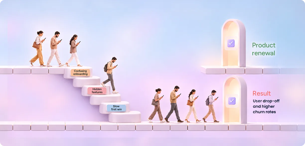
Users churn when a product makes them work too hard to get value. Confusing onboarding, slow time-to-value, cluttered workflows, and broken trust are the usual causes. A UX agency helps reduce churn by researching why users leave, redesigning the moments where they drop off, and testing fixes with real users before they ship.
Introduction
Most users never send a cancellation email. They just stop logging in.
One week they skip a session. The next week, a teammate finds a simpler tool. By the time the renewal date arrives, the decision was made months ago. That quiet exit is the hardest kind of loss to fix, because no one tells you why it happened.
Here’s what we’ve seen across 3,000+ projects at Yuj Designs: teams blame pricing, sales, or support first. Yet the real cause usually sits inside the product. Users leave because they couldn’t find value fast enough, or because finding it felt like work. If you want to reduce churn and improve customer retention, the product experience is where you start.
This guide explains why users churn, what it costs you, and how a UX agency helps you fix it.
What Is Churn Rate and How Do You Measure It?
Churn rate is the percentage of customers or users who stop using or paying for your product within a set period.
The basic formula is simple:
Churn rate = (Customers lost during the period ÷ Customers at the start of the period) × 100
If you start a month with 400 customers and lose 12, your monthly churn rate is 3%.
Benchmarks help you judge that number. Industry reports often put the median monthly SaaS churn rate at around 3–4% for growing companies. Teams that hold churn at 1–2% a month tend to sit in the top quartile. B2B products with annual contracts usually churn less than consumer apps, but their losses hit harder because each account is worth more. A healthy SaaS churn rate also depends on your target customer segment.
Two versions matter. Customer churn counts lost accounts. Revenue churn counts lost money, including downgrades. A product can keep most accounts and still bleed revenue if users quietly move to cheaper plans.
Also Read – User Research Services: Agency vs In-House Team Guide
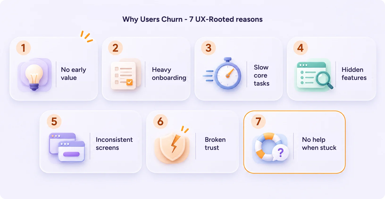
7 UX-Rooted Reasons Users Churn and How to Prevent Churn
Churn has many triggers. However, most come back to one simple gap: what users expected versus what they actually got. When the product feels harder than promised, people start looking elsewhere.
Here are the seven reasons we see most often.?
1. Users don’t see value in their first session
Every new user signs up with a goal in mind. Maybe they want to track a project, send an invoice, or spot a supply risk. The “aha” moment is when they first see the product deliver on that goal.
If the first session ends without that win, interest fades fast. Users don’t think, “I’ll try harder tomorrow.” They think, “This isn’t for me.”
2. Onboarding asks too much, too early
Picture a sign-up flow with seven setup fields before you see anything useful. It feels like homework. Many users quit halfway, and most of those never return.
Good onboarding works the other way around. It shows value first and asks for details later, once the user has a reason to care.
3. Core workflows are harder than they need to be
Users repeat some tasks every single day. If one of those tasks takes six clicks instead of two, the frustration adds up with every use.
In enterprise tools, this often shows up as quiet workarounds. Teams export data to spreadsheets because the product makes simple jobs slow. Once that habit forms, the product starts to feel optional.
4. Features exist, but no one finds them
Sometimes the product already does exactly what the user needs. The feature is just buried in a menu, or named in a way no one understands.
The user then decides the product “can’t do” it. They leave for a competitor that offers the same feature, only easier to find. Low feature adoption is one of the quietest causes of churn.
5. The interface feels inconsistent
On one screen, the save button sits at the top. On another, it’s at the bottom. Labels change from page to page.
Each difference forces users to stop and relearn the product. That extra mental effort is tiring. Over time, it wears down their confidence in the tool.
6. Users stop trusting the product
Trust breaks in small ways. A number on a dashboard looks wrong. An AI feature answers with no explanation. A bill arrives higher than expected.
People don’t stay with tools they can’t rely on. Once trust goes, user retention often drops too.
7. Help isn’t there when they’re stuck
Imagine a user hits a wall at 11 pm before a big deadline. The only option is a support ticket that won’t be answered until morning. Many will simply give up and try something else.
Clear in-app guidance, helpful error messages, and easy self-service help can stop that moment from turning into a lost customer.
What’s missing from this list?
Notice that “the product lacked features” isn’t here. Feature gaps do cause some churn. But far more users leave products that could have served them well. The experience simply got in the way.
How Churn Affects User Retention and Business Metrics
Impact on User Experience
Churn starts as a feeling long before it shows up in a dashboard. Users feel lost, slowed down, or unsure whether the product is working for them.
Every confusing screen adds a small cost. A user re-reads a label. They hunt for a button. They wonder whether a setting is saved. Each moment is minor, but together they shape a verdict: “This product is hard.”
That verdict spreads. In B2B teams, one frustrated power user can sour an entire department on a tool. In consumer apps, it shows up as poor ratings and reviews that put off new sign-ups. Poor user retention is rarely one big failure. It’s the sum of many small ones.
Impact on Business Metrics
The business math is blunt. Acquiring a new customer typically costs several times more than keeping an existing one. Research from Bain & Company found that a 5% lift in retention can raise profits by 25% to 95%.
High churn also distorts growth. Your marketing team may be filling a leaking bucket. Customer acquisition cost rises, lifetime value falls, and net revenue retention slips below 100%.
For SaaS businesses, a high SaaS churn rate also hurts valuation. Investors see churn as a sign of how well a product meets customer needs. A company that reduces its monthly customer churn rate by even 1–2% can see a significant difference in its business performance over the course of a year.
So the goal isn’t only to win back users. It’s to improve customer retention in a way that compounds over time.
How a UX Agency Helps Reduce Customer Churn: 6 Proven Moves
An in-house team often sees the product too closely to spot its friction. A UX agency brings outside eyes, research rigor, and pattern recognition from many products. Here is how that work helps reduce customer churn in practice.
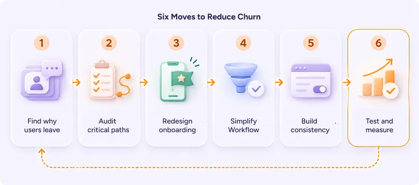
1. Find out why users really leave
Good churn reduction strategies start with evidence, not guesses. An agency combines product analytics with exit interviews, session recordings, and contextual research. The goal is to connect the “where” (the screen users drop from) with the “why” (what they felt there).
2. Run a UX audit of the critical paths
A UX audit reviews onboarding, core tasks, and upgrade flows against usability heuristics and real user behavior. It produces a ranked list of friction points, so the team fixes what costs the most users first. This is often the fastest way to reduce churn without a full rebuild.
3. Redesign onboarding around time-to-value
Instead of a feature tour, onboarding should get users to their first win. That might mean sample data, a shorter setup, or a guided first task. Faster value is one of the most reliable ways to prevent churn in the first 30 days.
4. Simplify the workflows users repeat every day
Daily tasks deserve the most design attention because users feel them most often. Agencies map these workflows, cut unneeded steps, and restructure information so the most important data appears first.
5. Build consistency with a design system
A design system gives every screen the same patterns, components, and language. Users learn the product once and apply that knowledge everywhere. It also helps product teams ship faster without creating new inconsistencies.
6. Test before you ship, then keep measuring
Usability testing with real users catches problems before they reach production. After launch, the agency tracks activation, task success, and cohort retention to confirm the fix worked and that user retention is climbing. This loop is what helps teams reduce churn steadily instead of once.
Which UX Signals Predict Churn Early?
It’s easier to prevent churn than to reverse it. These signals usually appear weeks before a user leaves.
1. Low activation rate
Users sign up but never reach their first moment of value. Shorten onboarding and add a guided first task so they see progress in the first session.
2. Long time-to-value
Setup feels like effort instead of progress. Smart defaults, ready-made templates, or sample data help users get to a result faster.
3. Low feature adoption
Valuable features stay hidden, so users assume the product can’t do what they need. Better discoverability and contextual prompts bring those features into view.
4. Falling session frequency
The product isn’t becoming part of the user’s routine. Surfacing relevant updates and visible progress gives people a reason to return.
5. Rising support tickets on one flow
A spike in tickets around a single task means that flow is confusing. Make it a priority in your next UX audit.
6. Repeated drop-off at one step
When many users abandon the same screen, that step is blocking them. Test it with real users and redesign it first.
Tracking these alongside your churn rate turns churn from a lagging number into an early warning system. It also shows you exactly where to reduce churn next.
Also Read – What Hiring a UX Consultant Actually Costs
Common Mistakes to Avoid When Fixing User Churn
Even well-funded teams fall into the same traps when building churn reduction strategies. Here are the ones we see most often.
1. Treating churn as a sales or support problem only
Discounts and win-back emails can delay a cancellation. They rarely fix the experience that caused it. If you want to reduce customer churn for good, fix the product.
2. Adding features to fix dissatisfaction
More features often mean more complexity. If users struggle with what exists, new features can raise churn instead of lowering it.
3. Relying on analytics without talking to users
Data shows where users drop off. Only research explains why. Teams that skip the “why” often fix the wrong thing.
4. Designing onboarding as a one-time tour
Users forget tours. To prevent churn, value has to be reinforced inside the product, not just shown once on day one.
5. Making cancellation deliberately difficult
Hidden cancel buttons may lower churn for a month. They also damage trust and reviews. A clear exit with a pause option often works better and helps reduce customer churn honestly.
6. Measuring churn without segmenting it
Your overall churn rate tells you how many customers are leaving, but not why. Break it down by subscription plan, customer group, product usage, and acquisition channel. This helps you spot patterns, understand which customers are most likely to leave, and identify where improvements are needed.
Real-World Applications: The Resilinc EventWatch Redesign
Resilinc, a US-based supply chain risk management company, built EventWatch, a mobile app that alerts professionals to supply chain disruptions.
The app struggled with engagement. Low-relevance content crowded the screen. Current events weren’t visible at a glance. Users needed six clicks to see which partners were affected.
Yuj Designs redesigned EventWatch as a news-centric app with a clear information hierarchy. Unregistered users could read news tailored to their interests for free. Registered users got focused views, including a “War Room” for active disruptions and a “Relevant” feed for forecast risks. Events were sorted into New, Assessing, Mitigating, and Resolved.
The result was higher user adoption, better stickiness, new customer acquisition, and lower support costs.
Read the full Resilinc case study
When to Bring In a UX Agency to Reduce Customer Churn
Not every churn problem needs outside help. However, an agency is worth considering when your own churn reduction strategies stall, or when:
- Your churn numbers have stayed flat or risen despite marketing and support efforts.
- Users sign up but don’t activate, and your team can’t pinpoint why.
- Your product has grown through many releases and now feels inconsistent.
- You serve complex enterprise users whose workflows your team hasn’t researched directly.
- You need to improve customer retention before a funding round or renewal cycle.
At Yuj Designs, we’ve spent more than 17 years designing complex enterprise products for clients in the US, Europe, and India. Our teams in Sunnyvale and Pune combine user research, UX audits, and design systems to help product teams reduce churn and improve customer retention with evidence, not opinion. The goal is always the same: make the product so clear that users stay because they want to.

FAQs