Holiday shoppers are rushed, buying for someone else, and mostly on a phone. Good holiday ecommerce UX answers three questions early: will it arrive in time, what will it really cost, and is this the right gift? Clear product page design and a short, honest checkout do more for peak-season revenue than any discount banner.
Introduction
Black Friday lands on November 27 this year, with Cyber Monday close behind on November 30. The traffic is budgeted. The question is whether your experience can turn it into orders.
Last season set a record. Adobe reports that US shoppers spent $257.8 billion online between November 1 and December 31, 2025, up 6.8% year over year. Mobile drove 56.4% of that spend, and 66.5% on Christmas Day.
Here’s the uncomfortable part. Peak traffic doesn’t create new UX problems. It exposes old ones at the exact moment they cost the most.
This guide draws on what YUJ Designs has learned over 17 years while working on more than 3,000 projects. We’ll cover the product page design and checkout patterns that matter most in Q4, the mistakes we see in almost every holiday audit, and where good ecommerce design pays off fastest.
Why Holiday Shoppers Demand Different Ecommerce UX
The July shopper is usually browsing for themselves. The December shopper is solving a problem for someone else, against a deadline.
They care less about discovery and more about certainty. Will this fit my nephew? Can I hide the price on the receipt? Will it reach Ohio before the 24th?
Many want the gift to feel personal, too. A short custom message on the card or packing slip turns a delivery into a gift from them, especially when they can’t be there to hand it over. Shoppers who can’t find that option often buy somewhere that offers it.
They also have less patience. Any step that makes them think twice is a step where they can leave.
Strong ecommerce UX design for the holidays starts here. You’re designing for a stressed gift-giver on a small screen, not a relaxed browser on a laptop.
Product Page Design Patterns That Help Gift Shoppers Decide
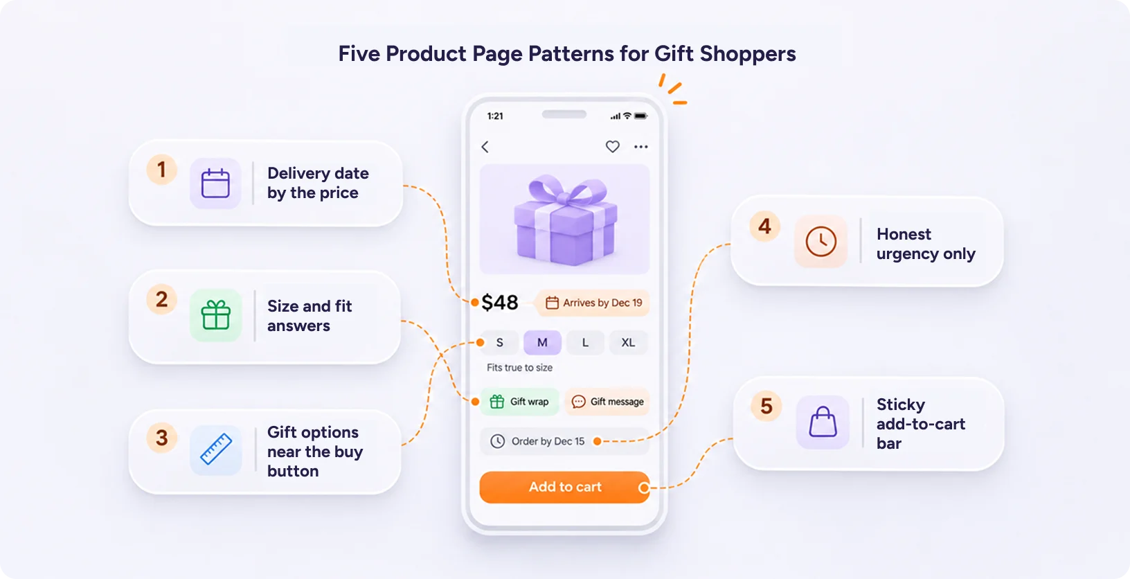
These are the product page design patterns we prioritize in peak-season audits.
Put the Delivery Date Next to the Price
Shoppers want to know one thing: will it arrive before the holiday? “Ships in 3–5 business days” leaves them guessing. “Arrives by Friday, Dec 18” gives a clear answer. Show this date right next to the price and the add-to-cart button. If the last shipping date has passed, say so and suggest store pickup or a gift card instead.
Make Gifting Visible Before Checkout
Gift wrap, gift receipts, and personal messages often hide in the final checkout step. By then, some shoppers have already left. Good product page design shows gift options near the buy button, with the cost of each.
Answer the Questions a Gift Buyer Can’t Ask
The recipient can’t try anything on. Size charts, “fits true to size” notes from reviews, compatibility checkers, and clear dimensions all reduce guesswork. State extended holiday return windows in one line, right on the page.
Use Urgency Only When It’s True
Low-stock labels and countdown timers help only when they’re real. One honest “order by” message does more for product page design credibility than three flashing badges.
Design for the Thumb First
In holiday ecommerce design, sticky add-to-cart bars, large tap targets, and fast images matter more than desktop polish. Test your product page design on a mid-range phone over a patchy connection.
Also Read – The ROI of UX: How Great UX Design Increases Revenue
Ecommerce Checkout Patterns That Hold Up Under Peak Traffic
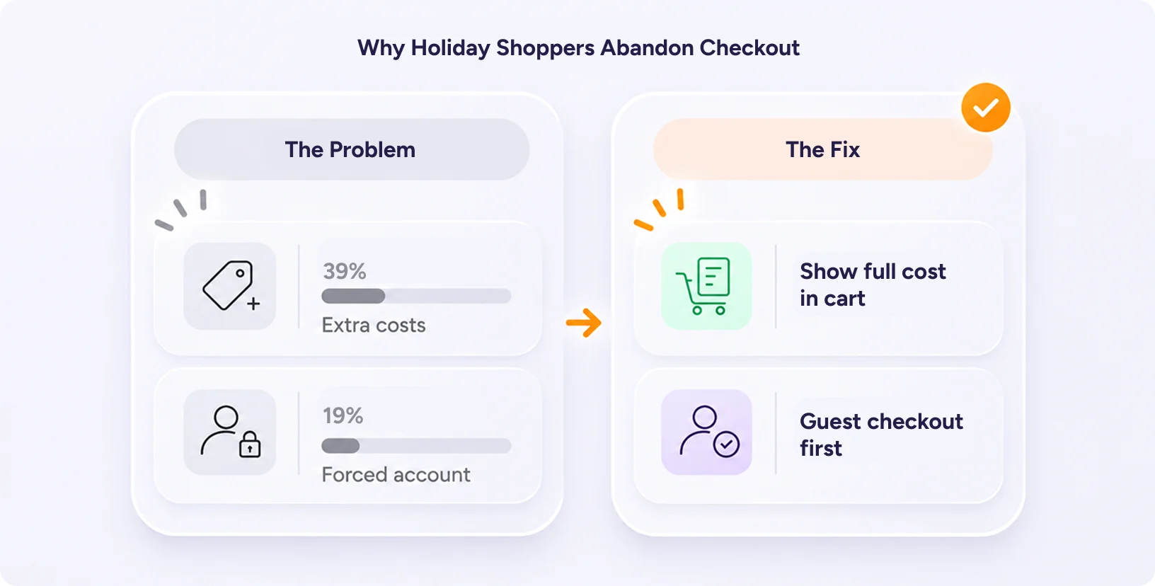
Baymard Institute puts the average cart abandonment rate at roughly 70%. In its surveys, 39% of shoppers who abandoned a checkout blamed extra costs, and 19% left because they had to create an account. Both are problems that checkout flow design can solve.
Offer Guest Checkout and Make It Obvious
Guest checkout should be the most visible path in your ecommerce checkout, not a gray link under a sign-in form. Invite people to create an account on the confirmation page, after they’ve paid. By then it feels like a convenience, not a toll.
Show the Full Cost Before the Last Step
In smart checkout flow design, shipping, taxes, and gift wrap fees appear in the cart, not the final screen. Good checkout UX design shows a free-shipping progress bar, an estimated total, and the delivery date together. A surprise fee is the fastest way to lose a ready buyer.
Support the Payments People Already Use
Express wallets like Apple Pay, Google Pay, and PayPal are a mobile checkout UX design essential because they remove most typing. Buy Now, Pay Later matters too. Adobe found BNPL drove $20 billion in online spend during the 2025 holiday season. A clear ecommerce checkout shows these options first, not after the card form.
Handle Multiple Addresses Without Friction
Holiday orders often ship to someone else. Your checkout flow design should make “ship to a different address” a single tap, remember recent recipients, and allow a gift message per package.
Validate Inline and Forgive Errors
An e-commerce checkout form that clears every field after one mistake is painful on a phone. Inline validation, address autocomplete, and plain-language error messages keep people moving. These small fixes are the backbone of solid checkout UX design.
How Holiday Ecommerce UX Shapes Results
We think of holiday ecommerce UX as a calm experience during a stressful time. When shoppers feel certain, they finish.
Impact on User Experience
Clear delivery dates remove the biggest source of holiday anxiety. Visible gift options save shoppers from hunting through menus. Express payments, a core checkout UX design pattern, cut checkout to a few taps.
The combined effect is confidence. Following ecommerce UX best practices also lowers the mental effort of comparing options, which matters when someone is buying for twelve people. Thoughtful product page design means fewer tabs open and fewer second thoughts.
Impact on Business Metrics
The gains from ecommerce UX design reach well beyond conversion rate. Baymard’s research suggests large online stores could lift conversion by about 35% through better checkout design alone.
Acquisition costs fall too. When your ecommerce checkout converts better, each paid click goes further at the most expensive time of year.
Clear ecommerce website design also cuts “where’s my order?” calls, which helps your team survive peak season.
Holiday shoppers include many first-time customers. Thoughtful ecommerce website design turns a one-time gift purchase into a repeat customer.
Also Read – Why Users Sign Up But Never Come Back
Quick Fixes You Can Make Mid-Season
Many teams freeze major releases once holiday traffic picks up. That doesn’t stop you from improving the experience while the season is underway.
Content changes rarely need a full release. Rewrite delivery messaging, add cutoff dates, and move gift options higher. These updates follow core ecommerce UX best practices and often ship through your CMS alone.
Next, review the product page design of your top 20 products and your checkout on a real phone. Fix what affects the most shoppers and costs the least to change.
Finally, watch five people try to buy a gift on your site. A UX design agency offering research-led UX design services can run these sessions in days.
Common Mistakes to Avoid
Even well-funded teams skip basic ecommerce UX best practices every Q4.
Launching a Redesign in November
A major rebuild weeks before peak traffic is a gamble. Make big ecommerce design changes in spring, then refine through the fall.
Hiding Delivery Cutoffs
Shoppers who can’t tell whether an order will arrive often leave to check elsewhere. Make your last shipping dates part of your product page design, your cart, and your ecommerce checkout summary.
Treating Mobile as an Afterthought
Many teams still review designs on large monitors. Strong ecommerce website design starts every sketch on a small screen.
Overloading Pages With Promotions
Pop-ups, banners, and timers pile onto ecommerce website design during sales, pushing the product down. Keep product page design focused on the item, the price, the delivery date, and the buy button.
Adding Fake Urgency
Fake “Only 2 left!” labels erode trust and invite legal scrutiny. Honest ecommerce UX earns urgency through accurate stock and shipping information.
Forgetting the Post-Purchase Experience
Late tracking emails and confusing gift returns damage trust. Good ecommerce UX design maps the full journey, from first search to the January return.
Real-World Applications: How YUJ Rebuilt Campaign Tooling for Wayfair
Wayfair, the US-based home goods retailer, ran campaign execution through an internal Template Manager. As it scaled, fragmented workflows, manual steps, and no real-time preview slowed launches and raised error risk.
YUJ Designs spent more than 100 hours observing marketing analysts, operations specialists, and support specialists. The team redesigned the tool around personalization, real-time previews with version control, role-based access, and AI-assisted template suggestions and error detection.
In evaluation, the redesign reached a 98.24% task success rate, an 88.75% satisfaction score, and a 4.2/5 star rating. Users could complete tasks independently, without relying on support.
Read the full Wayfair case study
How to Choose the Right Retail UX Partner
Every UX design agency approaches retail differently. Some sell redesigns, others sell testing tools. The right ecommerce UX agency brings research, design, and measurement together.
Check How They Find Problems
A good partner asks why shoppers aren’t converting before suggesting fixes. Expect analytics reviews, expert audits, and user sessions as part of their UX design services. A UX design agency that leads with quick tactics may be guessing.
Ask About Retail Experience
Furniture shoppers behave differently from gift card shoppers, and a good ecommerce UX agency knows it. An experienced ecommerce design agency should explain what it has learned about ecommerce design in your category.
Look for Research and Design Under One Roof
An ecommerce UX agency with in-house researchers and designers turns findings into screens quickly. Integrated UX design services matter when your season has a fixed deadline.
Review Their Metrics
Ask whether an ecommerce design agency tracks order value, returns, support volume, and repeat purchases. These show whether UX design services helped the business.
Ask for Real Case Studies
Ask any ecommerce design agency for named clients, defined problems, and measurable results. A UX design agency that can’t share detailed examples is telling you something.
How YUJ Designs Approaches E-Commerce UX
YUJ Designs is a global UX design agency with studios in Pune and Sunnyvale. Over 17 years, we’ve delivered 3,000+ projects and built 200+ enterprise partnerships. On retail and ecommerce work, we usually start with an expert review and user testing, then turn insights into designs shoppers trust.
Conclusion
The holiday season rewards stores that remove doubt. Shoppers want to know when it arrives, what it costs, and whether it’s the right gift.
Clear product page design answers the first and third questions. Honest checkout flow design answers the second. Together, they turn peak traffic into revenue you keep.
If traffic climbs every December while conversion stays flat, the discount is rarely the problem. More often, it’s one small moment of friction just before the buy button. Good ecommerce UX design finds that moment and fixes it. An ecommerce UX agency can audit your ecommerce UX before peak traffic arrives.

FAQs