Conversion rate optimization works best when user experience leads it. Tweaking button colors and headlines can nudge the numbers for a few weeks, but the gains rarely last. A UX-led approach starts by finding out why people hesitate, then fixes the experience that made them hesitate. That is what produces conversions that hold, along with better retention and lifetime value.
Introduction
Your next customer might already be on your website. So why aren’t they converting?
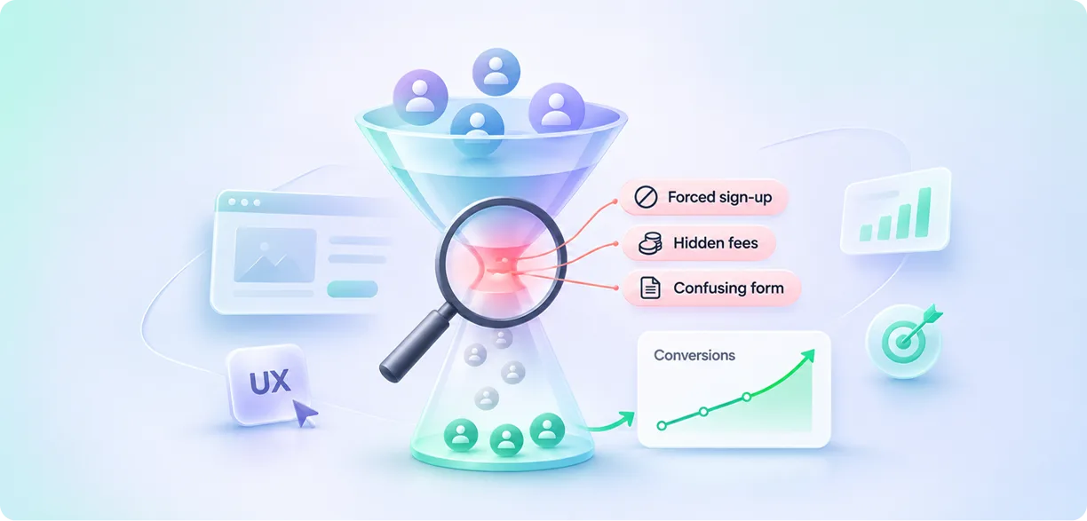
In many cases, the problem lies in the friction that stops potential customers from completing what they came to do. People arrive with real intent, get halfway through a purchase or a sign-up, and then hit something that makes them stop: a mandatory account, a form that wants a phone number for no clear reason, or a shipping fee that only appears on the last screen.
Your analytics will record it as an abandoned cart, but the real reason could be much simpler: the customer didn’t feel confident enough to share their payment details and complete the transaction. That gap between what the dashboard shows and what the user felt is where a lot of Conversion Rate Optimization programs quietly stall.
This guide makes the case for putting UX at the center of your conversion strategy. It draws on what YUJ Designs has learned over 17 years while working on more than 3,000 projects, including the patterns we repeatedly identify during UX audits. We’ll cover how experience affects business metrics, where teams tend to go wrong, and what good conversion rate optimization services actually look like once you’re inside an engagement.
What Is Conversion Rate Optimization, Really?
Conversion rate optimization is the process of getting a larger share of your website visitors to take the action you want them to, whether that’s making a purchase, booking an appointment, requesting a demo, or signing up.
The calculation is simple: divide the number of conversions by the total number of visitors and multiply by 100.
For example, if 2,000 people visit your website and 60 of them complete a purchase, your conversion rate is 3%. This means that out of every 100 visitors, only 3 actually make a purchase.
What the math leaves out is that every one of those 2,000 visits was a person making a judgment call. They were comparing you with two other tabs, wondering about the return policy, maybe reading your pricing on a phone in a noisy train. Conversion Rate Optimization done well is really the study of those judgment calls. That’s why we treat it as a design problem first. A test can tell you which version won; research tells you why it won and what to try next.
Why Quick-Fix CRO Tactics Stop Working
A lot of conversion programs begin with a checklist: add a countdown timer, enlarge the CTA, put a trust badge beside the payment field, A/B test the headline.
Some of those tests do win. The wins just tend to be small, and they have a habit of fading once the novelty wears off.
Here’s a situation the Yuj Designs team has seen more times than we can count in 17 years of UX audits. A product team has run test after test on a product page and moved conversion by a fraction of a percent. Then we sit in on five user sessions and watch every participant get stuck two screens later, on a form asking for details they don’t have at hand. Nobody had tested the form because nobody had looked at it.
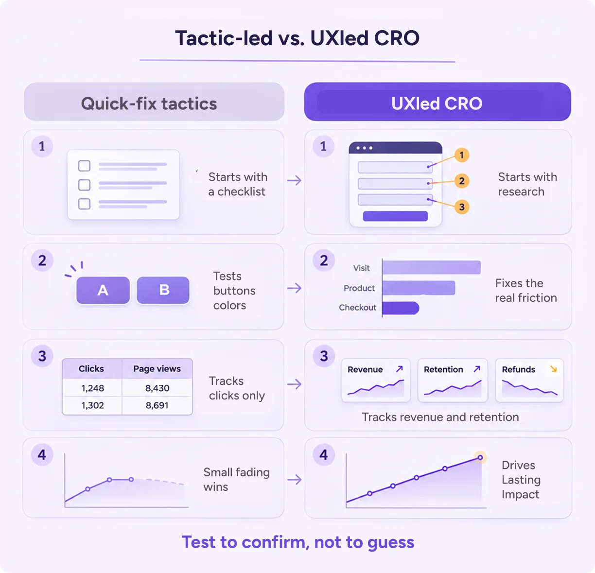
Tactic-led programs also have a measurement blind spot. An aggressive exit pop-up can push email sign-ups up while unsubscribes climb right behind them, and the dashboard only celebrates the first number.
Experience design starts with the entire user journey. It examines where people stall, what confuses them, and what would make them feel confident enough to complete an action. Strong conversion rate optimization services begin with those questions, well before anyone sets up a test.
How UX Drives Conversion Outcomes
We find it more useful to think of a conversion as the payoff of a good experience than as a separate goal sitting next to it. When the path is clear, quick, and believable, people tend to finish it.
Impact on User Experience
The most immediate change is that people understand their options faster. Good information hierarchy, and showing detail only when someone asks for it, saves users from staring at a grid of twelve plans and closing the tab.
People also feel safer to commit. Upfront pricing, realistic delivery dates, and a return policy they can find in one click remove the small doubts that pile up before a purchase. In many of the funnels we audit, lack of trust proves to be a bigger barrier to conversion than price.
And the work simply gets lighter. Removing a few form fields, offering guest checkout, and remembering what someone entered last time all cut the effort involved, which leaves people with fewer moments where quitting seems easier than continuing.
Impact on Business Metrics
These changes show up well beyond the conversion dashboard. When companies invest in experience-first conversion rate optimization services, the effect usually spreads into revenue, acquisition cost, and retention.
The broadest evidence comes from McKinsey. Its Business Value of Design study followed 300 publicly listed companies over five years. It found that companies in the top quartile for design practices outpaced their industry peers in revenue growth by 32 points. It’s a correlation study, so it doesn’t prove that design caused the growth, but it’s hard to ignore a gap that size.
Checkout is where the effect is easiest to see. Baymard Institute has run years of usability testing on large ecommerce sites, and its researchers estimate that design fixes to checkout alone could raise conversion by about 35%. In one of its surveys of US shoppers, 18% said they’d abandoned an order simply because the site wanted them to create an account.
Speed counts as part of the experience too. A Google and Deloitte study of 37 brands found that shaving just 0.1 seconds off mobile load times lifted retail conversions by 8.4% and average order value by 9.2%.
Acquisition costs also come down. Say $10,000 in ads brings 10,000 visitors. At a 2% conversion rate, each customer costs you $50. Increase that rate to 2.5%, and the same budget brings the cost down to $40 per customer, making acquisition roughly 20% cheaper. For many teams in the United States, where paid traffic keeps getting more expensive, that alone justifies the investment.
Support teams benefit too. When customers can easily find what they need and understand each step of the process, they have fewer reasons to contact support with questions like, “Where’s my order?”
Many conversion strategies focus on the first purchase but fail to consider what brings customers back. Bain & Company’s research has long suggested that a 5% increase in customer retention can raise profits by anywhere from 25% to 95%. When customers have a smooth and positive buying experience, they are more likely to return and buy again.
A UX-Led CRO Framework in Five Steps
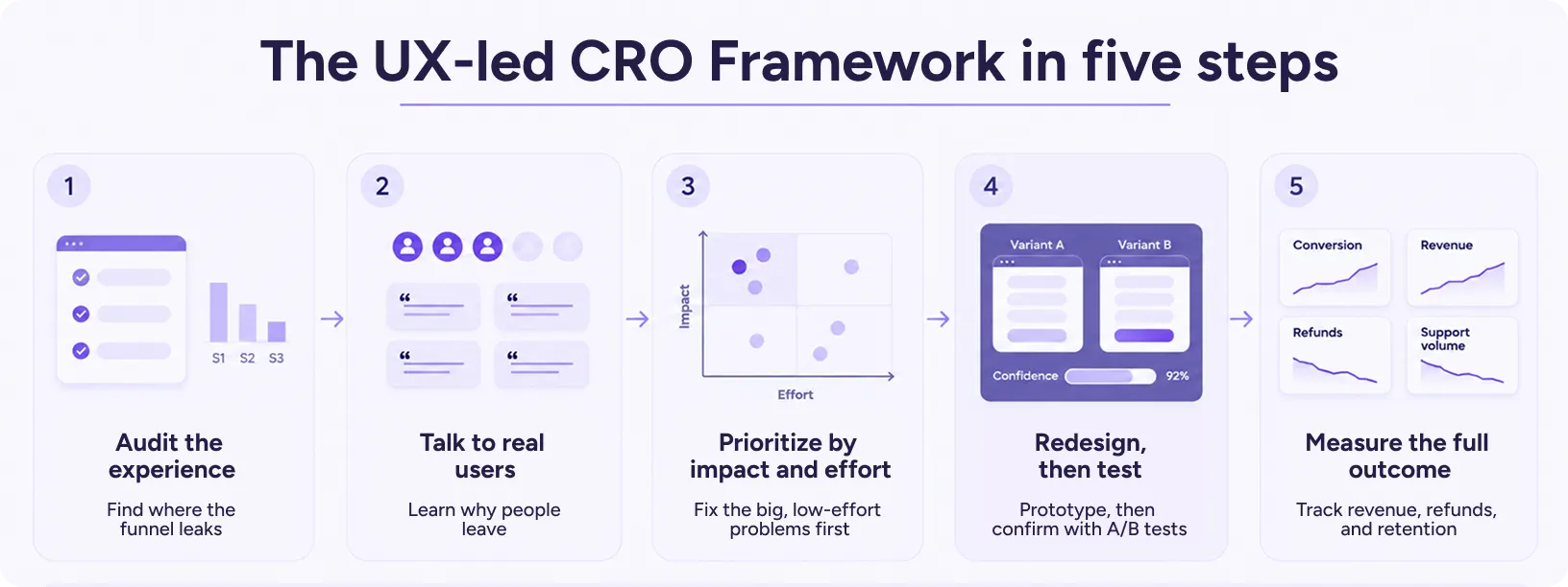
This is roughly the sequence we follow on engagements. Each stage feeds the next, so skipping ahead usually means coming back later.
Audit the Experience
Go through the product the way a first-time visitor would, ideally on a mid-range phone rather than a large monitor. A UX expert notes everything that’s confusing, slow, or awkward. Alongside that, pull the funnel reports to see where people actually leave. The expert review tells you what might be wrong; the analytics tell you which of those problems are costing you the most.
Talk to Real Users
Analytics can point to the step where people drop off, but they can’t explain the drop. For that, you need to watch people try to complete a real task, like buying a product or booking a demo, and ask what they expected to happen. Five or six sessions is often enough. By the third participant, you’ll usually hear the same complaint in slightly different words.
Prioritize by Impact and Effort
You’ll end up with a longer list of problems than you can fix this quarter. Sort it by two things: how many users each issue affects, and how much work the fix involves. Problems that hit lots of people and are cheap to fix go first. The expensive rebuilds can wait until you’ve earned some confidence.
Redesign, Then Test
Design the improvements based on what you saw in research, and put rough prototypes in front of users before any engineering time is spent. Once a design holds up, run an A/B test to confirm it performs. Used this way, the test is a check on a well-researched idea. Teams that skip the research end up using tests to generate ideas, which is slow and expensive.
Measure the Full Outcome
Look past the conversion rate. Track whether customers stay, how many return products, and whether support volume changes. If a new checkout lifts sales by 10% but refunds double, you haven’t won anything. The changes worth keeping move all of those numbers in the right direction.
You’ll notice testing sits fourth in this sequence. That placement is the biggest practical difference between UX-led conversion rate optimization and the tactic-first version.
Landing Page Conversion Optimization Through a UX Lens
A landing page is usually the first thing someone sees after clicking an ad or an email, which makes landing page conversion optimization one of the quickest places to see results.
Message match is where we start, because it’s the first thing that breaks in landing page conversion optimization. If the ad promised “set up in a day,” the headline should say that too. When the page opens with something different, people feel slightly misled before they’ve read a full sentence.
Keep the landing page focused on a single goal. Remove distractions such as full-site navigation, unrelated offers, and blog links. Every element on the page should guide visitors towards the same action, whether that’s making a purchase, booking a call, or signing up.
Forms deserve the most attention. Every extra field adds a little friction, and the phone-number field in particular causes more drop-offs than most teams expect. Ask for what you genuinely need right now and collect the rest after you’ve earned some trust.
Speed matters here as well. On a patchy mobile connection, a slow page loses people before the headline even loads.
Good landing page conversion optimization also accounts for how people actually read, which is mostly by scanning headlines, subheads, and buttons. Your clearest statement of value should sit where the eye lands first. Proof works the same way: one specific result placed next to the button does more than a row of client logos at the bottom of the page.
Treat each change as a hypothesis that came out of research. Over time, that habit is what makes landing page conversion optimization repeatable rather than a series of lucky guesses.
Ecommerce Conversion Rate Optimization: Where Friction Hides
Online stores lose a remarkable number of shoppers who had already decided to buy. Baymard Institute pulls together dozens of independent studies on cart abandonment, and the average has sat at roughly 70% for years. Many of the reasons shoppers give are about the experience, such as unexpected fees, forced accounts, and checkouts that feel too long.
That’s why ecommerce conversion rate optimization has to look well beyond the product page. In our audits, the friction tends to cluster in four places.
Discovery is often the quietest problem. If search returns poor results or filters don’t match how people shop, users never reach the right product, and large catalogs suffer most.
On the product page, doubt creeps in through missing size guides, vague specifications, and photos that don’t show the product clearly. Shoppers who can’t answer their own questions usually leave to find the answers somewhere else.
Checkout is where the classic abandonment triggers live: forced account creation, fees that appear at the last step, and forms that ask for the same address twice. Offering guest checkout and showing the full cost early fixes a surprising share of these losses.
After the purchase, order tracking, easy returns, and clear updates decide whether someone buys again. That makes retention part of ecommerce conversion rate optimization, even though few teams budget for it that way.
The strongest ecommerce conversion rate optimization programs map the whole path, from the first search to the second order, and treat every stage as one continuous experience.
Common Mistakes to Avoid
Even teams with healthy budgets fall into the same handful of traps.
Testing Without Research
An A/B test can tell you which of two versions did better. It can’t tell you what was worth testing. Without research, teams fall back on guesses like button colors or headline tweaks, and when one variant wins by a hair, it gets treated as a breakthrough when it was often just noise. Research gives each test a reason to exist.
Copying Competitors
Borrowing a big brand’s checkout feels safe, since surely they tested it. But their customers, products, and price points aren’t yours, and a layout that suits a large retailer can confuse a smaller, more specialized audience. Study why they made a choice, then design for your own users.
Ending Tests Too Early
A variant that looks like a clear winner on day three can lose by the end of the month. Buying behavior also shifts between weekdays and weekends and around paydays. Let tests run through at least one full business cycle, which for most companies means two to four weeks.
Optimizing One Page in Isolation
People move through a sequence of screens, so polishing the product page won’t help much if they still give up at checkout. Map the full path from first visit to purchase before you touch any single screen, and start with the step that loses the most people.
Ignoring Mobile Users
For many brands, most visitors now arrive on a phone, yet plenty of teams still design on a large monitor and check mobile at the end. Small tap targets, long forms, and heavy pages hurt much more on a five-inch screen. That habit leaves a costly gap in ecommerce conversion rate optimization, and the fix is simple: design and test on a phone from the first sketch.
Using Dark Patterns
Dark patterns are design tricks that push people into actions they didn’t mean to take, like fake “only 2 left” warnings, buried opt-outs, and add-ons that come pre-ticked at checkout. They can lift numbers for a while. But customers eventually recognise these tactics, and that can lead to refund requests, complaints, lost trust, and customers choosing not to return. It can also expose businesses to legal risks. Conversion growth that lasts doesn’t depend on tricking anyone.
Real-World Applications: How Yuj Redesigned Booking for Avis
Avis, the US-based car rental brand, was losing bookings to friction. Customers abandoned rentals partway through, and the company missed out on add-on and repeat business. Users faced overwhelming options, unclear pricing, generic journeys, and a disjointed mobile experience.
Yuj Designs rebuilt the experience around three pillars: trust through transparency and personalized recommendations, mobile-first interactions that work across devices, and progressive disclosure to simplify complex choices. The team added location-aware suggestions, multiple entry points, and smart filters with guided vehicle comparisons.
In evaluation, the redesign scored 9/10 on system usability and 9/10 for time to complete a booking, plus 10/10 for intuitive navigation and user confidence. Yuj delivered a scalable responsive application in 12 weeks. The work secured executive buy-in for full product development and helped establish a Design Centre of Excellence for the parent group.
Also Read – The full Avis case study
How to Choose the Right Conversion Rate Optimization Services
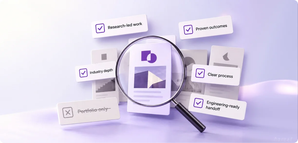
Providers come at CRO from very different directions. Some are really selling a testing tool, while others are selling page redesigns. The right conversion rate optimization services bring research, design, and measurement together. A few things are worth checking before you sign anything.
Check How They Identify Conversion Problems
A good partner wants to understand why users aren’t converting before proposing a single change. Expect them to ask for analytics access, run an expert review, and talk to real users. If the first proposal arrives as a list of quick tactics, ask how they arrived at it. It’s also fair to ask them to walk you through their discovery process step by step before any design work starts.
Look at the Metrics They Track
Conversion rate is one number among several. Good conversion rate optimization services also report on revenue, retention, refunds, and support volume, because those show whether a change actually helped the business. A provider that reports mostly clicks and page views may simply have little else to show. Ask them to describe what their first progress report will contain.
Make Sure They Have Strong In-House Design Skills
Research often reveals that a flow needs rebuilding, and a testing-only shop can tell you that without being able to do much about it. Look for a team where researchers, designers, and strategists work together, so findings turn into better experiences without weeks of handoffs between vendors.
Ask for Case Studies With Real Results
When evaluating a conversion optimization provider, ask for case studies featuring named clients, clearly defined problems, and measurable outcomes. Check whether the challenges they have addressed are similar to yours. A team that can’t share detailed examples is telling you something.
Confirm They Understand Your Industry
Someone buying a sofa online and someone evaluating enterprise software behave very differently, and fintech users bring their own heavy concerns about security. The best conversion rate optimization services adapt their methods to your users instead of running every client through the same template. Ask what they’ve worked on in your sector and what surprised them.
How Yuj Designs Approaches CRO
Yuj Designs is a global UX research and design company with studios in Pune and Sunnyvale. With 17 years of experience, the team has delivered more than 3,000+ projects and built 200+ enterprise partnerships. We usually begin CRO work with an expert review and user testing, then shape the findings into a UX strategy. From there, our design and development teams turn those insights into experiences people trust enough to complete.
Conclusion
Conversion is what happens when an experience respects people’s time, answers their questions, and gives them a reason to trust you.
Tactics still have a role, but they work best layered on top of a sound experience. That’s why the most effective conversion rate optimization services put UX research and design at the front of the process, with testing following close behind.
If your traffic keeps growing while conversions stay flat, the button color is rarely the culprit. More often, the problem is something users run into a step or two before they’d ever see the button.

FAQs