Most users who sign up and never return didn’t reject your product. They never reached its value. User activation is the moment a new user first experiences that value. Fixing it means removing friction between signup and that first win, then measuring every step along the way.
Introduction
You launched a campaign. Signups spiked. The dashboard looked great for a week.
Then you checked who came back. Most didn’t.
This pattern is more common than most teams admit. Data shared by 500 Global suggests that 40% to 60% of free-trial users open a product once and never return. That isn’t an acquisition problem. It’s a value delivery problem.
We see this often in product audits. Teams spend heavily to bring people in. Then they hand those people an empty dashboard, a 12-field form, or a tour of every feature at once. The person arrived with one job in mind. The product asked them to learn everything first.
This guide explains why that gap forms and how it affects both UX and revenue. It also covers what product teams can do to close it. You’ll see how Yuj Designs applied these ideas for a global car rental brand, too.
What Is User Activation?
Activation is the point where a new user completes the action that delivers your product’s core value for the first time. For a project tool, that might be creating and assigning a first task. For a payments app, it’s a first successful transfer. For a booking platform, it’s a confirmed reservation.
Signing up is not activation. Creating a password proves interest, not value.
The activation problem is the gap between those two moments. People commit enough to create an account. Then something stops them before the first win.
Your activation rate shows how wide that gap is. It’s the number of activated users divided by total new signups in the same period.
Here’s why it matters. Say 1,000 people sign up and 250 activate. Raise that to 400, and you gain 150 engaged users. You don’t spend another dollar on ads to get them.
Why User Activation Fails: Reasons Users Sign Up and Disappear
Low activation rarely has a single cause. Still, in our research sessions, the same five patterns keep appearing.
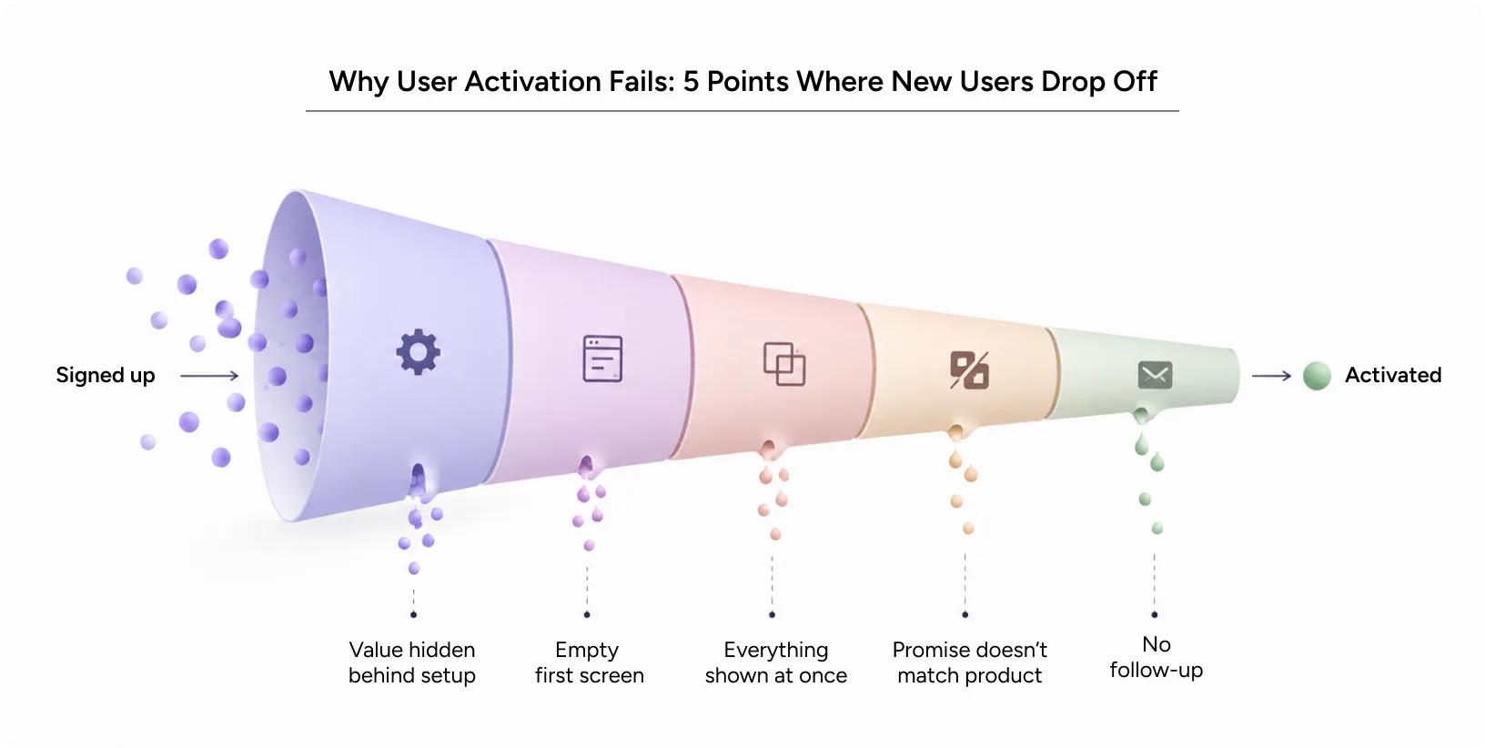
- The value hides behind setup. Users must configure, import, or invite before they see anything useful. Many leave planning to “finish later.” Later rarely comes.
- The first screen is empty. A blank dashboard gives no clue what success looks like. Users can’t picture the outcome, so they lose momentum.
- The product shows everything at once. Feature-heavy tours treat every capability as equally urgent. This buries the one action that matters on day one.
- The promise and the product don’t match. Your ad promised a two-minute result. The product delivered a 15-minute setup. That mismatch erodes trust fast.
- Nobody follows up. A user leaves mid-setup, and the product goes silent. There’s no reminder, no nudge, and no path back to where they stopped.
Notice that none of these are about missing features. They’re about sequence, clarity, and timing. That’s design work.
User Activation vs. Adoption: What’s the Difference?
These terms often get blurred in planning meetings, so it helps to separate them.
Activation is a single moment. Product adoption is a pattern over time. Activation happens when a user gets value once. Adoption happens when they make your product part of their routine.
Feature adoption sits between the two. It measures whether users find and keep using specific capabilities beyond the first win.
Think of it as a ladder. Users can’t reach adoption without stepping on activation first. Teams chasing low product adoption numbers should check the bottom rung before redesigning the top.
How to Find Your Product’s Activation Moment
Before you fix activation, you need to define it. Without a clear definition, every activation effort becomes guesswork.
Start with behavior data. List every action a user can take in their first week. Then compare users who stayed for 90 days against those who churned. Look for the action retained users took early and churned users skipped.
Validate it with real people. Analytics show where users stop. Interviews and usability tests show why. Nielsen Norman Group found that testing with just five users uncovers most usability problems in a design. You don’t need a massive study to find the obvious blockers.
Measure time to value. How quickly do retained users experience the product’s value? If they get there in three minutes while others take three days, you’ve found your target.
How to Measure User Activation: Key Metrics
Track a small set of metrics together. One number alone can mislead you.
| Metric | What It Tells You | How to Calculate |
|---|---|---|
| Activation rate | Share of new users who reach the aha moment | Activated users ÷ new signups × 100 |
| Onboarding conversion rate | Share of users who finish each onboarding step | Users completing a step ÷ users starting it × 100 |
| Time to value | How fast users reach the first win | Median time from signup to activation |
| Feature adoption | Whether users find the features that keep them | Users of a feature ÷ active users × 100 |
| Day-7 and Day-30 retention | Whether activated users come back | Returning users ÷ cohort size × 100 |
Read your onboarding conversion rate step by step, not as one total. A steep drop at step three tells you more than a healthy-looking average. Pair those numbers with session recordings, and the friction usually becomes obvious.
Impact on User Experience
Weak activation is usually a UX outcome before it shows up as a growth metric. Here’s how the first session shapes it.
Usability
If users can’t figure out the next step, they stop. Clear labels, a visible primary action, and forgiving error states keep people moving. Every moment of hesitation in onboarding is a small chance to leave.
Accessibility
A flow that fails screen readers, low-contrast settings, or keyboard users locks out real customers on day one. Accessible onboarding isn’t an extra. It widens the group of people who can reach value at all. It also tends to make the flow clearer for everyone else.
Cognitive Load
New users have limited attention and zero context. Asking them to make 10 decisions before seeing a result exhausts that budget. Progressive disclosure helps here. Show the next step only when the user needs it.
Emotional Response
The first session sets a feeling. Confusion feels like failure, and people avoid products that make them feel incompetent. A quick, visible win builds confidence. Confidence is what brings people back tomorrow.
Impact on Business Metrics
Engagement
Activated users explore further. They try a second feature, then a third. Weak activation starves feature adoption, because users never stay long enough to discover what else your product does.
Conversion
In trial-based models, activation is one of the strongest early signals of paid conversion. People pay for value they’ve already felt. A higher activation rate often lifts trial-to-paid numbers without any change to price or plans.
Retention
Retention starts in the first session. Product adoption grows when users build a habit around a core action. That habit can’t form if the first action never happens. Fix activation, and your retention curve settles at a higher level.
Brand Trust
A frustrating first session leaves a lasting impression. Users who struggled are less likely to return, recommend you, or try your next launch. A smooth start tells them your team respects their time.
Common Mistakes to Avoid
Misuse or Overuse
Product tours, tooltips, and checklists help when they point to one clear goal. They hurt when they multiply. Five pop-ups on first login train users to click “Skip” on everything, including what matters.
Poor Implementation
Teams often copy onboarding patterns from popular apps without testing them on their own users. A checklist that works for a consumer app may confuse an enterprise admin.
Another frequent mistake is tracking signup completion and calling it success. That inflates your onboarding conversion rate on paper while real activation stays flat.
Real-World UX Pitfalls
- Asking for credit card details or company size before showing any value
- Forcing team invites before the first user understands the product
- Using internal jargon in empty states and onboarding copy
- Sending generic “Welcome!” emails instead of nudges tied to the step a user missed
- Treating mobile onboarding as a shrunken desktop flow
A 5-Step Framework to Improve User Activation
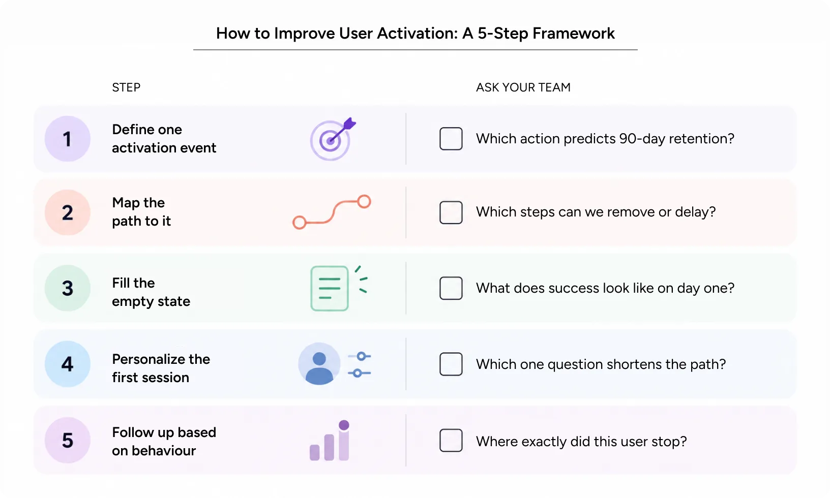
- Define one activation event. Pick the action that best predicts long-term retention. Write it down and share it across product, design, and marketing.
- Map the path to it. List every screen and decision between signup and that event. Then remove, delay, or automate anything that isn’t essential.
- Fill the empty state. Use templates, sample data, or a guided first action. Show users what success looks like before they build it.
- Personalize the first session. Ask one or two questions about the user’s goal. Use the answers to shorten the route to value.
- Follow up based on behavior. Trigger emails or in-app prompts tied to the exact step a user abandoned. Point them back to the finish line, not the homepage.
Then test, measure, and repeat. Strong activation comes from steady iteration, not one big redesign.
Real-World Application: How Yuj Designs Simplified Booking for Avis
Avis, the global car rental brand, faced a familiar first-session problem. Booking friction led to abandoned rentals and missed repeat business. Users met overwhelming vehicle options, unclear pricing, generic flows, and a disjointed mobile experience.
Yuj Designs rebuilt the booking flow around three principles. The first was helping users find the right option through clear pricing, relevant recommendations, and transparent details. The second was ensuring a seamless, mobile-first experience across devices. The third was using progressive disclosure to simplify complex choices. Smart filters, guided comparisons, and location-aware suggestions reduced the effort required to complete a booking.
User evaluation results were strong. The redesign scored 9/10 on system usability and retention desirability. It also scored 10/10 for intuitive navigation and user confidence. Yuj Designs delivered a scalable responsive application in just 12 weeks, which secured executive buy-in for full product development.
Read More: Avis Case Study
Conclusion
Users rarely leave because your product lacks features. They leave because they never reached the part worth staying for. Fixing activation means designing the first session around one clear win, then removing everything in the way.
Start small. Define your activation event. Map the path. Watch five real users try it.
Track your activation rate and onboarding conversion rate every week. Then let feature adoption and product adoption tell you whether the gains are lasting.
Yuj Designs has spent 17 years designing enterprise and consumer products for teams across the US, Europe, and India. If your signups aren’t turning into active users, we can help you find out why.

FAQs