A UX audit is a structured review of a website or app that shows where users get stuck and why they leave before converting. It combines analytics, expert evaluation, and real user testing. The result is a prioritized list of fixes tied to revenue, not a pile of design opinions.
Introduction
Traffic is up. Sign-ups are flat. Ad spend keeps climbing, and the sales team keeps asking where the leads went.
If that sounds familiar, you’re not alone. A website not converting is rarely a traffic problem. It’s usually a friction problem, hiding inside forms, menus, pricing pages, and checkout steps that nobody on the team uses the way a customer does.
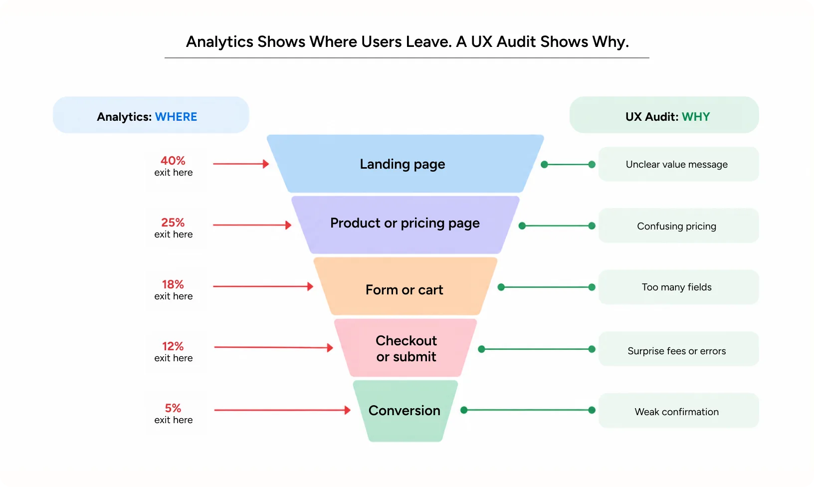
Here’s the hard part. Your analytics can tell you where people leave. They can’t tell you why. That’s the gap a proper audit closes.
This guide walks through how an audit works, what it reveals, how it affects people and revenue, and the mistakes that make audits useless. You’ll also see how Yuj Designs applied this thinking for a US car rental brand.
What a UX Audit Really Measures
At its core, an audit is a diagnostic review of an existing digital product. It measures the experience against usability principles, behavioral data, and business goals. Think of it as a health check, not a redesign.
A good audit answers three questions:
- Where are users leaving?
- Why are they leaving at that exact point?
- What should the team fix first to recover the most value?
It is not a style critique. “The button should be blue” is an opinion. “62% of mobile users never scroll far enough to see the button” is a finding. Audits deal in findings.
Signs Your Website Is Not Converting and Needs a UX Audit
Most teams don’t need a crystal ball to know something’s wrong. They need to recognize the pattern. These signals usually show up together:
- Strong traffic, but demo requests or purchases stay flat
- A high drop-off rate on one specific page or form step
- A sharp funnel drop-off between the pricing page and sign-up
- Paid campaigns with healthy click-through rates but poor cost per lead
- Support tickets asking questions your interface should already answer
- A recent redesign that looked better but performed the same, or worse
One signal is a hunch. Three or more is a pattern worth investigating. If your website not converting is accompanied by several of these warning signs, the problem is likely rooted in the user experience, not the audience.
Also Read – UX Competitive Audit: How to Benchmark Your Product
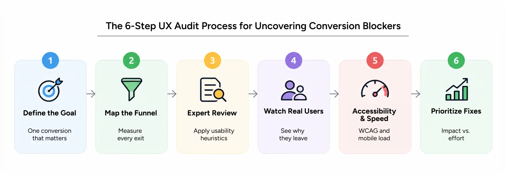
The 6-Step UX Audit Process for Uncovering Conversion Blockers
The steps below outline how experienced research teams approach the process, helping them move beyond assumptions and make decisions based on actual user behaviour.
Step 1: Define the conversion that matters
Start by identifying one clear goal, whether it’s getting users to book a demo, complete a purchase, or submit an application. Focusing on a specific outcome makes it easier to identify what needs fixing. Trying to improve everything at once often leads to unclear priorities and little meaningful progress.
Step 2: Map the funnel and measure each exit
Pull analytics for every step between landing and converting. Calculate the funnel drop-off at each stage. The steepest exit is usually where you dig first.
This is the quantitative backbone of conversion funnel optimization. It shows where potential customers drop off and where your website is losing conversions, helping you identify which stages need closer attention.
Step 3: Run an expert heuristic review
Senior designers walk through the flow using established usability principles. Jakob Nielsen’s 10 usability heuristics are the most common starting point. They look for unclear labels, missing feedback, broken patterns, and inconsistent controls.
Step 4: Watch real people use the product
Nothing replaces observation. Nielsen Norman Group’s research found that testing with around five users can uncover most usability issues in a user flow. Session recordings and heatmaps then show the exact moment of user drop-off at scale.
Step 5: Check accessibility and performance
Run the product against WCAG 2.2 guidelines. Check load times on slow mobile connections. A slow form is a broken form for someone on a weak signal.
Step 6: Prioritize by impact and effort
A typical audit surfaces dozens of issues. Rank them by how much funnel drop-off each one causes and the effort to fix it. Quick, high-impact wins go first. Structural problems go on the roadmap.
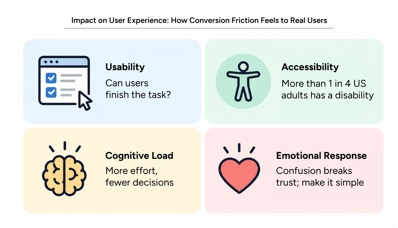
How Conversion Friction Feels to Real Users During a UX Audit
An audit looks at the product the way a customer feels it. Four lenses matter most.
Usability
Can people finish the task without help? Usability gaps look small on a screen. A vague error message or a hidden “next” button can quietly end hundreds of sessions a day. That kind of user drop-off rarely shows up in internal design reviews. Fixing it often produces the fastest wins.
Accessibility
More than one in four US adults lives with a disability, according to the CDC. Poor contrast, missing labels, and keyboard traps lock those people out. Accessibility fixes also help everyone else, from older users to people reading in bright sunlight.
Cognitive load
Every extra field, option, or unclear price asks the brain to work harder. When the effort feels larger than the reward, people postpone the decision. Often, they never return. This is one of the most common causes of user drop-off on pricing and sign-up pages. Reducing choices and revealing details only when needed lowers that mental cost.
Emotional response
People don’t only think through a flow. They feel it. Surprise fees create distrust. Long waits create anxiety. A confident, clear interface makes users feel competent, and competent users convert.
Impact on Business Metrics: What Removing Friction Is Worth
A better user experience can lead to measurable improvements in business performance. Here’s how each UX improvement translates into the metrics that matter most to business leaders.
Engagement
Clear navigation and readable content keep people exploring. Better engagement means more pages viewed, longer sessions, and more chances to make the case for your product.
Conversion
This is where audits earn their budget. Removing friction at the step with the highest drop-off rate is the most direct form of conversion funnel optimization. Baymard Institute puts average online cart abandonment at about 70%, and a large share traces back to fixable checkout issues.
Retention
Conversion is the first sale. Retention is every sale after it. Smooth onboarding and fewer frustrating moments reduce churn and support costs over time. That’s why retention belongs in an effective conversion funnel optimization plan.
Brand trust
Every confusing screen chips away at credibility. Every smooth one builds it. In regulated or high-value categories, trust is often the deciding factor between you and a competitor.
Common Mistakes to Avoid When Running a UX Audit for Conversions
An audit usually fails because of how it’s used, not how it’s done.
Misuse or overuse
Some teams run an audit, file the report, and never act. Others run audits so often that nothing gets implemented between them. An audit is a decision tool. If it doesn’t change the roadmap, it was wasted effort.
Poor implementation
Findings often get “fixed” by developers without design support. The result is a patched screen that creates new problems. Every recommendation needs a clear owner, a design solution, and a way to measure the result.
Real-world UX pitfalls
These show up in almost every audit we see:
- Treating analytics as the whole story, without asking users why
- Focusing on visual polish while ignoring the real user drop-off points
- Testing only on desktop when most of the traffic is mobile-driven
- Fixing ten minor issues instead of the one that blocks checkout
- Failing to track post-launch performance, leaving the team unsure of what worked and what needs improvement.
Watch the drop-off rate before and after every change. Without that, you can’t prove progress.
Real-World Applications: Simplifying Avis Car Rentals
Client: Avis, the US-based global car rental brand
The problem: Booking friction led to abandoned rentals and missed chances for add-ons and repeat business. Users faced overwhelming options, unclear pricing, generic journeys, and a disjointed mobile experience.
What Yuj Designs did: The team rebuilt the booking flow around three principles. Transparency and personalized recommendations built trust. Mobile-first interactions matched how travelers book on the go. Progressive disclosure simplified complex choices, supported by smart filters and guided vehicle comparisons.
The results:
- 9/10 System Usability Score and retention desirability
- 9/10 user rating for time to complete a booking
- 10/10 for intuitive navigation and user confidence
- A scalable responsive application delivered in 12 weeks
- Executive buy-in for full product development
Read More: The Avis case study
UX Audit vs. Usability Testing vs. CRO: Which One Fixes Your Drop Off Rate
These terms often get mixed up. Here’s how they differ.
| Approach | What it does | Best for | Output |
|---|---|---|---|
| Expert audit | Reviews the full experience using data, heuristics, and testing | Finding root causes of poor performance | Prioritized fix list |
| Usability testing | Observes real users completing specific tasks | Validating a flow or design | Behavioral insights |
| CRO | Runs experiments to lift a target metric | Optimizing known pages | Test results and winners |
The best programs use all three. The audit finds the problem. Testing confirms it. CRO measures the fix.
When to Hire Experts to Diagnose Poor Conversions
Internal teams are often too close to the product. They know where every button lives, so they stop seeing the friction customers face. A website not converting often looks perfectly fine to the people who built it.
An outside review makes sense when:
- You’re planning a redesign and don’t want to rebuild old problems
- Your funnel drop-off is steep, and the team can’t agree on why
- You’re entering a new market, such as US enterprise buyers
- Paid media costs keep rising while lead quality falls
Yuj Designs has spent over 17 years auditing complex products for enterprise teams across the US, Europe, and India. Our Expert Reviews and User Testing services combine behavioral psychology with real user evidence. From our Sunnyvale and Pune studios, we turn findings into fixes your developers can ship.
Conclusion
You can’t fix what you can’t see. Analytics show you where users drop off, while research helps you understand why. Together, they turn the “website not converting” issue into a clear, prioritised plan of action.
Start with one flow and one goal. Measure the funnel drop-off at every step. Watch real people use it. Then fix the biggest problem first and measure again.
That disciplined loop is what real conversion funnel optimization looks like. And it always begins with an honest audit.

FAQs