
Insurance UX design is the practice of shaping how people buy, manage, and claim on insurance through digital products. Good design cuts form fields, explains coverage in plain language, and shows claim status in real time. The result is a stronger insurance customer experience, fewer support calls, faster claims, and higher renewal rates.
Introduction
Nobody opens an insurance app because they’re in a good mood. They open it after a fender bender, a hospital admission, or a flooded basement. They are stressed, short on time, and often holding a phone in one hand.
That is the real context for every insurance product. Yet most insurers still design for a calm user with a laptop, a filing cabinet, and an hour to spare.
The gap shows up everywhere. Policy documents run to 40 pages. Claim forms ask for details the insurer already has. Status updates say “under process” for weeks. Each friction point chips away at the insurance customer experience, and eventually at retention.
This guide shows how to fix that across claims, policies, and the trust signals that make people comfortable sharing money and medical records. It draws on 25+ years of enterprise UX work at YUJ Designs in banking, healthcare, and other regulated sectors.
What Is Insurance UX Design?
UX design in insurance is the discipline of researching, structuring, and testing every digital touchpoint a policyholder, agent, or claims handler uses. It covers quote flows, onboarding, policy servicing, renewals, and claims. It also covers the internal tools staff use behind the scenes.
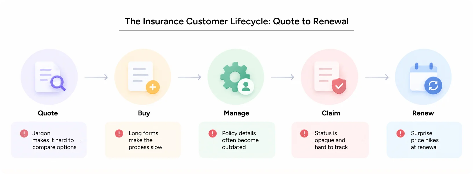
It is not the same as UI design. UI is how a screen looks: color, type, and buttons. UX is how the whole service works: what you ask for, in what order, and why. A beautiful claims screen still fails if it asks for a document nobody can find at midnight.
Insurance is harder than most categories for three reasons. The product is invisible until something goes wrong. The language is legal by default. And the stakes are emotional, financial, and sometimes medical. Good design treats all three as design problems, not compliance footnotes.
Why Does the Insurance Customer Experience Break Down?
Most broken experiences share the same root causes. They are rarely technology problems. They are decisions about what to ask, what to explain, and what to leave unsaid.
| Pain point | What customers feel | Design fix |
|---|---|---|
| Jargon-heavy policy wording | “I don’t know what I’m covered for.” | Plain-language summaries and coverage checkers |
| Long, repetitive forms | “Why are they asking this again?” | Prefill from existing records and progressive disclosure |
| Opaque claim status | “Has anyone even looked at this?” | Real-time tracker with named next steps |
| Channel breaks | “I had to explain everything twice.” | Shared case history across app, web, and call center |
| Surprise rejections | “They found a loophole.” | Upfront exclusions and pre-submission document checks |
| Legacy staff tools | Slow replies and repeated errors | Redesigned workflows for adjusters and agents |
The last row matters more than most teams admit. A poor customer experience often starts with a poor employee experience. If an adjuster needs six screens to find one policy detail, the customer waits.
In our experience, the biggest wins rarely come from new features. They come from removing steps. Every question you ask a stressed customer has a cost, and every unexplained delay erodes confidence in the brand.
Also Read – UX Audit Services: What’s Actually Included and When Your Product Needs One
How Can UX Design Simplify Insurance Claims?
The claim is the moment of truth in insurance. It is the only time most customers test the promise they paid for. Design it badly, and no marketing campaign can repair the damage to the insurance customer experience.
Speed has become the benchmark. US insurtech Lemonade made headlines by settling a claim in about three seconds. In India, IRDAI’s 2024 health insurance master circular requires cashless authorization decisions within one hour. Final discharge approval must follow within three hours. Regulation is now setting UX standards.
Design the Claim Flow Around the Incident
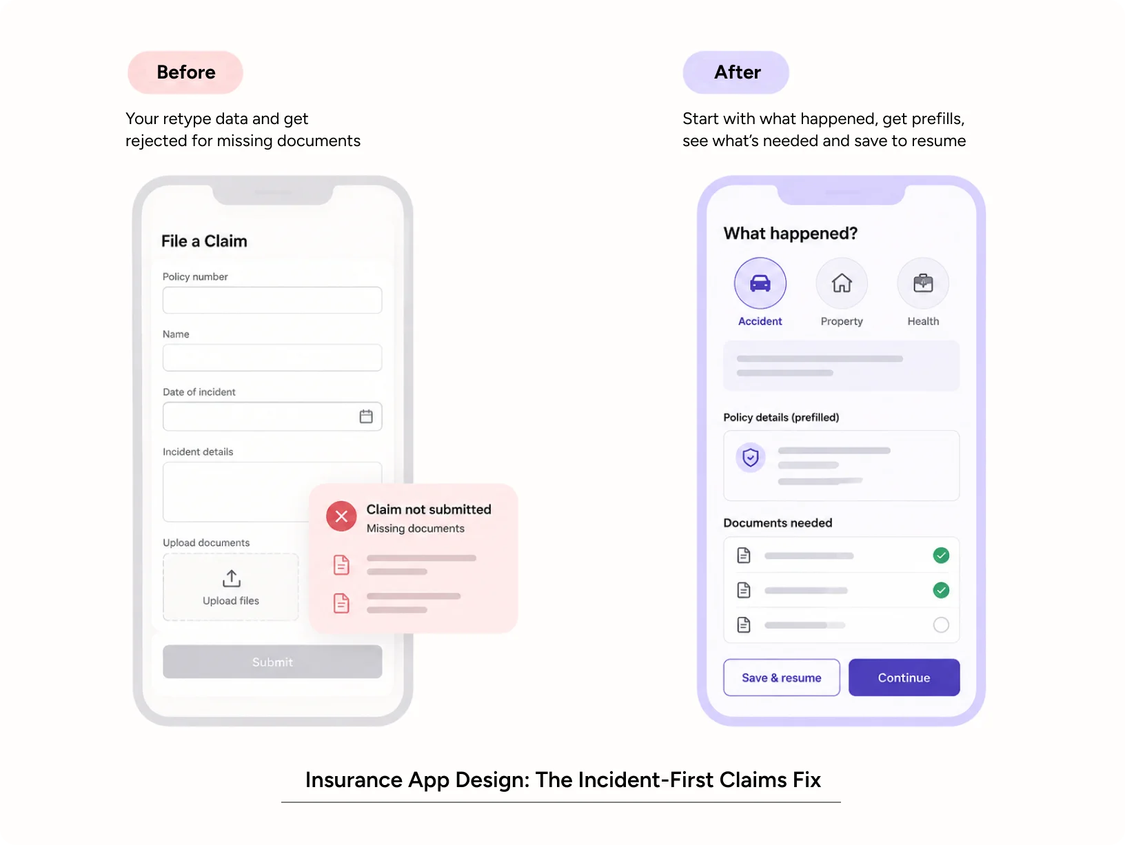
A good claims flow starts with what happened, not with the policy number. Let the customer pick the event first: accident, theft, hospitalization, or damage. Then show only the fields that event needs.
- Prefilled details pulled from the policy record, so customers confirm rather than type
- Guided photo capture with on-screen frames that show exactly what to shoot
- Document checklists shown before submission, so nothing bounces for a missing file
- Save and resume, because nobody finishes a hospital claim in one sitting
- Plain-language status like “Surveyor assigned, visiting Thursday” instead of “Claim in process”
Redesign the Claims Management System Adjusters Use
A customer-facing redesign only works if the claims management system behind it can keep up. Many insurers still run claims on platforms built 15 years ago. Adjusters jump between screens, re-key data, and chase approvals by email.
When we audit a claims management system, we map the adjuster’s day alongside the customer’s. Where the adjuster waits, the customer waits. Redesigning triage queues, decision screens, and document views often shortens settlement time more than any front-end change.
A modern claims management system should also automatically push status events to the customer
Each internal milestone, from survey to approval to payout, becomes a notification. That one change answers the most common call-center question before anyone dials.
How Should Online Policy Servicing Work?
Between purchase and claim, a policy sits quietly for months. This is where insurers lose customers without noticing. Renewal notices get ignored, nominee details go stale, and add-ons never get explained.
A well-designed policy management system turns that quiet period into a relationship. Customers should be able to view, change, and understand their cover without calling anyone.
What Should Policy Self-Service Include?
- A one-screen coverage summary: what’s covered, what isn’t, and the sum insured
- Instant downloads of policy documents, tax certificates, and ID cards
- Edits to address, nominee, and contact details with e-KYC verification
- Renewal reminders that show price changes and the reason behind them
- Side-by-side comparisons when upgrading or adding riders
Designing Policy Management Tools for Agents
A policy management system serves agents, underwriters, and service teams as much as customers. Agents need fast quoting, clean comparisons, and a view of each customer’s full portfolio. When the internal policy management system is cluttered, agents work around it with spreadsheets and WhatsApp messages. Data quality drops, and so does the insurance customer experience.
Explaining change is the most underrated pattern here. If a premium rises at renewal, say why. A short note like “Your premium rose 8% because you moved into a new age band” prevents a support call. It also prevents a quiet switch to a competitor.
Insurance Website Design: How to Build Trust Before Checkout
People hand insurers their health records, bank details, and family information. Trust isn’t a soft extra in this category. It is the product.
Digital trust comes from clarity, consistency, and control. Customers trust what they understand, what behaves the same way every time, and what lets them decide.
Good insurance website design answers the anxious question first: “Will this actually pay out?” That means showing claim settlement ratios, real turnaround times, and exclusions before checkout, not after.
Patterns that build confidence in insurance website design include:
- Plain-language plan comparisons instead of jargon-filled feature grids
- Visible regulatory details, such as IRDAI registration numbers for Indian insurers
- Transparent pricing that explains what drives the quote
- Real reviews and claim stories, not stock photos of smiling families
Quote flows deserve special care. Ask only what you need to price the risk, and explain why each sensitive question appears. A line like “We ask this to calculate your premium accurately” reduces drop-off at those fields.
Insurance App Design: What Policyholders Need on Good Days and Bad
Strong insurance app design makes the app useful on ordinary days, not just bad ones. Policy cards, wellness benefits, renewal tracking, and quick claim intimation give people reasons to open it. Simple navigation, less paperwork, and easy access to policy details can make insurance feel more useful every day.
Good insurance app design also respects context. Claims often begin on a roadside or in a hospital corridor. Large tap targets, offline drafts, regional language support, and one-tap calling to a human all matter. Biometric login and clear consent screens show customers their data is protected.
How to Design Trust Into AI-Driven Insurance Decisions
Many insurers now use AI for fraud checks, underwriting, and claim triage. That opens a new trust gap. Customers rarely leave because the model is wrong. They leave because they can’t see the reasoning behind the decision.
Explainable outcomes are a design job. Show the reason behind a decision, offer a path to a human reviewer, and never let automation feel like a dead end. Done well, AI speeds up the insurance customer experience without making it feel cold.
A 6-Step Insurance UX Design Process
Whether you’re fixing one flow or a full platform, this sequence keeps the work grounded in evidence.
- Research real moments. Interview recent claimants, agents, and adjusters. Watch how they actually use your products, not how process documents say they do.
- Map the end-to-end service. Chart every touchpoint across web, app, call center, branch, and the claims management system. Mark where handoffs fail.
- Run a UX audit. Evaluate current flows against usability heuristics and accessibility standards. Rank issues by business impact.
- Prioritize by pain and value. Fix the moments that drive complaints, drop-off, or churn first. A broken renewal flow usually beats a new feature.
- Prototype and test. Test with real customers, including older users and people on low-end phones. Iterate before any production code is written.
- Build a design system. Shared components keep insurance website design and insurance app design consistent across products and teams.
This is how design moves from opinion to evidence. Each step produces something you can measure.
How to Measure the Insurance Customer Experience
Design investment should show up in numbers leadership already tracks. These metrics connect UX changes to business outcomes.
| Metric | What it tells you |
|---|---|
| Quote-to-purchase conversion | Whether buying flows feel clear and trustworthy |
| Claim intimation completion rate | Whether customers can start a claim without help |
| Average claim settlement time | Whether front-end and back-end flows work together |
| Repeat contacts per claim | Whether status updates answer questions before customers ask |
| Renewal rate | Whether the policy period builds loyalty or erodes it |
| Post-claim NPS and CSAT | How the experience feels at its most critical moment |
| Self-service adoption | Whether the policy management system reduces service load |
Track these before you start. A baseline turns design work into a business case.
Case Study: How YUJ Helped StubHub Increase Conversion by 4.4%
The challenge: The largest secondary ticket marketplace in the US had confusing seat maps, redundant labels, and unintuitive categories. Buyers struggled to complete purchases.
What YUJ did: User research, concept design, and user testing to streamline the entire buying flow.
The outcome: Overall conversion rose 4.4%. StubHub’s senior product manager credited the seat selection redesign with a USD 117M return on investment.
Why it matters for insurers: Quote-and-buy flows fail for the same reasons. Unclear options and confusing labels make people abandon. Fix the flow, and revenue follows.
Read more: StubHub case study
How to Choose an Insurance UX Design Agency
The right partner understands regulation, legacy systems, and human stress at the same time. Ask these questions before you sign:
- Have they designed for regulated sectors like banking or healthcare?
- Do they research with real policyholders, or design from assumptions?
- Can they redesign internal tools such as a claims management system, not just customer screens?
- Do they measure success against your business metrics?
- Can they connect design decisions to privacy rules like India’s DPDP Act?
YUJ Designs has spent more than 25 years designing enterprise products for banking, healthcare, automotive, and retail clients across India and the US. That depth is what insurance problems demand: research-led, evidence-first, and comfortable with complexity.
Conclusion
Insurance is a promise people can’t see until they need it. Design is how that promise becomes visible, from the first quote to the final payout.
The insurers winning today treat the insurance customer experience as a core product, not a support function. They simplify claims, make policies understandable, and earn trust through transparency. If your claims flow, insurance website design, or insurance app design is losing customers, start with research.

FAQs