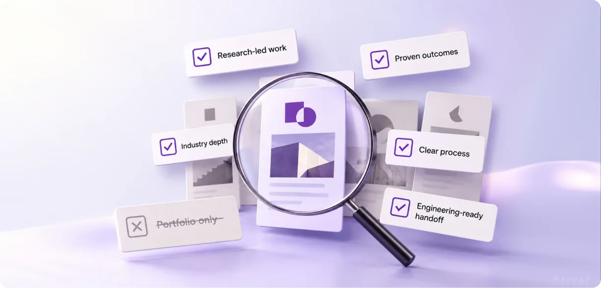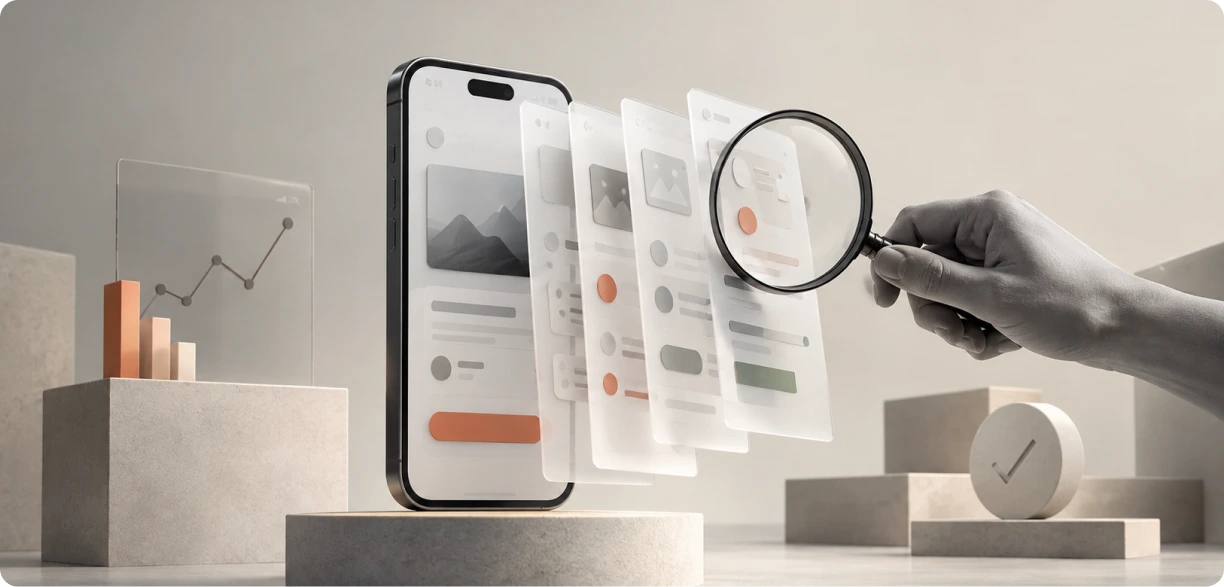
People mix these two up constantly, so let’s sort it out first. A UX competitive audit checks your product against direct competitors: usability, flows, interface, all of it. A UX design audit looks inward instead, at your own screens, for accessibility, consistency, and how efficiently people actually get things done. Run both, and you’ll know exactly where users struggle and what the best products in your category are doing better than you.
Why a UX Competitive Audit Matters
A product manager told our team once that his churn numbers looked fine. On paper, anyway. Then the session data told a different story. Users were opening a competitor’s app the same week they opened his, comparing screens side by side, and quietly switching over. Nobody at his company had run a UX competitive audit to figure out why. Most companies still haven’t, honestly.
It feels like an extra step when you already have a backlog. But you can build a product that works perfectly fine and still lose users to a rival with a clearer flow, a faster checkout, or a page people just trust more, and your analytics dashboard won’t tell you why.
So, this is what we’re covering. What that inward-looking review actually includes. Why benchmarking your category matters for both usability and revenue. How to run the whole thing yourself, without hiring a research firm. We’ll also share a real project we completed for a USA-based airline.
UX Audit vs UX Design Audit: Core Principles
What this process actually involves
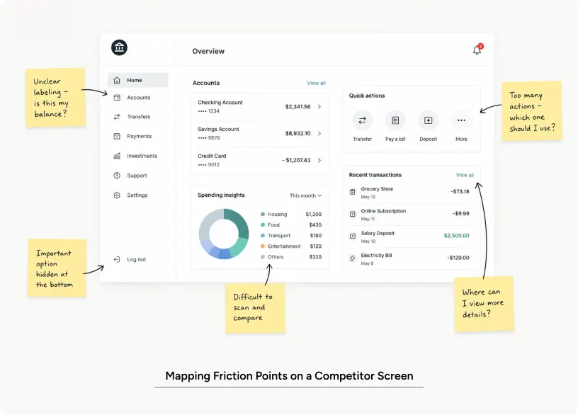
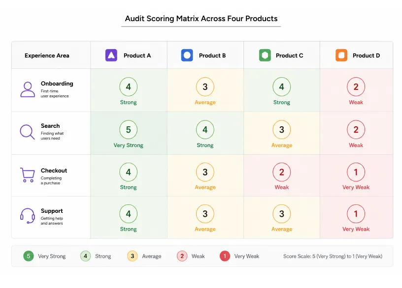
Take two to five direct or related competitors. Test the same tasks on all of them. Score everything against the same criteria. That’s a UX competitive audit, more or less. It maps flows, interface patterns, content clarity, and points of friction. The point isn’t to copy whoever’s winning. It’s to find where your users get a worse deal than they’d get elsewhere, and, just as important, where you’re already ahead of them.
Then there’s the UX design audit, which people confuse with the first one constantly, even though it’s a different exercise entirely. Instead of comparing you to competitors, it checks your own product against usability heuristics, accessibility standards, and internal consistency. Run both together, and you get better results than either gives you alone. One finds what’s broken inside your product. The other tells you how that compares to what’s already out there.
Types of audits you’ll encounter
Not every UX audit looks the same, and honestly the terminology gets murky fast. A heuristic evaluation is expert reviewers checking screens against established usability principles, with no real users involved at all. Comparative benchmarking is a direct UX competitive audit measuring specific tasks, signup or checkout, for instance, across several products at once. A full UX design audit goes wider still, covering information architecture, visual hierarchy, and interaction patterns in a single pass. An accessibility-focused design audit narrows in on exactly one thing: contrast, keyboard navigation, screen-reader compatibility, nothing else.
A usability audit sticks to task completion and error rates alone. A web design audit, or a website design audit if you’d rather call it that, goes further, reviewing page load speed, content structure, and SEO basics right alongside the visual design.
Core principles
Three things matter here, and I’ve watched teams skip at least one almost every time. Test real tasks, not just screens. A login flow means nothing on its own, without the friction a user actually hits while trying to get through it. Keep the scoring criteria identical across every product you review, or the whole comparison falls apart. And tie every finding to a business metric, whether that’s drop-off rate, time on task, or straight conversion. Skip that last part and a UX design audit is just an opinion in a nicer outfit.
Also Read: UX Audit Services: What’s Actually Included and When Your Product Needs One
Why It Matters: Impact & Common Mistakes
Impact on user experience
Users rarely explain why one product feels easier than another. They just notice. Then they leave, and you’re stuck guessing why. Run a proper UX audit, and the actual cause tends to show up fast: too many steps in a form, unclear labels, a navigation pattern that breaks whatever people already expect from every other app on their phone. A usability audit catches cognitive load problems before they turn into a wave of support tickets. Accessibility gaps found during a website design audit usually affect more of your audience than teams expect going in. That one surprises people every time.
Impact on business metrics
Numbers make this an easy sell, which is probably why finance likes a UX competitive audit more than most design work. Teams benchmarking against category leaders usually turn up three or four quick wins that lift conversion inside a single sprint. Here’s a real one. On a recent project, a UX design audit we ran for a B2B SaaS client uncovered mobile performance and accessibility gaps nobody had flagged before. Fixing them cut load time by 40%, dropped bounce rate by 18%, and lifted conversion on key user flows by 25%. Not bad for a few weeks of work.
A website design audit that includes page speed tends to surface this exact link between load time and bounce rate. Mobile especially.
Common mistakes to avoid
The same mistakes keep showing up.
Teams run a web design audit once, file it as done, then act surprised six months later when the findings feel stale. They always do. Others compare themselves only to competitors in their own category and miss whatever’s actually shaping user expectations right now. A food delivery app like Swiggy or Zomato can quietly set the bar for onboarding, even in a completely unrelated industry. And then there’s the audit that never gets acted on. Run a design audit without putting a name on the follow-up, and the report just sits in a drive folder gathering dust. I have watched this happen more times than I can count.
How to apply it: a practical guide
Step-by-step workflow
Running a UX competitive audit doesn’t take a big team or an expensive toolkit. It really doesn’t. Here’s roughly how we do it.
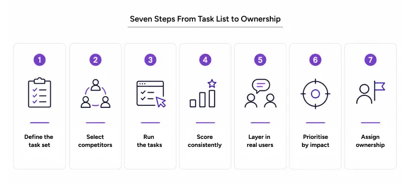
- Define the task set. Pick three to five core user tasks: sign up, search, checkout, whatever matters most for your product.
- Select your comparison set. Choose two to five competitors, including at least one product outside your immediate category that users compare you to anyway.
- Run the tasks yourself. Complete each task on every product and log every point of friction, confusion, or, occasionally, delight.
- Score consistently. Use the same rubric across all products for a fair UX design audit comparison.
- Layer in a usability audit. Bring in five to eight real users to complete the same tasks and record where they hesitate or fail.
- Prioritize findings by impact. Rank issues by how many users they affect and how directly they touch revenue.
- Assign ownership. Every finding needs a name attached, or it won’t ship. This step gets skipped constantly, and it shows.
Pro tips from Yuj Designs
- Pair it with real analytics: Expert opinion alone isn’t enough for a thorough website design audit, no matter how sharp the reviewer is.
- Test on real devices and speeds: A web design audit run on fast office Wi-Fi won’t reflect what actual users experience.
- Revisit it every quarter: Treat a UX design audit as ongoing, not one-and-done, especially right after a competitor ships a redesign.
Tools and resources
Screen recording tools capture what actually happens during a task. Heuristic checklists, Nielsen’s ten principles being the obvious one, give reviewers a decent starting point. Nothing really beats watching a real person get stuck, though. Analytics platforms tie usability findings back to funnel data. A basic spreadsheet is often enough to score and track a UX audit across several products at once. The discipline matters more than whatever tool ends up in the spreadsheet.
Real-world applications
A UX competitive audit proves its worth most clearly in complex, high-stakes products, the kind where a small usability gap costs real money fast. Yuj Designs worked with Alaska Airlines to redesign SpotOn, a support hub used by pilots, flight attendants, and ground crew to sort out technical issues during live operations. The old process left staff without any fast, central way to get help between flights. Sounds minor until you’re the one standing there waiting.
We ran research alongside a UX design audit of the existing crew workflow. It showed exactly where staff was losing time, and where a competing internal tool simply worked faster and felt easier to use. The redesign delivered a mobile and web experience built around one goal: staff could get help without any prior training, mid-shift, under real pressure. Alaska Airlines’ Employee Experience Manager later said it was the team’s ownership of the project, not just the execution, that actually made the difference.
Read more: Alaska Airlines Case Study
Conclusion
Your product doesn’t exist in a vacuum for the people using it. It never has. They compare it, often without realizing they’re even doing it, to every other well-designed app already sitting on their phone. A UX competitive audit puts that comparison in your hands instead of leaving it up to chance. Pair it with a thorough UX design audit, and vague complaints stop being vague. They become a plan someone can actually fund.
Teams that treat a UX audit as an ongoing habit, not a one-off report, keep up as their category shifts under them. Run a website design audit once a quarter and small problems get caught while they’re still small, before they turn into lost users. That’s really the whole difference between reacting to lost users and staying ahead of them.
Yuj Designs has spent 17 years running exactly this kind of research for enterprise product teams across fintech, healthcare, and B2B software, out of our offices in the US and India. We know where users stall, because we’ve watched thousands of them try.

FAQs