
E-commerce UX is how an online store guides a shopper from first click to paid order with the least friction. Strong ecommerce UX design shapes product pages, search, and checkout so people buy without second-guessing. Good ecommerce usability lifts conversion, cuts cart abandonment, and turns one-time buyers into returning ones.
Why do most stores lose sales?
You built a beautiful e-commerce website. The traffic shows up. Then most visitors leave without making a purchase.
That gap is rarely a traffic problem. It is usually an e-commerce UX problem. Somewhere between the product page and the “Pay now” button, people hit a moment of doubt, and doubt is where sales quietly die.
Here’s the part that surprises founders. Great product photos and competitive pricing aren’t always enough. A confusing size selector or even a small hurdle at checkout can send buyers elsewhere. Shoppers don’t owe you patience. They leave.
This post walks through the design patterns that keep people moving toward purchase. Not theory. The specific decisions on product pages and checkouts that we at YUJ Designs see move conversion in real client projects.
What does e-commerce UX actually mean?
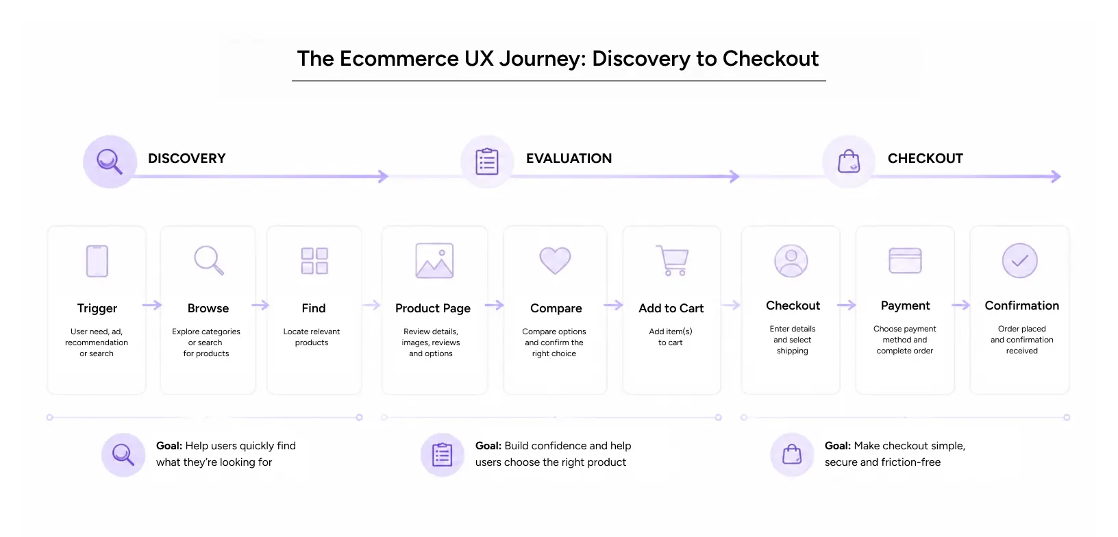
E-commerce UX design is the practice of designing the full shopping experience so buying feels obvious. It covers how people find products, judge them, trust them, and pay for them. Interface polish is one small slice of that. The rest is structure, sequence, and clarity.
People confuse this with visual design all the time. An e-commerce website can look premium and still frustrate users. E-commerce usability is the measure that matters here: can a first-time visitor complete a purchase without help, without hesitation, and without giving up?
The main layers of the experience
There are a few distinct layers, and each one can leak sales on its own.
Discovery is how shoppers land and browse. This is where landing page UX design earns its keep, because a weak landing page loses people before they ever see a product. Evaluation is the product page, where a buyer decides if this is the right item. Decision is the cart and checkout, where intent either converts or evaporates.
A store can be excellent at one layer and terrible at another. That is why we audit all three before touching pixels.
Core principles that hold across every store
A few rules tend to survive across industries and price points.
Reduce the number of choices a person makes at once. Show the next step clearly. Never make someone re-enter information they already gave you. Keep the price honest and visible so nothing surprises them at the end. These sound basic. Most stores break at least two of them.
Why does it matter for users and revenue?
What does it do for the shopper?
A well-designed e-commerce website lowers mental effort. Shoppers do not have to figure out how your filters work or where the shipping cost is hiding. They can focus on the thing they came to do, which is to buy.
That calm feeling has a business name: trust. When a checkout behaves the way people expect, they feel safe handing over card details. When it behaves oddly, they assume the website isn’t trustworthy. E-commerce UX work is, in large part, trust work.
What it does for the numbers
Better ecommerce usability shows up directly in the metrics leadership cares about. Higher add-to-cart rates. Fewer abandoned carts. More returning customers who did not need to relearn the store. Lower support tickets from people stuck at payment.
Retailers in the United States lose enormous revenue to preventable checkout friction every year. A hired e-commerce UX agency usually finds that most of the lift is not in redesigning the brand. It sits in three or four checkout screens that quietly reject buyers.
The mistakes we see most
Some patterns fail so often that they are almost predictable.
Forcing account creation before checkout is a classic. Hiding shipping costs until the final screen is another. Cramming a product page with badges, popups, and upsells until the buy button drowns. Filters that reload the whole page and lose your place. Each of these feels small in isolation. Together, they are why the cart sits full and empty at the same time.
Also read: 2026: Agentic AI Moves from Experimentation to Enterprise
Ecommerce UX Patterns Behind Product Pages That Convert
The product page is where most buying decisions get made. Get it right, and the rest gets easier.
Lead with images that answer real questions. People want scale, texture, and how the thing looks in use, not just a floating studio shot. Put the price, availability, and delivery estimate where the eye lands first. Make the primary action, usually “Add to Cart,” the loudest element on the screen.
Variant selection is where a lot of e-commerce UX design quietly falls apart. Size, color, and quantity should be easy to pick and hard to get wrong. Grey out what is out of stock instead of letting people select it and fail later.
Reviews belong near the decision, not buried at the bottom. Social proof works best when a hesitant buyer sees it at the exact moment they are weighing the choice.
If you run on Shopify, a Shopify design system helps enormously here. Consistent components across every product template mean shoppers learn your store once and apply that knowledge everywhere. A good Shopify design system also keeps your team from reinventing the buy button on every page, which is how inconsistency creeps in.
Ecommerce UX Patterns Behind Checkouts That Convert
Checkout is the highest-stakes screen you own. Every extra field is a chance to lose the sale.
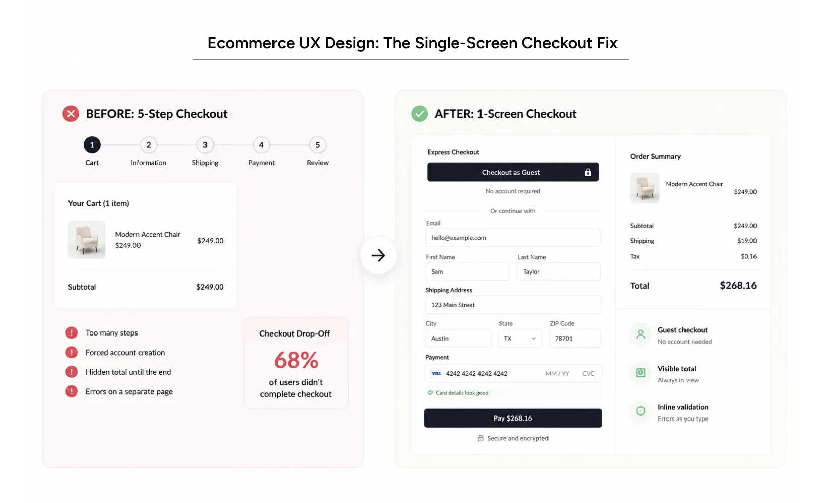
Offer guest checkout. Always. You can invite people to create an account after they have paid, when the risk of losing them is gone. Show the full cost early, including shipping and tax, so the total on the final screen matches what people expected.
Cut steps ruthlessly. A checkout that fits on one well-organized screen usually beats a five-step wizard. Autofill address fields. Validate errors inline, next to the field, in plain language, not with a red banner at the top that makes people hunt for the mistake.
On mobile, this matters even more. Thumbs are clumsy, and patience is thin. Large tap targets, a numeric keypad for card entry, and a visible progress cue all reduce the small frustrations that add up to abandonment. This is where landing page UX design and checkout design have to agree, because a promo landing page that dumps people into a mismatched checkout breaks the momentum you paid to create.
Also Read: Navigating the Agentic Era: Redefining UX for Real-World Impact
How to apply this to your own e-commerce website?
You do not need a full rebuild to see movement. Start with what is losing money now.
First, watch real sessions. Recordings and analytics show you where people drop off, not where you assume they do. Second, run a focused e-commerce usability test with five to eight actual shoppers trying to buy something. You will learn more in an afternoon than in a month of internal debate.
Then fix in order of impact. Check out friction first, because that is closest to the money. Product page clarity next. Discovery and landing page UX design after that. Ship one change at a time so you can tell what actually worked.
A simple workflow
Map the current buying flow. Find the friction with data and testing. Redesign the worst screen. Test the new version against the old one. Keep what wins and move to the next screen.
A few things we have learned the hard way
Do not A/B test tiny tweaks when the whole flow is broken; fix the flow first. Do not add a chatbot to paper over a confusing page; fix the page. And resist the urge to personalize before the basics work, because a personalized version of a broken experience is still broken.
For tooling, Figma covers design and prototyping, and analytics platforms plus session recording tools cover the evidence. If you are on Shopify, invest early in a Shopify design system so every new page inherits patterns that already convert. Teams that skip this end up with ten slightly different product pages and no idea which one to trust.
Real results: How StubHub Achieved USD 117M ROI
StubHub is the largest online secondary ticket marketplace in the United States, owned by eBay. They came to YUJ Designs with a familiar problem: rich pages, plenty of features, and conversion that had stalled. Confusing labels, unintuitive categories, and a static seat-selection flow made buying tickets harder than it needed to be.
We ran user research, mapped the real task flow, and rebuilt the buying experience around discoverability and speed. We regrouped information, redesigned key micro-interactions, and cut steps wherever they were not earning their place. Working with a partner, we designed a dynamic seat map that let buyers feel the view, seat, and price before committing.
The redesign lifted overall conversion by 4.4%, increased sales by 10.6%, and helped StubHub reach an ROI of USD $117M.
Conclusion
Product pages and checkouts are not decoration. They are the parts of the store where money is won or lost, one small decision at a time. When you remove doubt, show the next step, and respect a shopper’s time, conversion follows.
You do not have to guess at any of this. The patterns are known, the friction is measurable, and the fixes are usually smaller than a full redesign. Watch how people actually shop, fix the screen closest to the money, and repeat.
That is the work an ecommerce UX agency like YUJ Designs should do with you, and it is the work that separates a store people admire from a store people buy from. Design experiences your users feel, not just see.

FAQs