Quick Answer
UI vs UX refers to two core disciplines in product design. UI (User Interface) covers the visual layer, buttons, colors, typography, and interactive elements. UX (User Experience) covers the structural layer research, user flows, usability, and information architecture. Both are essential: UI shapes how a product looks, while UX shapes how well it actually works.
Introduction: 25% of Apps Are Used Just Once. Here’s Why.
One in four apps is downloaded once and never opened again. That figure, documented across global app stores, is not about bad engineering or poor marketing. In most of those cases, the product worked. It launched without critical bugs. The design team spent weeks making it look polished.
The problem was simpler and more expensive. Users opened the app, could not figure out what to do, and left. The interface was well-designed. The experience was broken. The team never drew a clear line between those two things.
That gap is the cost of treating UI and UX as interchangeable disciplines. This post draws a clear line between them, explains the six UX design principles that govern every strong product, and walks through the design process that prevents the expensive rework that comes from getting the sequence wrong.
What Is UX and UI Design, Really?
To understand what is ux and ui design, you need to separate the two disciplines first and then see how they connect.
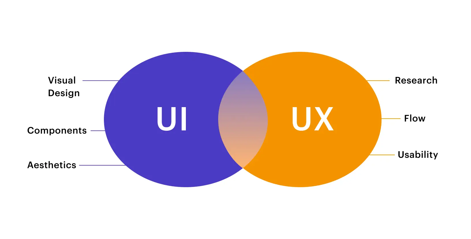
UI stands for User Interface. It covers every visual and interactive element a user encounters on screen. Buttons, form fields, color palettes, icon sets, card components, navigation bars, micro-animations, loading states are all UI. The UI designer’s question is: Does this product look right, feel right, and guide the user visually?
UX stands for User Experience. It covers the entire journey a user takes while interacting with a product, from the first impression to the final action. UX includes research, information architecture, user flows, wireframing, and usability validation. The UX designer’s question is: Does this product solve the user’s problem efficiently, logically, and without frustration?
That is the ui vs ux meaning in plain terms. UI is the surface. UX is the structure underneath.
Here is an analogy that actually fits. Think about ordering food on Zomato or Swiggy. The UX is everything that makes the experience logical: the search that surfaces relevant results, the menu layout that makes your options scannable, the checkout flow that does not make you re-enter your address every time.
The UI is everything that makes it feel good: the food photography, the button colors, the smooth scroll animation, and the brand typography that makes the whole thing feel trustworthy. One without the other fails in a different but equally costly way.
The quick-reference comparison:
| UI Design | UX Design | |
|---|---|---|
| Stands for | User Interface | User Experience |
| Focus | Visual & interactive elements | Flow, logic & user satisfaction |
| Primary question | Does it look and feel right? | Does it work and solve the problem? |
| Key deliverables | Design system, visual mockups, prototypes | User research, journey maps, wireframes |
| Primary tools | Figma, Adobe XD, Principle | Figma, Maze, Hotjar, Miro |
| Comes first? | No — follows UX validation | Yes — always starts here |
| Measured by | Visual consistency, accessibility scores | Task completion rate, NPS, retention |
This table alone is worth bookmarking. When a stakeholder asks you to explain ui vs ux meaning, show them this.
Types and Variations
What is ux vs ui in terms of range?
Both disciplines have meaningful sub-disciplines.
1. On the UX side
UX research, UX strategy, information architecture, interaction design, content design, and service design. Each is a field of its own. Senior UX roles typically specialize in one or two of these areas rather than covering all.
2. On the UI side
visual design, motion design, component and design system work, accessibility design, and responsive design across breakpoints. Again, senior UI practitioners often specialize in a motion designer and a design systems lead require very different skillsets.
Core UX Design Principles
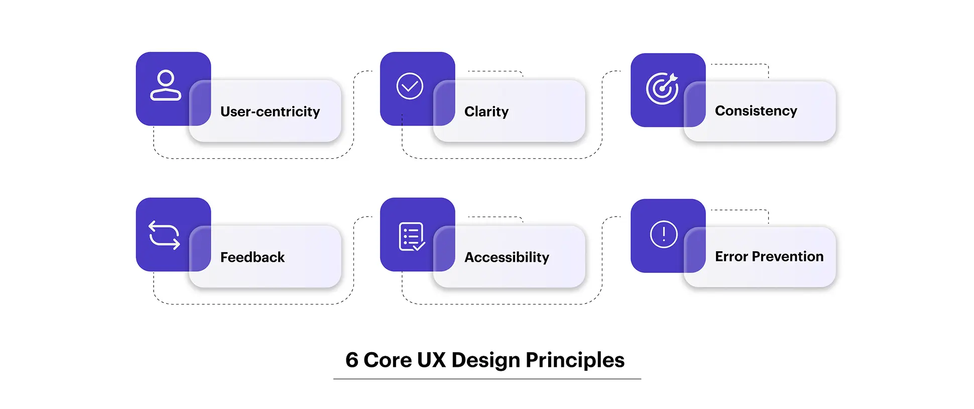
The ux design principles that anchor strong product work are not guidelines for designers alone. They are the logic that every product decision should be tested against.
1. User-centricity
is the non-negotiable foundation. Don Norman, who coined the term “User Experience” while working at Apple in the early 1990s, built his entire framework around one idea: design must start with the human, not the technology. Every feature you ship, every flow you redesign, every screen you simplify, has to trace back to a real user need that research has validated, not a stakeholder assumption.
2. Clarity over cleverness.
The best UX design decisions are invisible. When a navigation system is perfectly logical, users don’t notice the navigation; they just find what they need. Clever interactions that require a learning curve fail this principle every time.
3. Consistency
builds trust faster than almost anything else in digital products. When users can predict how your product behaves, where the back button lives, how errors are communicated, and what a primary CTA looks like, they spend less mental energy on the interface and more on their actual goal.
4. Feedback and response.
Every action a user takes needs a visible, immediate response. A tap that does nothing feels broken. A form submission with no confirmation creates anxiety. Micro-interactions that acknowledge user input are not a design luxury; they are a communication requirement.
5. Accessibility as a baseline.
The ux design principles that define inclusive design, such as sufficient contrast ratios, keyboard navigability, screen reader support, and scalable text, are not enhancements. They are the price of admission for products that claim to be well-designed.
Error prevention before error recovery. The strongest product teams design to prevent errors rather than just handle them gracefully. Inline validation, confirmation dialogs before destructive actions, and clear affordances that signal what is interactive all reduce the rate of user error before it becomes expensive.
Also Read: Why Complex Organizations Can’t Scale Without Strong Design Teams
The Real Cost of Getting This Wrong
What Users Experience
Poor UX creates cognitive load. Users spend mental energy figuring out what to do instead of doing it. Confusing navigation, unclear error states, and illogical form sequences compound these issues. Users rarely consciously diagnose “bad UX.” They feel frustrated. They leave. According to UXCam, 91% of dissatisfied users abandon a product rather than complain. Your feedback channels will not tell you this is happening. Your retention data will.
Poor UI creates a trust deficit. Low-contrast text strains the eyes. Visual inconsistency signals a lack of care. Cluttered screens overwhelm users before they have engaged with a single feature. In fintech products serving users in Mumbai and across India, that visual hesitation has a direct conversion cost.
What the Business Numbers Show
Forrester Research found that every dollar invested in UX design returns approximately $100. McKinsey’s Design Index tracked 300 companies over five years and found that businesses in the top design quartile grew revenue 32% faster than industry peers and delivered 56% higher total shareholder returns.
These are not design-industry arguments. They are board-level outcomes. And they trace back to product decisions made or skipped during the design process.
Common Mistakes to Avoid
The most expensive mistake is treating ui vs ux as a sequential handoff. UX does research, throws wireframes to UI, UI produces screens, and everyone moves on. There is no feedback loop. By launch, the research is six months old, and nobody has tested anything with a real user since the wireframe stage.
The second most common mistake is skipping discovery entirely in favor of moving fast. Teams jump from idea to Figma screens in days. They ship something that looks finished and functions like a rough draft. The redesign costs three times more than the research would have.
The third mistake is measuring design success by stakeholder approval rather than user behavior. A design that delights the CEO and confuses the user has failed, regardless of how the review meeting went.
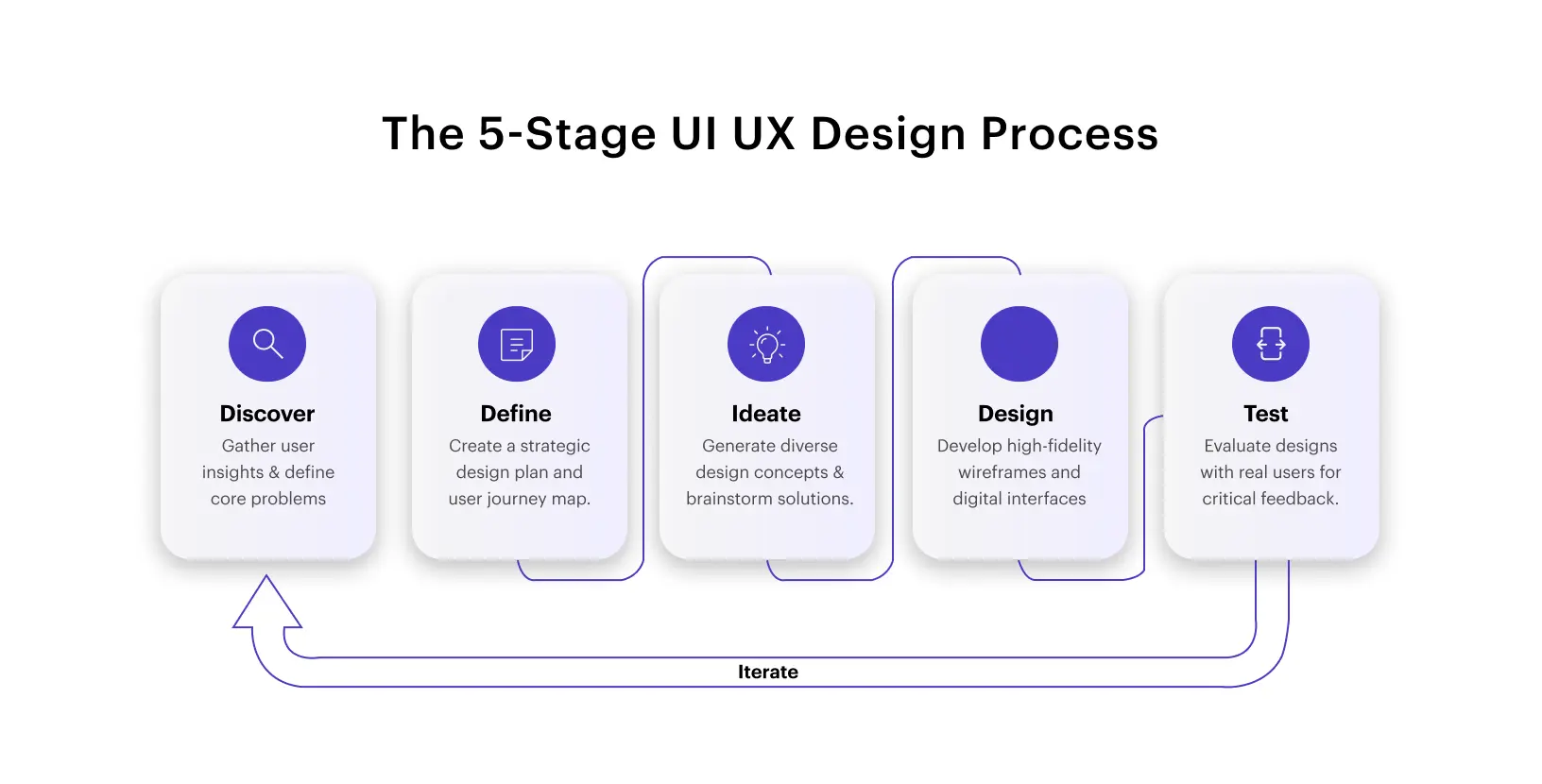
The UI UX Design Process, Step by Step
Step-by-Step Workflow
The full ui ux design process runs through five stages. The order is not negotiable, but the iteration within and between stages is what separates average teams from exceptional ones.
Stage 1: Discovery and Research. This is where the ui ux design process either succeeds or fails. Before anyone opens Figma, the team needs to understand the problem. User interviews, contextual inquiry, competitive analysis, analytics review, and jobs-to-be-done mapping all belong here. The output is not a slide deck; it is a shared understanding of who the user is, what they are trying to accomplish, and where current solutions are failing them.
Stage 2: Define and Synthesize. Raw research becomes decisions. User personas are built from behavioral patterns, not demographic assumptions. Journey maps expose where users succeed, struggle, and abandon. Problem statements are written. Crucially, the team agrees on what problem to solve before anyone starts designing solutions. This is the most skipped stage in the ui ux design process, and its absence is why so many products ship features users never asked for.
Stage 3: Ideation and Wireframing. Low-fidelity wireframes and quick sketches explore structural directions quickly and cheaply. This is pure UX territory. The goal is not to make anything look good; it is to test logic, flow, and information hierarchy with the minimum possible investment. Five users navigating a grayscale wireframe will reveal more than a hundred users looking at a finished screen.
Stage 4: Visual Design and Prototyping. Once the UX structure is validated, UI design takes over. The design system is applied: color tokens, typography scale, component behavior, spacing rules, iconography, and motion principles. Interactive prototypes are built so that stakeholders, developers, and users can experience the product before a single line of code is written. This stage is also where accessibility review happens, not after development, when it is expensive to fix.
Stage 5: Testing and Iteration. Usability tests, A/B experiments, heatmaps, and session recordings generate data that feeds back into design. The ui ux design process is a loop, not a line. Products that ship once and never revisit the design lose ground to competitors who iterate continuously based on real user data.
Also Read: Gamifying AI with Octalysis: Designing Motivation in Intelligent Systems
Where UI vs UX Plays Out in Practice
Case-Based Examples
1. The Ticketing Marketplace That Was Losing Conversions Despite a Feature-Rich Experience
One of the largest online secondary ticketing marketplaces in the United States had a platform packed with content, yet conversion had stagnated. The core friction: a confusing seat selection flow, poor event schedule representation, and unintuitive content categorization that made the buying journey feel like work.
The redesign was driven by user research and testing. Information was regrouped, steps reduced, and a dynamic seat map was introduced, giving buyers real-time visibility into row configuration, seat view, and live pricing in one fluid interaction.
The result: a 4.4% increase in conversion rate, a 10.6% increase in total sales, and a verified ROI of USD $117 million.
2. The Airline That Had the Tools But Not the Experience to Use Them
A leading American airline was equipping ground staff with more mobile devices than ever, but when technical issues arose, there was no fast or intuitive way to resolve them. IT support was slow and fragmented, pulling pilots, flight attendants, and service agents away from their core responsibilities.
The solution combined a physical on-ground technology hub with a companion web and mobile app designed to require zero prior training. Staff could walk in, instantly locate the space through purposeful signage, flag issues, and get fast resolutions from an embedded IT team.
The impact: meaningfully faster response times and a ground operations team that could stay focused on what actually mattered.
Industry Use Cases
Fintech. In financial products, trust is the product. The ui ux design process in fintech must balance security communication with simplicity, so users need to feel safe without feeling interrogated. Every friction point in a payment flow is a potential drop-off. Every inconsistency in UI erodes the trust that financial products depend on.
Healthcare. In healthcare applications, what is ux vs ui is potentially a matter of patient outcomes. Poor navigation in a symptom checker or medication reminder can cause real harm. Accessibility is not optional; elderly users, users with low digital literacy, and users managing stress or illness all need products that are forgiving, clear, and consistent.
SaaS. In SaaS, the ui ux design process directly drives Net Revenue Retention. Features users can’t find generate support tickets and churn. Features users can’t understand generate churned accounts. The companies winning in SaaS are those treating design as a product function, not a finishing step.
E-commerce. A 1% improvement in checkout conversion on a ?100 Cr revenue business adds ?1 Cr in annual revenue without increasing marketing spend. That is the concrete answer to what a ui ux designer is worth to an e-commerce business.
Also Read: 2026: Agentic AI Moves from Experimentation to Enterprise
Conclusion
Here is what every product team, founder, and designer should walk away knowing:
UI is what users see. UX is what users feel. The ui vs ux meaning distinction is not semantic; it determines how you staff your team, sequence your work, and measure success.
UX always comes before UI. Validating structure before building visuals is what separates teams that ship right from teams that redesign after launch.
The full ui ux design process is iterative, not linear. Discovery, Define, Ideate, Design, Test, and then do it again with new data.
Applying strong ux design principles is a business decision, not a design preference. User-centricity, consistency, accessibility, and feedback loops drive conversion, retention, and brand trust.
Understanding what a ui ux designer is matters more than ever. Whether you hire a hybrid or a specialist depends on your stage and complexity, but you always need someone who treats both disciplines with the depth they deserve.
At YUJ Designs, we’ve spent years applying this thinking to real products across fintech, healthtech, SaaS, and enterprise, measuring success not by how good the screens looked in a handoff deck, but by how well users moved through what we built.
That is what is ux and ui design looks like when it is done for the right reasons.
FAQs