Have you ever wondered how design can influence your users? Can design help users discover what they want, ignore what they shouldn’t be seeing and get their tasks done with easy?
The answer lies in the science part of design – the principles of human cognition. These principles act as solid guide to avoid basic pitfalls in design.
Here, lets take a look at some of these:
Serial Positioning Effect
Given a list of choices in a sequence, you are likely to remember initial and last items. Ever wondered why this happens?
If I ask you to read the list of few items :
- Dish
- Butter
- Spoon
- Bottle
- Knife
- Milk
- Sugar
- Fork
- Jar
- Salt
- Sauce
- Oregano
And than ask you to say all the things I listed above, chances are :
– You will recall the initial few items in right sequence and then
– Recall most recent items, which are the end of the list.
Takeaway points : Maximize the recall by presenting important items at the beginning of a list than middle. When the list is visual, present important items at the beginning of the list. When the list is auditory, present important items at the end.
This principle is very useful when the decision is to be made immediately after presenting list items. By putting the items at the end of the list, it’s probability of selection increases.
Picture Superiority Effect
How often do we make card payment online?
When we were new to this process, we went back to check our cards and typed into fields. And of course it took us little time to know where the CVV number is located.

Could it be done in more efficient way? Where the person will know exactly what he is referring from credit/debit card and where he has to enter the information.
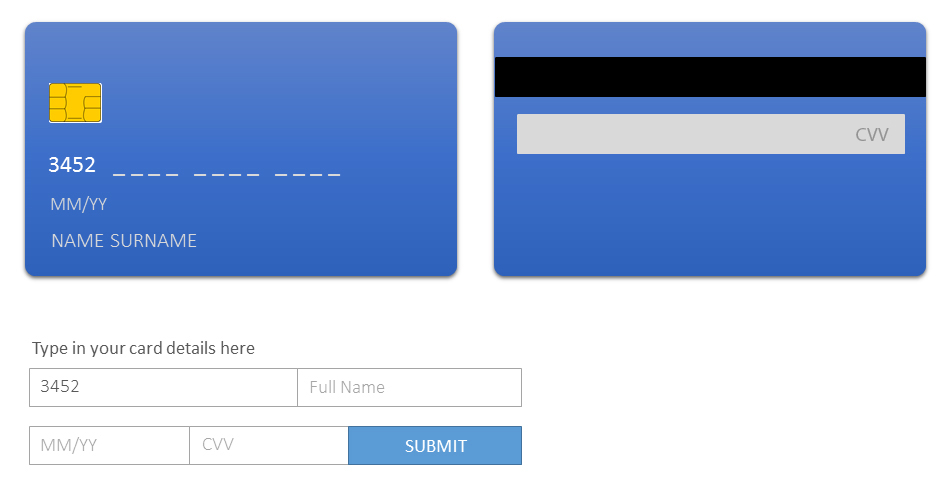
This example along with usage of image makes it definitely more efficient and interesting.
“Pictures are remembered better than words.”
Picture superiority effect is helpful when people are exposed to information and the exposure time is limited. Usage of images along with the information can direct the attention of observer to intended areas. Pictures are useful for increasing the recognition and recall of key information.
Signal to Noise Ratio
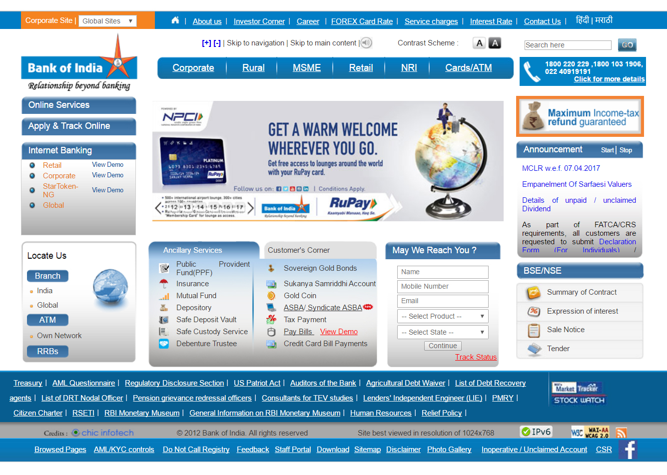
This bank website has several services and information to show upfront on the homepage. Too much text, call to action, graphic elements makes it looks overwhelming. It makes things hard for visitors to understand since attention of the viewer is directed to multiples piece of information. Is there a way design could help users find what they want and get started sooner.
You must have come across graphs showing relation of many data points. Graphs are good way of showing information. Success of showing the information in this way lies in making that information stand out in clear way.
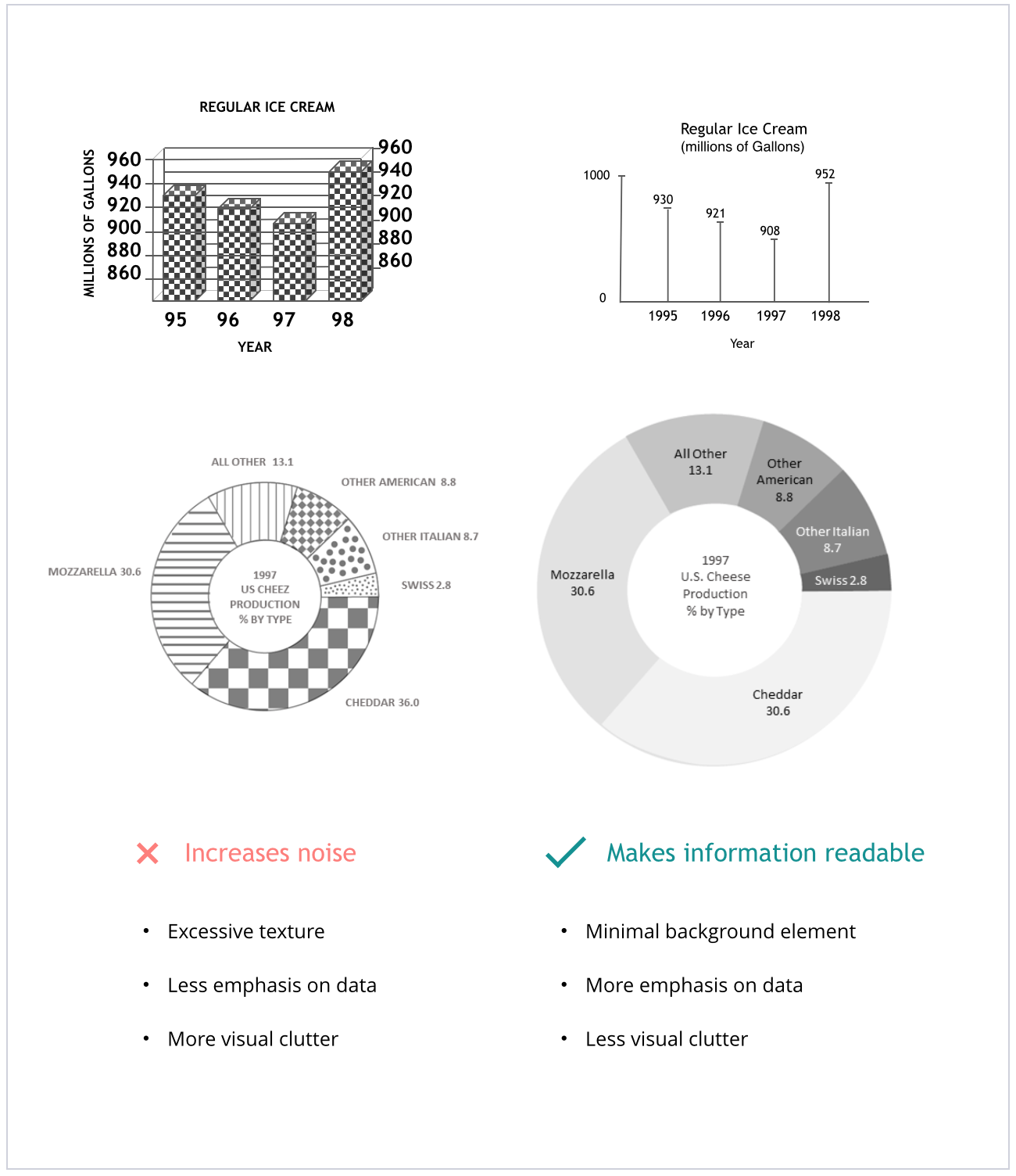
“The ratio of relevant to irrelevant information is signal to noise ratio.
S/N ratio can be increased by enhancing main information and degrading the excess information. In above stated image all the data representation indicate presence of noise as compared with right hand side counterparts. This noise is in terms of dark background, thick borders that mute down the numerical data.
Some of the most observed reasons behind degradation of the signal are :
- Ambiguous icon/labels
- Inappropriate graphs
- Unclear writing
A simple way of enhancing the signal is presenting it in simple, precise and minimalistic way. This will result in quickly understanding the information. Every element of the design should be used to extent of necessity. Its use beyond necessity is excess and results into noise.
Its amazing to chisel out every element of design and keeping it only to the extent of necessity. I will cover more such principles in my next blog. Stay tuned.
References
Universal Principles of Design by William Lidwell
http://www.presentationzen.com/presentationzen/2007/03/signaltonoise_r.html
https://en.wikipedia.org/wiki/Picture_superiority_effect
http://www.bankofindia.co.in/english/home.aspx
https://www.interaction-design.org/literature/article/serial-position-effect-how-to-create-better-user-interfaces
Here’s an article you may be interested in – Psychology & UX
Amplify your brand presence with the best UX design studio that truly aligns your needs with those of your consumers! Get in touch with us at YUJ Designs, today!
